 Menu
Menu
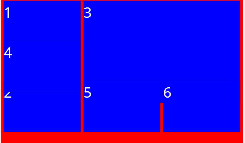
I am using angularjs 1.5.8 and trying to achieve angular gridster layout like this

and in mobile mode elements stack below one another. My gridster-options are as follows
 this.standardItems = [
        { sizeX: 2, sizeY: 1, row: 0, col: 0 },
        { sizeX: 2, sizeY: 1, row: 1, col: 0 },
        { sizeX: 4, sizeY: 2, row: 0, col: 2 },
        { sizeX: 2, sizeY: 1, row: 2, col: 0 },
        { sizeX: 2, sizeY: 1, row: 2, col: 2 },
        { sizeX: 2, sizeY: 1, row: 2, col: 4 },
    ];

    $scope.gridsterOpts2 = {
        margins: [20, 20],
        outerMargin: false,
        swapping: false,
        pushing: false,
        rowHeight: 'match',
        mobileBreakPoint: 600,
        margins: [10, 10],
        floating: false,
        isMobile: true,
        draggable: {
            enabled: false
        },
        resizable: {
            enabled: false,
            handles: ['n', 'e', 's', 'w', 'se', 'sw']
        }
    };
and I have used the following style too
.smalltiles{
  min-height: 30%;
}

.largetile{
  min-height: 60%;
}

.gridster .gridster-item {
  -webkit-box-shadow: 0 0 5px rgba(0, 0, 0, 0.3);
  -moz-box-shadow: 0 0 5px rgba(0, 0, 0, 0.3);
  box-shadow: 0 0 5px rgba(0, 0, 0, 0.3);
  color: #004756;
  background: #ffffff;
  padding-top: 5px;
  padding-bottom: 0px;
  background: blue;
  font-size: 50px;
  color:white;
}
.gridster{
  min-height:100%;
}
.gridster-item{
  margin-bottom: 10px;
}
The grid looks fine in desktop screen when it is resized down or in full screen the grid overlaps and elements below each other begin to overlap like this.
How do I proceed with this. Is my layouting wrong thanks in advance.
Note: It would be better if an example using bootstrap css classes is given
 559
559
finally succeeded to replicate your issue by adding ng-class="{smalltiles:item.sizeY<2,largetile:item.sizeY>1}" to gridster item, see https://jsfiddle.net/cerwwxd8/9/, and try to move 2 (SMALL TILE) above 3 (LARGE TILE). This fiddle uses min-height CSS rule.
here https://jsfiddle.net/cerwwxd8/10/ all min-height CSS rules are replaced with height CSS rule, and here moving 2 (SMALL TILE) above 3 (LARGE TILE) does not produce overlapping.
BTW: index in this fiddle is printed with attr() CSS function which fetches this value from the tabindex HTML property within content CSS rule:
.smalltiles{
  text-align: center;
  height: 30%;
}
.smalltiles:after {
  font-size: 0.5em;
  content: attr(tabindex) ' (SMALL TILE)';
}

.largetile{
  text-align: center;
  height: 60%;
}
.largetile:after {
  font-size: 0.7em;
  content: attr(tabindex) ' (LARGE TILE)'
}
If you love us? You can donate to us via Paypal or buy me a coffee so we can maintain and grow! Thank you!
Donate Us With