 Menu
Menu
I am trying to accomplish exactly something like this: http://www.freshbooks.com/
I have a container with a background and a form inside it. I want this container to resize exactly to the width and the height of the window it is opened in. Also, when resizing, it should resize along the window.
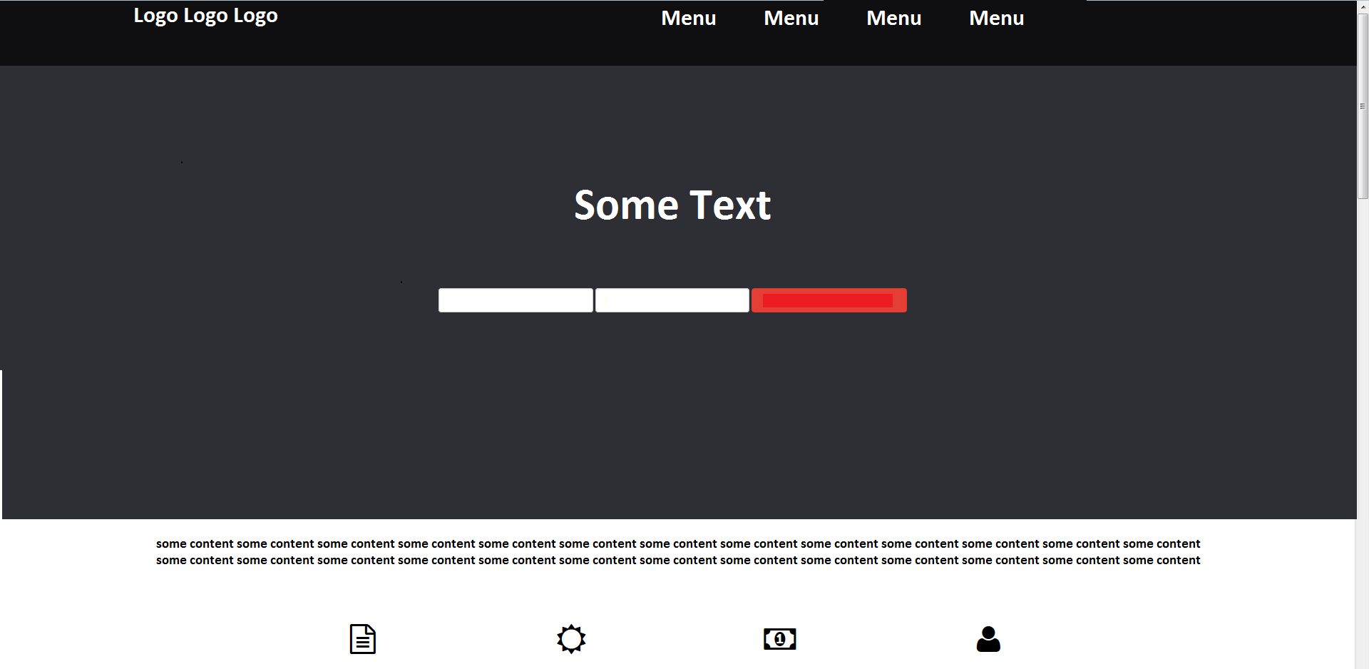
I drew it so I can be more clear. This is how I want it to look like:
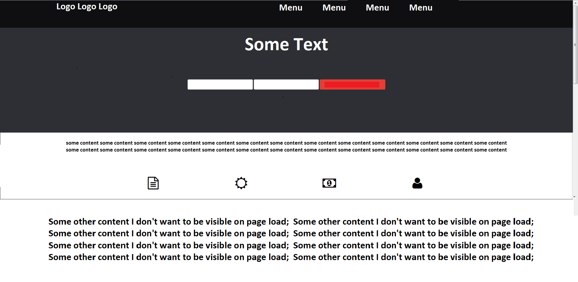
Instead, at the moment it looks like:
I know how to do this with jQuery, it's pretty simple, but if I set a fixed height to the container, the "responsiveness" of bootstrap and of the page is completely lost when I shrink it to a smaller size.
I am pretty sure that bootstrap has some build in and ready to use functionality for doing this, but obviously I can't find it.
Also, I am having trouble to center the "Some text and form" components vertically in the gray area.
Your help is appreciated!
 217
217
There should be no need for jQuery or JavaScript. This can be done using only CSS.
You can use .container-fluid instead of .container to have it span almost the entire width of the window. The columns inside it will have a small gutter of 15px to the left and right though. But as you'll likely add the background-color on the .container-fluid this shouldn't be a problem.
Put all content that should take up the entire height of the window inside the .container-fluid and add a height property to it. Either 100vh, 100% of the view height. If that doesn't work due to browser support (e.g. you need to support IE8) give it a height of 100% and make sure that all its parents (at least html and body) also get a height: 100%.
.height-full {
  height: 100vh;
}

.bg-dark {
  background-color: #333;
  color: #fff;
}
<link href="http://maxcdn.bootstrapcdn.com/bootstrap/3.3.1/css/bootstrap.min.css" rel="stylesheet" />
<div class="container-fluid height-full bg-dark">
<div class="row">
<div class="col-xs-12">
<h1>Full width and height</h1>
</div>
</div>
</div>
<div class="container">
<div class="row">
<div class="col-xs-12">
<h1>Regular content</h1>
</div>
</div>
</div>If it's only about showing a small form horizontally and vertically centered in the entire width and height of the screen, I suggest not using the .container-fluid but the regular .container. From your screenshots it seems that you don't want the form to take up the entire width of the screen. Surround the .container with a div that has its background-color set.
Create a Bootstrap grid that contains the form (in my example I've used .col-xs-6.col-xs-offset-3 to have a half width column in the center of the screen. Give this column the height: 100vh to make it take up the entire height of the screen. The horizontal centering is now done.
Vertical centering is done by positioning the form absolutely, pushing it down top: 50% of the height of its container (the column has position: relative) and pulling it transform: translateY(-50%) of its own height up. See css-tricks.com/centering-css-complete-guide/ for more information
The 100vh might conflict with your navbar. Take it outside of the regular document flow by either make it fixed by adding .navbar-fixed-top or position it absolutely.
.height-full {
  height: 100vh;
}
.bg-dark {
  background-color: #333;
  color: #fff;
}
.vertically-center {
  position: absolute;
  top: 50%;
  transform: translateY(-50%);
}
<link href="http://maxcdn.bootstrapcdn.com/bootstrap/3.3.1/css/bootstrap.min.css" rel="stylesheet" />
<div class="bg-dark">
<div class="container">
<div class="row">
<div class="col-xs-6 col-xs-offset-3 height-full">
<form class="vertically-center">
<h1 class="text-center">Some text</h1>
<div class="row">
<div class="col-xs-4">
<input class="form-control" type="text" />
</div>
<div class="col-xs-4">
<input class="form-control" type="text" />
</div>
<div class="col-xs-4">
<button class="btn btn-danger btn-block">Submit</button>
</div>
</div>
</form>
</div>
</div>
</div>
</div>
<div class="container">
<div class="row">
<div class="col-xs-12">
<h1>Regular content</h1>
</div>
</div>
</div>If you love us? You can donate to us via Paypal or buy me a coffee so we can maintain and grow! Thank you!
Donate Us With