Are there tools for visualizing numpy arrays themselves like the image below?
 asked Oct 15 '25 19:10
You can do it from first principles:
from matplotlib import pyplot as plt
from matplotlib.patches import Rectangle
from matplotlib.transforms import Bbox

def square(i, j, k, origin=(0,0), zstep=0.2, **kwargs):
    xy = np.array(origin) + np.array((k, j)) + np.array([1, -1]) * i * zstep
    return Rectangle(xy, 1, 1, zorder=-i, **kwargs)

def draw(a, *, origin=(0,0), zstep=0.2, ax=None,
         rect_kwargs=None, text_kwargs=None):
    ax = plt.gca() if ax is None else ax
    rect_kwargs = {} if rect_kwargs is None else rect_kwargs
    facecolor = rect_kwargs.pop('facecolor', 'lightblue')
    facecolor = np.broadcast_to(facecolor, a.shape)
    text_kwargs = {} if text_kwargs is None else text_kwargs
    textcolor = rect_kwargs.pop('color', 'k')
    textcolor = np.broadcast_to(textcolor, a.shape)
    text_kwargs = dict(ha='center', va='center') | text_kwargs
    im, jm, km = a.shape
    bboxes = []
    origin = np.array(origin) + np.array((0, zstep * im))
    for i in range(im):
        for j in range(jm):
            for k in range(km):
                r = square(i, j, k, origin=origin, edgecolor='k',
                           facecolor=facecolor[i, j, k], **rect_kwargs)
                ax.add_patch(r)
                bb = r.get_bbox()
                bboxes.append(bb)
                center = bb.get_points().mean(0)
                ax.annotate(a[i, j, k], center, **text_kwargs, zorder=-i)
    bb = Bbox.union(bboxes)
    # help auto axis limits
    ax.plot(*bb.get_points().T, '.', alpha=0)
    return bb
def np_example(shape):
    return 1 + np.arange(np.prod(shape)).reshape(shape)

a, b = [np_example(shape) for shape in [(2, 3, 4), (2, 2, 4)]]

fig, ax = plt.subplots(figsize=(4, 4))
draw(a, ax=ax)
draw(b, origin=(0, a.shape[1] + 1), rect_kwargs=dict(facecolor='lightgreen'))

acolor = np.broadcast_to('lightblue', a.shape)
bcolor = np.broadcast_to('lightgreen', b.shape)
draw(
    np.concatenate((a, b), axis=1), origin=(a.shape[2] + 2, 0),
    rect_kwargs=dict(facecolor=np.concatenate((acolor, bcolor), axis=1)))

ax.set_aspect(1)
ax.invert_yaxis()
ax.set_axis_off()
plt.tight_layout()
plt.show()

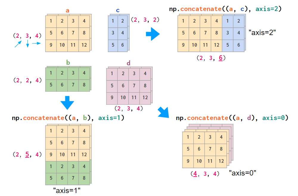
a, b, c, d = [np_example(shape) for shape in [(2, 3, 4), (2, 2, 4), (2, 3, 2), (2, 3, 4)]]
colors = ['#ffe5b6', '#add8a3', '#c5dbfb', '#efd0dd']

arrs = [a, b, np.concatenate((a, b), axis=1),
        c, d, None,
        np.concatenate((a, c), axis=2), None, np.concatenate((a, d), axis=0)]
a_, b_, c_, d_ = [np.broadcast_to(c, ar.shape) for c, ar in zip(colors, [a, b, c, d])]
colors = [a_, b_, np.concatenate((a_, b_), axis=1),
        c_, d_, None,
        np.concatenate((a_, c_), axis=2), None, np.concatenate((a_, d_), axis=0)]
titles = ['a', 'b', 'np.concatenate((a, b), axis=1)',
          'c', 'd', None,
          'np.concatenate((a, c), axis=2)', None, 'np.concatenate((a, d), axis=0)']

x_pos = np.array((0, 5.5, 12))
y_pos = np.array((0, 4.5, 10))

origins = np.c_[np.meshgrid(x_pos, y_pos)].T.reshape(-1, 2)

fig, ax = plt.subplots(figsize=(6, 6))
for ar, color, title, origin in zip(arrs, colors, titles, origins):
    if ar is None:
        continue
    bb = draw(ar, origin=origin, rect_kwargs=dict(facecolor=color))
    cc = np.array(bb.coefs['S'])
    txt_xy = np.diagonal(np.c_[1-cc, cc] @ bb.get_points())
    ax.annotate(title, txt_xy, xytext=(0, 4), textcoords='offset points', ha='center', va='bottom')
ax.set_aspect(1.1)
ax.invert_yaxis()
ax.set_axis_off()
plt.tight_layout()
plt.show()

import matplotlib.pyplot as plt
import numpy as np
import matplotlib.cm as cm

values = np.array([[0.8, 2.4, 2.5, 3.9, 0.0, 4.0, 0.0],
                    [2.4, 0.0, 4.0, 1.0, 2.7, 0.0, 0.0],
                    [1.1, 2.4, 0.8, 4.3, 1.9, 4.4, 0.0],
                    [0.6, 0.0, 0.3, 0.0, 3.1, 0.0, 0.0],
                    [0.7, 1.7, 0.6, 2.6, 2.2, 6.2, 0.0],
                    [1.3, 1.2, 0.0, 0.0, 0.0, 3.2, 5.1],
                    [0.1, 2.0, 0.0, 1.4, 0.0, 1.9, 6.3]])


fig, ax = plt.subplots()
ax.imshow(values, cmap=cm.Greens)
ax.set_axis_off()

# annotate the heatmap
for i in range(values.shape[0]):
    for j in range(values.shape[1]):
        text = ax.text(j, i, values[i, j],
                       ha="center", va="center")

fig.tight_layout()
plt.show()

import matplotlib.pyplot as plt
import numpy as np

# based on the matplotlib example "Hinton diagrams":
# https://matplotlib.org/stable/gallery/specialty_plots/hinton_demo.html#sphx-glr-gallery-specialty-plots-hinton-demo-py
def hinton(matrix, max_weight=None, ax=None):
    """Draw Hinton diagram for visualizing a weight matrix."""
    ax = ax if ax is not None else plt.gca()

    if not max_weight:
        max_weight = 2 ** np.ceil(np.log2(np.abs(matrix).max()))

    ax.patch.set_facecolor('gray')
    ax.set_aspect('equal', 'box')
    ax.xaxis.set_major_locator(plt.NullLocator())
    ax.yaxis.set_major_locator(plt.NullLocator())

    for (x, y), w in np.ndenumerate(matrix):
        color = 'white' if w > 0 else 'black'
        size = np.sqrt(abs(w) / max_weight)
        rect = plt.Rectangle([x - size / 2, y - size / 2], size, size,
                             facecolor=color, edgecolor=color)
        ax.add_patch(rect)
        textcolor = 'black' if w > 0 else 'white'
        ax.text(x, y,'{0:3.2f}'.format(w), ha="center", va="center", size=size*30, color=textcolor)

    ax.autoscale_view()
    ax.invert_yaxis()


if __name__ == '__main__':
    # Fixing random state for reproducibility
    np.random.seed(19680801)

    hinton(np.random.rand(6, 4) - 0.5)
    plt.show()

import matplotlib.pyplot as plt
import numpy as np
from matplotlib.patches import PathPatch
from matplotlib.text import TextPath
from matplotlib.transforms import Affine2D
import mpl_toolkits.mplot3d.art3d as art3d

# copied from the "Draw flat objects in 3D plot" matplotlib example:
# https://matplotlib.org/stable/gallery/mplot3d/pathpatch3d.html#sphx-glr-gallery-mplot3d-pathpatch3d-py
def text3d(ax, xyz, s, zdir="z", size=None, angle=0, usetex=False, **kwargs):
    """
    Plots the string *s* on the axes *ax*, with position *xyz*, size *size*,
    and rotation angle *angle*. *zdir* gives the axis which is to be treated as
    the third dimension. *usetex* is a boolean indicating whether the string
    should be run through a LaTeX subprocess or not.  Any additional keyword
    arguments are forwarded to `.transform_path`.

    Note: zdir affects the interpretation of xyz.
    """
    x, y, z = xyz
    if zdir == "y":
        xy1, z1 = (x, z), y
    elif zdir == "x":
        xy1, z1 = (y, z), x
    else:
        xy1, z1 = (x, y), z

    text_path = TextPath((0, 0), s, size=size, usetex=usetex)
    trans = Affine2D().rotate(angle).translate(xy1[0], xy1[1])

    p1 = PathPatch(trans.transform_path(text_path), **kwargs)
    ax.add_patch(p1)
    art3d.pathpatch_2d_to_3d(p1, z=z1, zdir=zdir)

# generate 3D data array
values = np.random.rand(4, 4, 4)

x_num = values.shape[0]
y_num = values.shape[1]
z_num = values.shape[2]

# all voxels are going to be filled
filled = np.ones((x_num, y_num, z_num), dtype=bool)

# plot voxels
fig, ax = plt.subplots(subplot_kw={"projection": "3d"})
ax.voxels(filled=filled, facecolor='red', edgecolor='k', alpha=0.3)

# place values inside voxels
for x in range(x_num):
    for y in range(y_num):
        for z in range(z_num):
            text3d(ax, (x + 0.2, y, z + 0.4), '{0:3.2f}'.format(values[x, y, z]), zdir="y", size=0.3, ec="none", fc="k")

ax.set_axis_off()

plt.show()

The values are not easily discernable here, in this picture, but Matplotlib allows you to rotate the 3D-plot. Some parts of the array could be highlighted by means of the parameter "filled" (e.g. to show the result of some recent concatenation).
answered Oct 18 '25 08:10
If you love us? You can donate to us via Paypal or buy me a coffee so we can maintain and grow! Thank you!
Donate Us With