 Menu
Menu
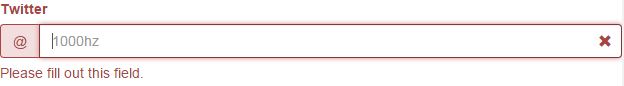
In the sample below I add some sample file, which is working fine but I need to do some modification on that. Currently while validating, it shows the error like this:
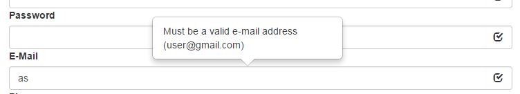
But what I need it to do is to show a tooltip. The tooltip needs to be auto pop and remain visible until the error is cleared. Like this:
$('#myForm').validator()<script src="https://code.jquery.com/jquery-1.10.2.min.js"></script>
<script src="https://1000hz.github.io/bootstrap-validator/dist/validator.min.js"></script>
<link href="https://netdna.bootstrapcdn.com/bootstrap/3.3.5/css/bootstrap.min.css" rel="stylesheet"/>
<form data-toggle="validator" role="form">
<div class="form-group">
<label for="inputName" class="control-label">Name</label>
<input type="text" class="form-control" id="inputName" placeholder="Cina Saffary" required>
</div>
<div class="form-group has-feedback">
<label for="inputTwitter" class="control-label">Twitter</label>
<div class="input-group">
<span class="input-group-addon">@</span>
<input type="text" pattern="^[_A-z0-9]{1,}$" maxlength="15" class="form-control" id="inputTwitter" placeholder="1000hz" required>
</div>
<span class="glyphicon form-control-feedback" aria-hidden="true"></span>
<span class="help-block with-errors">Hey look, this one has feedback icons!</span>
</div>
<div class="form-group">
<label for="inputEmail" class="control-label">Email</label>
<input type="email" class="form-control" id="inputEmail" placeholder="Email" data-error="Bruh, that email address is invalid" required>
<div class="help-block with-errors"></div>
</div>
<div class="form-group">
<label for="inputPassword" class="control-label">Password</label>
<div class="form-group col-sm-6">
<input type="password" data-minlength="6" class="form-control" id="inputPassword" placeholder="Password" required>
<span class="help-block">Minimum of 6 characters</span>
</div>
<div class="form-group col-sm-6">
<input type="password" class="form-control" id="inputPasswordConfirm" data-match="#inputPassword" data-match-error="Whoops, these don't match" placeholder="Confirm" required>
<div class="help-block with-errors"></div>
</div>
</div>
</div>
<div class="form-group">
<div class="radio">
<label>
<input type="radio" name="underwear" required>
Boxers
</label>
</div>
<div class="radio">
<label>
<input type="radio" name="underwear" required>
Briefs
</label>
</div>
</div>
<div class="form-group">
<div class="checkbox">
<label>
<input type="checkbox" id="terms" data-error="Before you wreck yourself" required>
Check yourself
</label>
<div class="help-block with-errors"></div>
</div>
</div>
<div class="form-group">
<button type="submit" class="btn btn-primary">Submit</button>
</div>
</form> 716
716
Many ways of doing this.
With pure CSS, leaving the DOM structure alone:
span.help-block.with-errors {
    position: absolute;
    top:45%;
    right:36px;
    z-index:1000;
}
Or, if you modify the DOM structure (moving the validation text into the .form-group):
<div class="form-group has-feedback">
    <label for="inputTwitter" class="control-label">Twitter</label>
    <div class="input-group">
        <span class="input-group-addon">@</span>
        <input type="text" pattern="^[_A-z0-9]{1,}$" maxlength="15" class="form-control" id="inputTwitter" placeholder="1000hz" required>
        <span style="position:absolute;top:2px;right:36px;z-index:1000;" class="help-block with-errors">Hey look, this one has feedback icons!</span>
    </div>
    <span class="glyphicon form-control-feedback" aria-hidden="true"></span>
</div>
You could inline a bit of CSS to get the position correct. Stack snippet follows.
If you want to do the tooltip-style thing, I'd suggest a jQuery plugin to handle this bit for you. One example is Tooltipster.
$('#myForm').validator()<script src="https://code.jquery.com/jquery-1.10.2.min.js"></script>
<script src="https://1000hz.github.io/bootstrap-validator/dist/validator.min.js"></script>
<link href="https://netdna.bootstrapcdn.com/bootstrap/3.3.5/css/bootstrap.min.css" rel="stylesheet"/>
<form data-toggle="validator" role="form">
<div class="form-group">
<label for="inputName" class="control-label">Name</label>
<input type="text" class="form-control" id="inputName" placeholder="Cina Saffary" required>
</div>
<div class="form-group has-feedback">
<label for="inputTwitter" class="control-label">Twitter</label>
<div class="input-group">
<span class="input-group-addon">@</span>
<input type="text" pattern="^[_A-z0-9]{1,}$" maxlength="15" class="form-control" id="inputTwitter" placeholder="1000hz" required>
<span style="position:absolute;top:2px;right:36px;z-index:1000;" class="help-block with-errors">Hey look, this one has feedback icons!</span>
</div>
<span class="glyphicon form-control-feedback" aria-hidden="true"></span>
</div>
<div class="form-group">
<label for="inputEmail" class="control-label">Email</label>
<input type="email" class="form-control" id="inputEmail" placeholder="Email" data-error="Bruh, that email address is invalid" required>
<div class="help-block with-errors"></div>
</div>
<div class="form-group">
<label for="inputPassword" class="control-label">Password</label>
<div class="form-group col-sm-6">
<input type="password" data-minlength="6" class="form-control" id="inputPassword" placeholder="Password" required>
<span class="help-block">Minimum of 6 characters</span>
</div>
<div class="form-group col-sm-6">
<input type="password" class="form-control" id="inputPasswordConfirm" data-match="#inputPassword" data-match-error="Whoops, these don't match" placeholder="Confirm" required>
<div class="help-block with-errors"></div>
</div>
</div>
</div>
<div class="form-group">
<div class="radio">
<label>
<input type="radio" name="underwear" required>
Boxers
</label>
</div>
<div class="radio">
<label>
<input type="radio" name="underwear" required>
Briefs
</label>
</div>
</div>
<div class="form-group">
<div class="checkbox">
<label>
<input type="checkbox" id="terms" data-error="Before you wreck yourself" required>
Check yourself
</label>
<div class="help-block with-errors"></div>
</div>
</div>
<div class="form-group">
<button type="submit" class="btn btn-primary">Submit</button>
</div>
</form>If you love us? You can donate to us via Paypal or buy me a coffee so we can maintain and grow! Thank you!
Donate Us With