 Menu
Menu
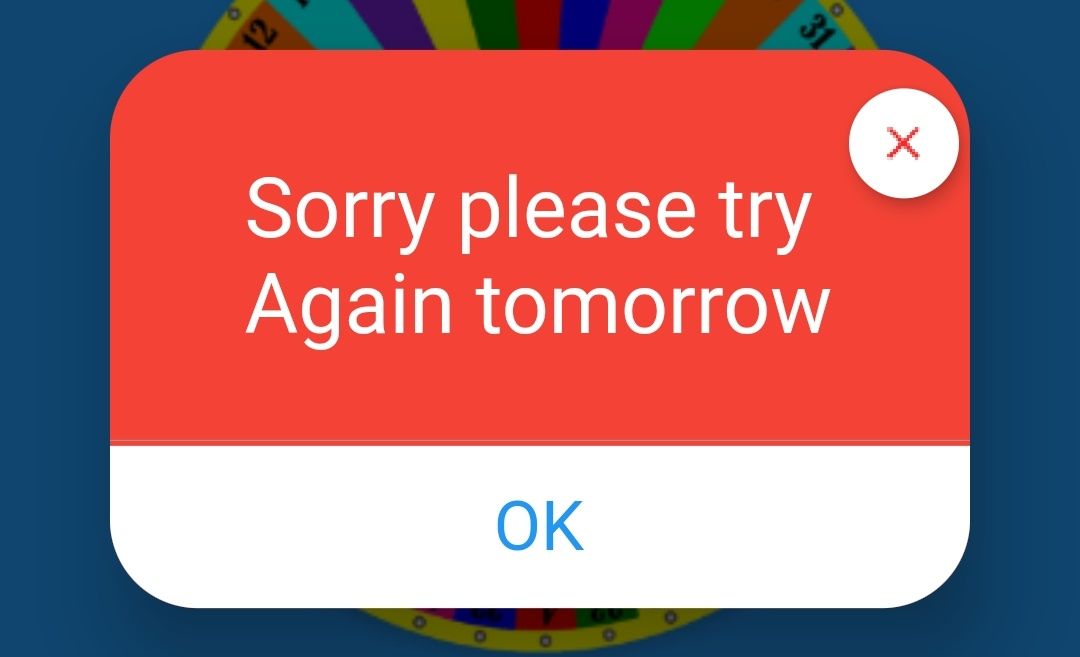
I have an image of the dialog box and trying to design the same as below the image.

I tried but it's not same as above the image
I just want set cross button at the top right corner, like above the image.
i used Stack, and a placed Positioned widget at the top:0.0,right:0.0.
CODE:
 customDialogBox(BuildContext context) {
    return showDialog(
        context: context,
        builder: (BuildContext context) {
          return AlertDialog(
            backgroundColor: Colors.red,
            shape: RoundedRectangleBorder(
              borderRadius: BorderRadius.all(Radius.circular(32.0))),
            contentPadding: EdgeInsets.only(top: 10.0),
            content: Stack(
              children: <Widget>[
                Container(
              width: MediaQuery.of(context).size.width,
              child: Column(
                mainAxisAlignment: MainAxisAlignment.center,
                crossAxisAlignment: CrossAxisAlignment.stretch,
                mainAxisSize: MainAxisSize.min,
                children: <Widget>[
                  SizedBox(
                    height: 20.0,
                  ),
                  Center(
                    child: Padding(
                      padding: const EdgeInsets.all(10.0),
                      child: new Text("Sorry please try \n again tomorrow", style:TextStyle(fontSize: 30.0,color: Colors.white)),
                    )//
                  ),

                  SizedBox(
                    height: 20.0,
                    width: 5.0,
                  ),
                  Divider(
                    color: Colors.grey,
                    height: 4.0,
                  ),

                 InkWell(
                    child: Container(
                      padding: EdgeInsets.only(top: 15.0, bottom: 15.0),
                      decoration: BoxDecoration(
                        color:Colors.white,
                        borderRadius: BorderRadius.only(
                        bottomLeft: Radius.circular(32.0),
                        bottomRight: Radius.circular(32.0)),
                      ),
                      child:  Text(
                       "OK",
                        style: TextStyle(color: Colors.blue,fontSize: 25.0),
                        textAlign: TextAlign.center,
                      ),
                    ),
                    onTap:(){
                      Navigator.pop(context);
                    },
                  ),
                ],
              ),
            ),
            Positioned(
              top: 0.0,
              right: 0.0,
              child: FloatingActionButton(
                child: Image.asset("assets/red_cross.png"),
                onPressed: (){
                Navigator.pop(context);
                },
                shape: RoundedRectangleBorder(borderRadius: BorderRadius.circular(80)),
                backgroundColor: Colors.white,
                mini: true,
                elevation: 5.0,
              ),
            ),
          ],
        )
      );
    });
  }
here's my Dialog Box:
 215
215
Flutter custom Alert Dialog If you want to implement more advanced custom Dialog, you can use Dialog widget for that. Instead of the AlertDialog , in here we return Dialog widget. The showDialog method will remain the same. You can use a Container widget to set relevant height for the Dialog.
The below code will close AlertBox/DialogBox in Flutter. Navigator. of(context). pop();
A CloseButton is an IconButton with a "close" icon. When pressed, the close button calls Navigator. maybePop to return to the previous route. Use a CloseButton instead of a BackButton on fullscreen dialogs or pages that may solicit additional actions to close.
In the AlertDialog widget, there is a parameter called action. It accepts arrays of widgets and you can provide multiple buttons to that. Those Buttons will appear in the bottom right corner of the dialog. Here is complete code on implementing AlertDialog. Let us start creating our custom Dialog in flutter with a Dialog method.
Use Dialog class which is a parent class to AlertDialog class in Flutter. Dialog widget has a argument , "shape" which you can use to shape the Edges of the Dialog box.
Create a new dart file called custom_dialog_box.dart inside the lib folder. In this screen, we will use CircularAvatar for the image at the top, Text for Title and Descriptions, and FlatButton for button. Let’s declare the CustomDialogBox class.
Before adding Dialog you must call showDialog function to change current screen state to show the intermediate Dialog popup. In here we use AlertDialog widget to show simple Dialog with title and some text in the body.
Try this will work perfect.
import 'package:flutter/material.dart';
import 'custom_dialog.dart';
void main() {
runApp(MyApp());
}
class MyApp extends StatelessWidget {
@override
Widget build(BuildContext context) {
return MaterialApp(
title: 'Flutter Demo',
home: HomePage(),
);
}
}
class HomePage extends StatefulWidget {
@override
_HomePageState createState() => _HomePageState();
}
class _HomePageState extends State<HomePage> {
@override
Widget build(BuildContext context) {
return Scaffold(
appBar: AppBar(),
body: Center(
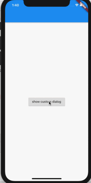
child: RaisedButton(
onPressed: () {
showDialog(context: context, builder: (BuildContext context) => CustomDialog());
},
child: Text('show custom dialog'),
),
),
);
}
}
Dialog Widget :
    import 'package:flutter/material.dart';

    class CustomDialog extends StatelessWidget {

    @override
    Widget build(BuildContext context) {
        return Dialog(
        shape: RoundedRectangleBorder(borderRadius: BorderRadius.circular(16.0)),
        elevation: 0.0,
        backgroundColor: Colors.transparent,
        child: dialogContent(context),
        );
    }

    Widget dialogContent(BuildContext context) {
        return Container(
        margin: EdgeInsets.only(left: 0.0,right: 0.0),
        child: Stack(
            children: <Widget>[
            Container(
                padding: EdgeInsets.only(
                top: 18.0,
                ),
                margin: EdgeInsets.only(top: 13.0,right: 8.0),
                decoration: BoxDecoration(
                    color: Colors.red,
                    shape: BoxShape.rectangle,
                    borderRadius: BorderRadius.circular(16.0),
                    boxShadow: <BoxShadow>[
                    BoxShadow(
                        color: Colors.black26,
                        blurRadius: 0.0,
                        offset: Offset(0.0, 0.0),
                    ),
                    ]),
                child: Column(
                mainAxisSize: MainAxisSize.min,
                crossAxisAlignment: CrossAxisAlignment.stretch,
                children: <Widget>[
                    SizedBox(
                    height: 20.0,
                    ),
                    Center(
                        child: Padding(
                        padding: const EdgeInsets.all(10.0),
                        child: new Text("Sorry please try \n again tomorrow", style:TextStyle(fontSize: 30.0,color: Colors.white)),
                        )//
                    ),
                    SizedBox(height: 24.0),
                    InkWell(
                    child: Container(
                        padding: EdgeInsets.only(top: 15.0,bottom:15.0),
                        decoration: BoxDecoration(
                        color:Colors.white,
                        borderRadius: BorderRadius.only(
                            bottomLeft: Radius.circular(16.0),
                            bottomRight: Radius.circular(16.0)),
                        ),
                        child:  Text(
                        "OK",
                        style: TextStyle(color: Colors.blue,fontSize: 25.0),
                        textAlign: TextAlign.center,
                        ),
                    ),
                    onTap:(){
                        Navigator.pop(context);
                    },
                    )
                ],
                ),
            ),
            Positioned(
                right: 0.0,
                child: GestureDetector(
                onTap: (){
                    Navigator.of(context).pop();
                },
                child: Align(
                    alignment: Alignment.topRight,
                    child: CircleAvatar(
                    radius: 14.0,
                    backgroundColor: Colors.white,
                    child: Icon(Icons.close, color: Colors.red),
                    ),
                ),
                ),
            ),
            ],
        ),
        );
    }
    }
Approach 2:
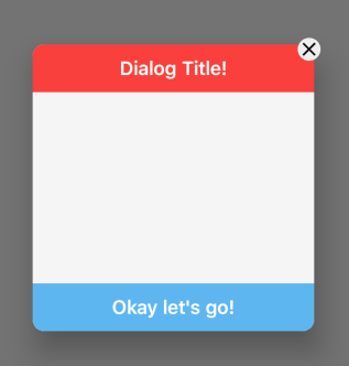
    void showFancyCustomDialog(BuildContext context) {
            Dialog fancyDialog = Dialog(
            shape: RoundedRectangleBorder(
                borderRadius: BorderRadius.circular(12.0),
            ),
            child: Container(
                decoration: BoxDecoration(
                borderRadius: BorderRadius.circular(20.0),
                ),
                height: 300.0,
                width: 300.0,
                child: Stack(
                children: <Widget>[
                    Container(
                    width: double.infinity,
                    height: 300,
                    decoration: BoxDecoration(
                        color: Colors.grey[100],
                        borderRadius: BorderRadius.circular(12.0),
                    ),
                    ),
                    Container(
                    width: double.infinity,
                    height: 50,
                    alignment: Alignment.bottomCenter,
                    decoration: BoxDecoration(
                        color: Colors.red,
                        borderRadius: BorderRadius.only(
                        topLeft: Radius.circular(12),
                        topRight: Radius.circular(12),
                        ),
                    ),
                    child: Align(
                        alignment: Alignment.center,
                        child: Text(
                        "Dialog Title!",
                        style: TextStyle(
                            color: Colors.white,
                            fontSize: 20,
                            fontWeight: FontWeight.w600),
                        ),
                    ),
                    ),
                    Align(
                    alignment: Alignment.bottomCenter,
                    child: InkWell(
                        onTap: () {
                        Navigator.pop(context);
                        },
                        child: Container(
                        width: double.infinity,
                        height: 50,
                        decoration: BoxDecoration(
                            color: Colors.blue[300],
                            borderRadius: BorderRadius.only(
                            bottomLeft: Radius.circular(12),
                            bottomRight: Radius.circular(12),
                            ),
                        ),
                        child: Align(
                            alignment: Alignment.center,
                            child: Text(
                            "Okay let's go!",
                            style: TextStyle(
                                color: Colors.white,
                                fontSize: 20,
                                fontWeight: FontWeight.w600),
                            ),
                        ),
                        ),
                    ),
                    ),
                    Align(
                    // These values are based on trial & error method
                    alignment: Alignment(1.05, -1.05),
                    child: InkWell(
                        onTap: () {
                        Navigator.pop(context);
                        },
                        child: Container(
                        decoration: BoxDecoration(
                            color: Colors.grey[200],
                            borderRadius: BorderRadius.circular(12),
                        ),
                        child: Icon(
                            Icons.close,
                            color: Colors.black,
                        ),
                        ),
                    ),
                    ),
                ],
                ),
            ),
            );
    showDialog(
        context: context, builder: (BuildContext context) => fancyDialog);
}
126
In order to build the custom Dialog box I had to do everything custom.
I still used stack but instead of a inbuilt DialogBox i used a Container, I also replaced the image of the icon with an actual icon, and made the ok bold, as on the expected result.
hope this fits your needs.
Stack(
            alignment: Alignment.center,
            children: <Widget>[
               Container(
                    decoration: BoxDecoration(
                      color: Colors.red,
                      borderRadius: BorderRadius.circular(30.0),

                    ),
                    width: 500.0,
                    child: Column(
                      mainAxisAlignment: MainAxisAlignment.center,
                      crossAxisAlignment: CrossAxisAlignment.stretch,
                      mainAxisSize: MainAxisSize.min,
                      children: <Widget>[
                        SizedBox(
                          height: 20.0,
                        ),
                        Center(
                            child: Padding(
                              padding: const EdgeInsets.all(10.0),
                              child: new Text("Sorry please try \n again tomorrow", style:TextStyle(fontSize: 30.0,color: Colors.white)),
                            )//
                        ),

                        SizedBox(
                          height: 20.0,
                          width: 5.0,
                        ),
                        Divider(
                          color: Colors.grey,
                          height: 4.0,
                        ),

                        InkWell(
                          child: Container(
                            padding: EdgeInsets.only(top: 15.0, bottom: 15.0),
                            decoration: BoxDecoration(
                              color:Colors.white,
                              borderRadius: BorderRadius.only(
                                  bottomLeft: Radius.circular(32.0),
                                  bottomRight: Radius.circular(32.0)),
                            ),
                            child:  Text(
                              "OK",
                              style: TextStyle(color: Colors.blue,fontSize: 25.0, fontWeight: FontWeight.bold),
                              textAlign: TextAlign.center,
                            ),
                          ),
                          onTap:(){
                            Navigator.pop(context);
                          },
                        ),
                      ],
                    ),
              ),
              Align(
                alignment: Alignment(1.05, -0.35),
                child: InkWell(
                  onTap: () {},
                  child: Container(
                    width: 40.0,
                    height: 40.0,
                    child: Icon(Icons.close, color: Colors.red, size: 40,),
                    decoration: BoxDecoration(
                        boxShadow: [
                          BoxShadow(color: Colors.black,offset: Offset(0, 1), blurRadius: 2),
                        ],
                        shape: BoxShape.circle,
                        color: Colors.white
                    ),
                  ),
                ),
              ),
            ],
          ),
If you love us? You can donate to us via Paypal or buy me a coffee so we can maintain and grow! Thank you!
Donate Us With


