 Menu
Menu
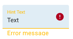
I want to customize TextInputLayout's error text color. My app theme is based on one of the MaterialComponents themes namely Theme.MaterialComponents.Light.DarkActionBar. I have created a custom text style based on TextAppearance.Design.Error, and created a custom style based on Widget.Design.TextInputLayout in order to set my TextInputLayout components' styles. But the error and label of the EditText are not displayed in the created style.
Here is my code:
styles.xml
<style name="ErrorText" parent="TextAppearance.Design.Error">
    <item name="android:textColor">@color/materialRed</item>
    <item name="android:textSize">16sp</item>
</style>
<style name="TextInputLayoutAppearance" parent="Widget.Design.TextInputLayout">
    <item name="errorTextAppearance">@style/ErrorText</item>
</style>
And, I have set my TextInputLayout's theme to this custom style:
<com.google.android.material.textfield.TextInputLayout
    android:id="@+id/usernameWrapper"
    app:errorTextAppearance="@style/TextInputLayoutAppearance"
    android:layout_width="match_parent"
    android:layout_height="wrap_content">

    <com.google.android.material.textfield.TextInputEditText
        android:id="@+id/username"
        android:layout_width="match_parent"
        android:layout_height="wrap_content" />

</com.google.android.material.textfield.TextInputLayout>
 907
907
Just use a custom style like:
   <com.google.android.material.textfield.TextInputLayout
            style="@style/ErrorTextInputLayout"
            ...>
with:
  <style name="ErrorTextInputLayout" parent="Widget.MaterialComponents.TextInputLayout.FilledBox">
    <item name="errorTextAppearance">@style/myErrorTextAppearance</item>
    <item name="errorTextColor">@color/text_input_error_selector</item>
  </style>

  <style name="myErrorTextAppearance" parent="TextAppearance.MaterialComponents.Caption" >
    <item name="android:textSize">16sp</item>
  </style>
The errorTextColor can be a color or a selector.
<selector xmlns:android="http://schemas.android.com/apk/res/android">
  <item android:color="?attr/colorOnError" android:state_enabled="false"/>
  <item android:color="?attr/colorError"/>
</selector>
Pay attention to the textSize used.
You can also use in the layout the app:errorTextAppearance and app:errorTextColor attributes:
<com.google.android.material.textfield.TextInputLayout
    app:errorTextAppearance="@style/myErrorTextAppearance"
    app:errorTextColor="@color/text_input_error_selector"
    ...>
style.xml
<style name="ErrorText" parent="TextAppearance.Design.Error">
    <item name="android:textSize">11sp</item>
    <item name="android:textColor">@color/accentRed</item>
</style>
<style name="EditTextInputLayoutStyle" parent="Widget.MaterialComponents.TextInputLayout.OutlinedBox.Dense">
    <item name="boxStrokeColor">@color/lightGrey</item>
    <item name="boxStrokeWidth">0.5dp</item>
    <item name="boxBackgroundColor">@color/slightGrey</item>
    <item name="errorTextAppearance">@style/ErrorText</item>
</style>
Layout.xml
<com.google.android.material.textfield.TextInputLayout
        android:id="@+id/email_layout"
        android:layout_width="match_parent"
        android:layout_height="wrap_content"
        app:hintEnabled="false"
        android:layout_marginTop="40dp"
        app:layout_constraintTop_toTopOf="parent"
        app:layout_constraintStart_toStartOf="parent"
        android:layout_marginLeft="32dp"
        android:layout_marginStart="32dp"
        app:layout_constraintEnd_toEndOf="parent"
        android:layout_marginEnd="32dp"
        android:layout_marginRight="32dp"
        app:errorEnabled="true"
        style="@style/EditTextInputLayoutStyle">

    <com.google.android.material.textfield.TextInputEditText
            android:layout_width="match_parent"
            android:layout_height="60dp"
            android:inputType="textEmailAddress"
            android:ems="10"
            android:id="@+id/emailaddress"
            android:hint="@string/email_username_placeholder"
            android:padding="20dp"
            style="@style/editTextstyle"/>

</com.google.android.material.textfield.TextInputLayout>
If you love us? You can donate to us via Paypal or buy me a coffee so we can maintain and grow! Thank you!
Donate Us With