 Menu
Menu
I'm new to Android development and I've got big problems with creating custom toolbar. My requirements:
Here is sample image which explains my requirements:
I was trying to use actionBar.setCustomView(v); but it didn't solve my problems:
My questions:
 268
268
You can make other changes like font, size, color, etc in custom_toolbar. xml file. If you want to change the text of custom toolbar, you can do in this way: ....
The Toolbar is basically a FrameLayout so you can add inside the layout-tag whatever you want. In your case something like the following seems sufficient:
layout.xml
<android.support.v7.widget.Toolbar
    android:id="@+id/toolbar"
    android:layout_width="match_parent"
    android:layout_height="?actionBarSize"
    android:background="?colorPrimary"
    app:contentInsetLeft="0dp"
    app:contentInsetStart="0dp"
    app:popupTheme="@style/ThemeOverlay.AppCompat.Light">

    <LinearLayout
        android:layout_width="wrap_content"
        android:layout_height="?attr/actionBarSize"
        android:divider="@drawable/divider"
        android:dividerPadding="8dp"
        android:orientation="horizontal"
        android:showDividers="end">

        <TextView
            android:id="@+id/toolbar_save"
            style="@style/TextAppearance.Widget.AppCompat.Toolbar.Subtitle"
            android:layout_width="match_parent"
            android:layout_height="match_parent"
            android:background="?attr/selectableItemBackground"
            android:drawableLeft="@drawable/ic_action_check"
            android:drawablePadding="8dp"
            android:gravity="center_vertical"
            android:paddingLeft="16dp"
            android:paddingRight="16dp"
            android:text="Save"
            android:textAllCaps="true" />

    </LinearLayout>
</android.support.v7.widget.Toolbar>
divider.xml
Add this to your /res/drawable folder. This is used as the LinearLayout divider in the code above.
<?xml version="1.0" encoding="utf-8"?>
<shape xmlns:android="http://schemas.android.com/apk/res/android"
    android:shape="rectangle">

    <size android:width="1dp" />

    <solid android:color="@android:color/white" />

</shape>
Code
private void setupToolbar() {
    Toolbar mToolbar = (Toolbar) findViewById(R.id.toolbar);
    setSupportActionBar(mToolbar);
    // Hide the title
    getSupportActionBar().setTitle(null);
    // Set onClickListener to customView
    TextView tvSave = (TextView) findViewById(R.id.toolbar_save);
    tvSave.setOnClickListener(new View.OnClickListener() {
        @Override
        public void onClick(View v) {
            // TODO
        }
    });
}
In terms of the items on the right side: Simply use the default onCreateOptionsMenu method and inflate the corresponding R.menu.* resource.
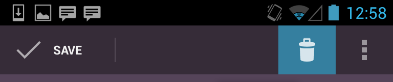
Result

200
 <android.support.v7.widget.Toolbar
        android:layout_width="match_parent"
        android:layout_height="?actionBarSize"
        app:contentInsetLeft="0dp"
        app:contentInsetStart="0dp"
        app:contentInsetStartWithNavigation="0dp"
      />
You also need app:contentInsetStartWithNavigation="0dp" to Toolbar
40
If you love us? You can donate to us via Paypal or buy me a coffee so we can maintain and grow! Thank you!
Donate Us With


