 Menu
Menu
When I was a child, I used to read all Dragon Ball manga books.
The Super Saiyan effect (surrounding aura and lightning) is really cool!
Now I have an event page which lists all upcoming events in cards and it looks like this:
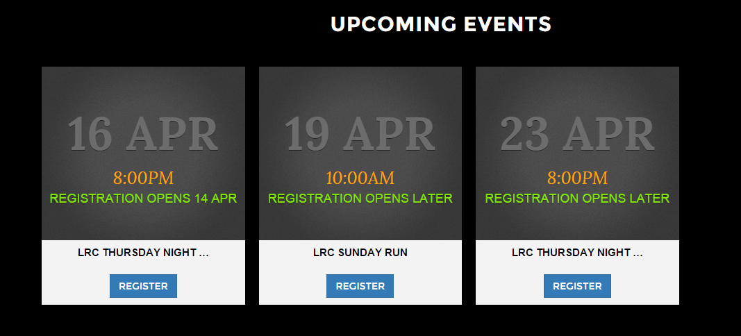
And here is the code
<div class="col-sm-3 col-xs-12 event">
<div class="row hidden-xs icon">
<div class="title">16 Apr</div>
<div class="event-time"><i>8:00PM</i></div>
<div class="sub-title">Registration Opens 14 Apr</div>
</div>
<div class="row hidden-xs sub-icon">
<div><span>LRC Thursday Night Run test long long</span></div>
<div>
<input type="button" class="btn btn-primary" value="Register" />
</div>
</div>
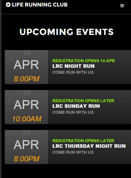
<div class="row visible-xs-inline-block hidden-lg hidden-md hidden-sm event-sm">
<div class="col-xs-4 event-left">
<div class="event-day">16</div>
<div class="event-month">apr</div>
<div class="event-time"><i>8:00PM</i></div>
</div>
<div class="col-xs-8 event-right">
<div class="event-notice">Registration Opens 14 Apr</div>
<div class="event-title">LRC Night Run</div>
<div class="event-slogan">Come run with us</div>
</div>
</div>
</div>
One of them is a special event.
So here is what I want:
I want this special event being surrounded by the "Super Saiyan" effect!
So it will look like this one:
 (sorry the Saiyan isn't drawn beautifully, but the effect is well addressed)
So there will be many lightning strikes and flames around this event card, and they are flowing!
Sorry, I cannot come up with any css code for this one as I am not even sure that whether it can be done by css or not.
Is it possible?
Update
If this is impossible, how about the static lightning and flames(KI)? And it has to be responsive.
Update 2
Also, this page is responsive, and it would be terrible if the flame and lightning were mis-placed when the page got resized. So here is how it looks like on a smaller screen
Update 3
Here is my css code for event card:
.event {
    margin:10px;
    text-transform: uppercase;
}

.icon {
    background: #545454 url(../Content/img/event-icon.png) no-repeat center center;
    background-size:cover;
    min-height: 250px;
    height: 250px;
    width: auto;
    min-width: 250px;
    display: flex;
    -ms-flex-direction: column;
    flex-direction: column;
    align-items: center;
    justify-content: center;
}

.title{
  font-weight: 700;
  color:#6c6c6c;
  font-size: 67px;
  text-shadow: 0 1px 0 rgba(0,0,0,.5);

}

.sub-title{
  overflow: hidden;
  font-size: 18px;
  text-shadow: 0 1px 0 rgba(0,0,0,.4);
  color:#87e300;
  text-transform: uppercase;
  font-style: normal;
  font-weight: normal;
  font-family: 'TradeGothicW01-BoldCn20 675334', Helvetica, Arial, sans-serif;
  -webkit-font-smoothing: antialiased;
  -o-font-smoothing: antialiased;
  -ms-font-smoothing: antialiased;
  font-smoothing: antialiased;
}

.event-time{
  color:orange;
  font-size:25px;
}


.sub-icon {
    display: flex;
    -ms-flex-direction: column;
    flex-direction: column;
    justify-content: center;
    align-items: center;
    align-content: space-around;
    background: #f3f3f3;
    font-size: 15px;
    font-weight: bold;
    font-style: normal;
    line-height: 1.1;
    text-transform: uppercase;
    font-family: 'TradeGothicW01-BoldCn20 675334', Helvetica, Arial, sans-serif;
}

    .sub-icon span {
        display: inline-block;
        -ms-text-overflow: ellipsis;
        -o-text-overflow: ellipsis;
        text-overflow: ellipsis;
        overflow: hidden;
        width: 200px;
        white-space: nowrap;
        color:black;
    }

.sub-icon div{
  margin-top : 10px;
  margin-bottom:10px;
}


.event-day{
  font-size:24px;
  line-height:0.85;
  font-style:normal;
  font-weight:normal;
  color: #6c6c6c;
}
.event-month{
  color: #cccbcb;
  font-size: 42px;
}


.event-time{
  color:orange;
  font-size:25px;
}


.event-notice {
    color: #87e300;
    font-size: 14px;
    font-weight:600;
    -ms-text-overflow: ellipsis;
    -o-text-overflow: ellipsis;
    text-overflow: ellipsis;
    overflow: hidden;
    white-space: nowrap;
    line-height: .95;
    font-family: 'TradeGothicW01-BoldCn20 675334', Helvetica, Arial, sans-serif;
}

.event-title{
  font-size:16px;
  font-weight:800;
  color:white;
  font-family: 'TradeGothicW01-BoldCn20 675334', Helvetica, Arial, sans-serif;
}

.event-slogan{
  font-size:14px;
  font-weight:600;
  color: #999;
}

@media (max-width: 767px) {
    .event-sm {
        display: flex !important;
    }
}
 915
915
CODEPEN
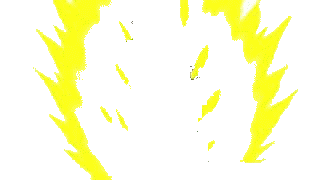
I am a bit unsure if you wanted the yellow KI glow or the lighting so i went for the lighting effect.
I reused a simple <svg> shape with the <use> element.
The lighting shape is taken from Gohan.
The top left lighting. 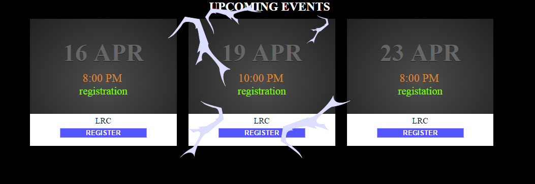
body {
  margin: 0;
}
.main {
  background-color: black;
  width: 100vw;
  height: 100vh;
}
.calander {} .calander h2 {
  margin: 0;
  color: white;
  text-align: center;
}
.calander .event-grid {
  margin: 0 5%;
}
.event-grid .event {
  position: relative;
  display: inline-block;
  width: 30%;
  height: 250px;
  margin: 1%;
  text-align: center;
  background: -moz-radial-gradient(center, ellipse cover, #4c4c4c 0%, #212121 100%);
  /* FF3.6+ */
  background: -webkit-gradient(radial, center center, 0px, center center, 100%, color-stop(0%, #4c4c4c), color-stop(100%, #212121));
  /* Chrome,Safari4+ */
  background: -webkit-radial-gradient(center, ellipse cover, #4c4c4c 0%, #212121 100%);
  /* Chrome10+,Safari5.1+ */
  background: -o-radial-gradient(center, ellipse cover, #4c4c4c 0%, #212121 100%);
  /* Opera 12+ */
  background: -ms-radial-gradient(center, ellipse cover, #4c4c4c 0%, #212121 100%);
  /* IE10+ */
  background: radial-gradient(ellipse at center, #4c4c4c 0%, #212121 100%);
}
.event .date {
  color: #666;
  font-size: 3em;
  margin-bottom: 10px;
  text-shadow: 0px 1px #222;
}
.event .time {
  font-size: 1.4em;
  color: #dd8834;
}
.event .note {
  font-size: 1.3em;
  color: LawnGreen;
}
.event .bottom-reg {
  position: absolute;
  bottom: 0;
  height: 25%;
  width: 100%;
  background-color: white;
}
.event .bottom-reg p {
  margin: 5px 0;
}
.event .bottom-reg input {
  text-align: center;
  color: white;
  background-color: #55f;
  border: 1px solid #99f;
}
::-webkit-input-placeholder {
  /* WebKit browsers */
  color: white;
  font-weight: bold;
}
:-moz-placeholder {
  /* Mozilla Firefox 4 to 18 */
  color: white;
  font-weight: bold;
}
::-moz-placeholder {
  /* Mozilla Firefox 19+ */
  color: white;
  font-weight: bold;
}
:-ms-input-placeholder {
  /* Internet Explorer 10+ */
  color: white;
  font-weight: bold;
}
.test {
  display: none;
}
.spesial {
  z-index: 5;
  position: absolute;
  top: -25%;
  left: -25%;
  width: 150%;
  height: 150%;
}
<div class="main">
<section class="calander">
<h2>UPCOMING EVENTS</h2>
<div class="event-grid">
<div class="event">
<h1 class="date">16 APR</h1>
<span class="time">8:00 PM</span>
<br>
<span class="note">registration</span>
<div class="bottom-reg">
<p>LRC</p>
<input placeholder="REGISTER"></input>
</div>
</div>
<div class="event">
<h1 class="date">19 APR</h1>
<span class="time">10:00 PM</span>
<br>
<span class="note">registration</span>
<div class="bottom-reg">
<p>LRC</p>
<input placeholder="REGISTER"></input>
</div>
<div class="spesial">
<svg width="100%" height="100%" viewBox="0 0 200 200">
<use x="40" y="100" transform="scale(0.5) rotate(20)" xlink:href="#light" />
<use x="150" y="-790" transform="scale(0.2) rotate(90)" xlink:href="#light" />
<use x="0" y="200" transform="scale(0.35) rotate(-45)" xlink:href="#light" />
<use x="-240" y="390" transform="scale(0.5) rotate(-70)" xlink:href="#light" />
<use x="300" y="-90" transform="scale(0.4) rotate(90)" xlink:href="#light" />
</svg>
</div>
</div>
<div class="event">
<h1 class="date">23 APR</h1>
<span class="time">8:00 PM</span>
<br>
<span class="note">registation</span>
<div class="bottom-reg">
<p>LRC</p>
<input placeholder="REGISTER" />
</div>
</div>
</div>
</section>
<svg class="test" width="100px" height="100px" viewBox="0 0 200 200" xmlns="http://www.w3.org/2000/svg" xmlns:xlink="http://www.w3.org/1999/xlink">
<defs>
<path fill="#ddf" stroke="#ddf" id="light" d="m 0,0 c 6.24111,-8.9445 10.61204,-23.77912 17.97353,-53.80856 l 29.7995,-5.55584 35.35534,41.92133 c -1.95372,12.45653 45.89675,34.80534 61.61931,34.34518 -17.63651,5.49982 -9.56977,24.91725 2.52538,36.87057 C 139.10793,46.26094 131.45087,39.06432 122.46831,22.22336 118.45247,16.48431 87.40919,-0.96167 83.63345,0.73967 c -9.2424,4.06941 -3.52888,14.963 -1.51523,18.60117 -4.31715,4.656 -7.89706,8.06774 -8.43836,13.6677 0.0873,-12.34933 1.5179,-42.45863 -5.49456,-26.14667 L 65.95578,-14.91769 C 61.11992,-21.99984 48.27857,-50.5446 47.89033,-37.93673 46.10689,-46.50735 39.22534,-49.00909 35.6512,-48.25273 17.657,-46.88454 17.9011,-38.9303 16.45831,-31.58521 7.76504,-6.22367 6.56293,-8.29891 0,0 Z"
/>
</defs>
</svg>
</div>This might not be the best way, but a quick way could be to download an animated gif of super saiyan, make it transparent, edit the character out, then use css to overlay the image on your event.
With better photo editing software this could probably look a lot better, but this only took me about 5 minutes.
Here's the code: http://codepen.io/anon/pen/gpLMGr
<div class="event">
    <img id="saiyan" src="http://i.stack.imgur.com/CFoa1.gif" />
    <h1 class="date">19 APR</h1>
    <span class="time">10:00 PM</span>
    <br>
    <span class="note">registration</span>
    <div class="bottom-reg">
      <p>LRC</p>
      <input placeholder="REGISTER"></input>
    </div>
  </div>

<style>
    #saiyan {
      position: absolute;
      z-index: 1;
      width: 160%;
      height: 100%;
      left: -30%;
      top: 0;
    }
</style>
I just absolutely position the image over the rest of the event object, and have its width and height dependent on the event div.
14
If you love us? You can donate to us via Paypal or buy me a coffee so we can maintain and grow! Thank you!
Donate Us With