 Menu
Menu
I'm creating a chat application and would like to create the typical speech bubble that contains each message. I created a Path object in Blend (in XAML) like this:
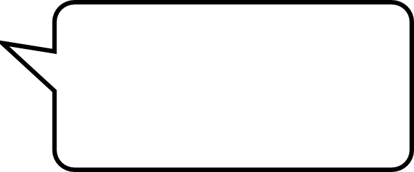
The problem is that the path is has designed to have a specified width and height and I would like it to wrap around the text without stretching, so it won't look deformed, like a border does.
How can I make it behave like I want?
 209
209
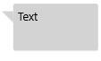
You may use Polygon in combination with StackPanel:
<StackPanel Orientation="Horizontal"
            HorizontalAlignment="Left"
            Padding="6"
            >
    <Polygon Points="0,0 15,0 15,15"
             Fill="LightGray"
             Margin="0,10,0,0"
             />

    <Border Background="LightGray"
            CornerRadius="3"
            Padding="6"
            VerticalAlignment="Top"
            >
        <TextBlock Text="Text"
                   TextWrapping="WrapWholeWords"
                   Width="100"
                   Height="50"
                   />
    </Border>
</StackPanel>
which looks like this:
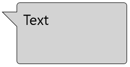
EDIT:
Version with border:
<Grid HorizontalAlignment="Left"
      Padding="6"
      >
    <Polygon Points="0,0 15,0 15,15"
             Fill="LightGray"
             Stroke="Black"
             Margin="0,10,0,0"
             />

    <Border Background="LightGray"
            BorderBrush="Black"
            BorderThickness="0.5"
            CornerRadius="3"
            Padding="6"
            Margin="14,0,0,0"
            VerticalAlignment="Top"
            >
        <TextBlock Text="Text"
                   TextWrapping="WrapWholeWords"
                   Width="100"
                   Height="50"
                   />
    </Border>

    <Polygon Points="0,0 15,0 15,15"
             Fill="LightGray"
             Margin="0,10,0,0"
             />
</Grid>
This is probably not the easiest and the best way how to do this, maybe Path will be better to do this, but it works:
125
Here is a Custom control that declares a Dependency Property for the Text and reuse some properties of the base control in its template (Background, Width, Heigth).
First the class definition: (SpeechBubbleControl.xaml.cs)
[TemplatePart(Name = PartBubbleText, Type = typeof(TextBlock))]
public sealed partial class SpeechBubbleControl : Control
{
    private const string PartBubbleText = "BubbleText";
    public static readonly DependencyProperty TextProperty = DependencyProperty.Register(nameof(Text), typeof(string), typeof(SpeechBubbleControl), new PropertyMetadata(""));

    public SpeechBubbleControl()
    {
        DefaultStyleKey = typeof(SpeechBubbleControl);
    }

    public string Text
    {
        get { return GetValue(TextProperty).ToString(); }
        set { SetValue(TextProperty, value); }
    }
}
With its default template (SpeechBubbleControl.xaml):
<ResourceDictionary xmlns="http://schemas.microsoft.com/winfx/2006/xaml/presentation"
                    xmlns:x="http://schemas.microsoft.com/winfx/2006/xaml"
                    xmlns:local="using:App6"
                    >

    <Style TargetType="local:SpeechBubbleControl">
        <Setter Property="Template">
            <Setter.Value>
                <ControlTemplate TargetType="local:SpeechBubbleControl">
                    <Grid Background="{TemplateBinding Background}" Width="{TemplateBinding Width}" Height="{TemplateBinding Height}">
                        <Grid.RowDefinitions>
                            <RowDefinition Height="*"/>
                        </Grid.RowDefinitions>
                        <Rectangle Fill="{TemplateBinding Background}" Stroke="#FF000000" RadiusX="10" RadiusY="10"/>
                        <Path Fill="{TemplateBinding Background}" Stretch="Fill" Stroke="#FF000000" HorizontalAlignment="Left" Margin="-15,-5,0,20" Width="30" Height="40" Data="M0,0 L15,40 30,20 0,0" RenderTransformOrigin="0.5,0.5" UseLayoutRounding="False">
                            <Path.RenderTransform>
                                <CompositeTransform Rotation="-20"/>
                            </Path.RenderTransform>
                        </Path>
                        <Rectangle Fill="{TemplateBinding Background}" RadiusX="10" RadiusY="10" Margin="1"/>
                        <TextBlock Name="BubbleText" HorizontalAlignment="Center" VerticalAlignment="Center"
                                   Text="{TemplateBinding Text}" FontSize="20" TextWrapping="Wrap"/>
                    </Grid>
                </ControlTemplate>
            </Setter.Value>
        </Setter>
    </Style>
</ResourceDictionary>
You have to import this resource into your application resource using something like this in your app.xaml:
<Application
    x:Class="App6.App"
    xmlns="http://schemas.microsoft.com/winfx/2006/xaml/presentation"
    xmlns:x="http://schemas.microsoft.com/winfx/2006/xaml"
    xmlns:local="using:App6"
    RequestedTheme="Light">
    <Application.Resources>
        <ResourceDictionary>
            <ResourceDictionary.MergedDictionaries>
                <ResourceDictionary Source="SpeechBubbleControl.xaml" />
            </ResourceDictionary.MergedDictionaries>
        </ResourceDictionary>
    </Application.Resources>
</Application>
And finally a sample test page, which use this control with bindings on width, height (based on the sliders) and the text that must be displayed.
<Grid Background="{ThemeResource ApplicationPageBackgroundThemeBrush}">
        <Grid.ColumnDefinitions>
            <ColumnDefinition />
            <ColumnDefinition />
        </Grid.ColumnDefinitions>
        <Grid.RowDefinitions>
            <RowDefinition Height="40"/>
            <RowDefinition Height="40"/>
            <RowDefinition />
        </Grid.RowDefinitions>
        <TextBox x:Name="testText" Grid.ColumnSpan="2"  PlaceholderText="My text..." />
        <Slider x:Name="width" Grid.Row="1" Minimum="50" Maximum="500" Value="200" />
        <Slider x:Name="height" Grid.Row="1"  Grid.Column="2" Minimum="50" Maximum="500" Value="100" />

        <local:SpeechBubbleControl Grid.Row="2" Grid.ColumnSpan="2"
                                   Width="{Binding Value, ElementName=width}"
                                   Height="{Binding Value, ElementName=height}"
                                   Text="{Binding Text, ElementName=testText, FallbackValue=Hello}"
                                   Background="Beige" >
        </local:SpeechBubbleControl>
    </Grid>

    <local:SpeechBubbleControl Grid.Row="2" Grid.ColumnSpan="2"
        Width="{Binding Value, ElementName=width}" Height="{Binding Value, ElementName=height}"
                               Text="{Binding Text, ElementName=testText, FallbackValue=Hello}"
                               Background="Beige" >

    </local:SpeechBubbleControl>
</Grid>
Here is the result:
Note that my answer is adapted from this one: WPF speech bubble
22
If you love us? You can donate to us via Paypal or buy me a coffee so we can maintain and grow! Thank you!
Donate Us With


