 Menu
Menu
I want to use the FloatingActionButton, along with its behaviour when anchored on a BottomAppBar, on top of a BottomNavigationView.
I came up with a rather "hacky" trick to just place the BottomNavigationView on top of the BottomAppBar without providing a background thus making it transparent.
This seemed to work well at first sight but I found out that the fab button can only be clicked when touching the upper half of the button (So where there is no transparent BottomNavigationView on top).
<androidx.constraintlayout.widget.ConstraintLayout xmlns:android="http://schemas.android.com/apk/res/android" xmlns:app="http://schemas.android.com/apk/res-auto" android:layout_width="match_parent" android:layout_height="match_parent"> <androidx.coordinatorlayout.widget.CoordinatorLayout android:layout_width="match_parent" android:layout_height="120dp" android:layout_gravity="bottom" app:layout_constraintBottom_toBottomOf="parent"> <com.google.android.material.floatingactionbutton.FloatingActionButton android:id="@+id/fab" android:layout_width="wrap_content" android:layout_height="wrap_content" android:clickable="true" android:focusable="true" app:layout_anchor="@id/bar" /> <com.google.android.material.bottomappbar.BottomAppBar android:id="@+id/bar" android:layout_width="match_parent" android:layout_height="58dp" android:layout_gravity="bottom" android:backgroundTint="@color/colorPrimaryDark" /> <com.google.android.material.bottomnavigation.BottomNavigationView android:id="@+id/bottomNavigation" android:layout_width="match_parent" android:layout_height="wrap_content" android:layout_gravity="bottom" app:itemIconTint="@android:color/darker_gray" app:itemTextColor="@android:color/white" app:labelVisibilityMode="labeled" app:menu="@menu/navigation" /> </androidx.coordinatorlayout.widget.CoordinatorLayout> </androidx.constraintlayout.widget.ConstraintLayout> Is there any way of implementing this idea in which I can fully click on the FloatingActionButton?
 234
234
First Way
Try this You can Create a CustomBottomNavigationView
Here is the good article for CustomBottomNavigationView
How I draw custom shapes in BottomNavigationView
SAMPLE CODE
import android.content.Context; import android.graphics.*; import android.support.design.widget.BottomNavigationView; import android.support.v4.content.ContextCompat; import android.util.AttributeSet; public class CustomBottomNavigationView extends BottomNavigationView { private Path mPath; private Paint mPaint; /** the CURVE_CIRCLE_RADIUS represent the radius of the fab button */ private final int CURVE_CIRCLE_RADIUS = 128 / 2; // the coordinates of the first curve private Point mFirstCurveStartPoint = new Point(); private Point mFirstCurveEndPoint = new Point(); private Point mFirstCurveControlPoint1 = new Point(); private Point mFirstCurveControlPoint2 = new Point(); //the coordinates of the second curve @SuppressWarnings("FieldCanBeLocal") private Point mSecondCurveStartPoint = new Point(); private Point mSecondCurveEndPoint = new Point(); private Point mSecondCurveControlPoint1 = new Point(); private Point mSecondCurveControlPoint2 = new Point(); private int mNavigationBarWidth; private int mNavigationBarHeight; public CustomBottomNavigationView(Context context) { super(context); init(); } public CustomBottomNavigationView(Context context, AttributeSet attrs) { super(context, attrs); init(); } public CustomBottomNavigationView(Context context, AttributeSet attrs, int defStyleAttr) { super(context, attrs, defStyleAttr); init(); } private void init() { mPath = new Path(); mPaint = new Paint(); mPaint.setStyle(Paint.Style.FILL_AND_STROKE); mPaint.setColor(ContextCompat.getColor(getContext(),R.color.colorAccent)); setBackgroundColor(Color.TRANSPARENT); } @Override protected void onLayout(boolean changed, int left, int top, int right, int bottom) { super.onLayout(changed, left, top, right, bottom); } @Override protected void onSizeChanged(int w, int h, int oldw, int oldh) { super.onSizeChanged(w, h, oldw, oldh); // get width and height of navigation bar // Navigation bar bounds (width & height) mNavigationBarWidth = getWidth(); mNavigationBarHeight = getHeight(); // the coordinates (x,y) of the start point before curve mFirstCurveStartPoint.set((mNavigationBarWidth / 2) - (CURVE_CIRCLE_RADIUS * 2) - (CURVE_CIRCLE_RADIUS / 3), 0); // the coordinates (x,y) of the end point after curve mFirstCurveEndPoint.set(mNavigationBarWidth / 2, CURVE_CIRCLE_RADIUS + (CURVE_CIRCLE_RADIUS / 4)); // same thing for the second curve mSecondCurveStartPoint = mFirstCurveEndPoint; mSecondCurveEndPoint.set((mNavigationBarWidth / 2) + (CURVE_CIRCLE_RADIUS * 2) + (CURVE_CIRCLE_RADIUS / 3), 0); // the coordinates (x,y) of the 1st control point on a cubic curve mFirstCurveControlPoint1.set(mFirstCurveStartPoint.x + CURVE_CIRCLE_RADIUS + (CURVE_CIRCLE_RADIUS / 4), mFirstCurveStartPoint.y); // the coordinates (x,y) of the 2nd control point on a cubic curve mFirstCurveControlPoint2.set(mFirstCurveEndPoint.x - (CURVE_CIRCLE_RADIUS * 2) + CURVE_CIRCLE_RADIUS, mFirstCurveEndPoint.y); mSecondCurveControlPoint1.set(mSecondCurveStartPoint.x + (CURVE_CIRCLE_RADIUS * 2) - CURVE_CIRCLE_RADIUS, mSecondCurveStartPoint.y); mSecondCurveControlPoint2.set(mSecondCurveEndPoint.x - (CURVE_CIRCLE_RADIUS + (CURVE_CIRCLE_RADIUS / 4)), mSecondCurveEndPoint.y); mPath.reset(); mPath.moveTo(0, 0); mPath.lineTo(mFirstCurveStartPoint.x, mFirstCurveStartPoint.y); mPath.cubicTo(mFirstCurveControlPoint1.x, mFirstCurveControlPoint1.y, mFirstCurveControlPoint2.x, mFirstCurveControlPoint2.y, mFirstCurveEndPoint.x, mFirstCurveEndPoint.y); mPath.cubicTo(mSecondCurveControlPoint1.x, mSecondCurveControlPoint1.y, mSecondCurveControlPoint2.x, mSecondCurveControlPoint2.y, mSecondCurveEndPoint.x, mSecondCurveEndPoint.y); mPath.lineTo(mNavigationBarWidth, 0); mPath.lineTo(mNavigationBarWidth, mNavigationBarHeight); mPath.lineTo(0, mNavigationBarHeight); mPath.close(); } @Override protected void onDraw(Canvas canvas) { super.onDraw(canvas); canvas.drawPath(mPath, mPaint); } } Now use like this
<?xml version="1.0" encoding="utf-8"?> <RelativeLayout xmlns:android="http://schemas.android.com/apk/res/android" xmlns:app="http://schemas.android.com/apk/res-auto" android:id="@+id/coordinatorlayout" android:layout_width="match_parent" android:layout_height="match_parent" android:orientation="vertical"> <android.support.design.widget.FloatingActionButton android:id="@+id/fab" android:layout_width="wrap_content" android:layout_height="wrap_content" android:layout_alignParentBottom="true" android:layout_centerInParent="true" android:layout_marginBottom="30dp" android:clickable="true" android:focusable="true" /> <neel.com.demo.CustomBottomNavigationView android:id="@+id/customBottomBar" android:layout_width="match_parent" android:layout_height="wrap_content" android:layout_alignParentBottom="true" android:background="@color/colorAccent" app:labelVisibilityMode="labeled" /> </RelativeLayout> Activity
import android.support.v7.app.AppCompatActivity; import android.os.Bundle; public class MainActivity extends AppCompatActivity { @Override protected void onCreate(Bundle savedInstanceState) { super.onCreate(savedInstanceState); setContentView(R.layout.activity_main); CustomBottomNavigationView curvedBottomNavigationView = findViewById(R.id.customBottomBar); curvedBottomNavigationView.inflateMenu(R.menu.bottom_menu); } } OUTPUT
Second Way
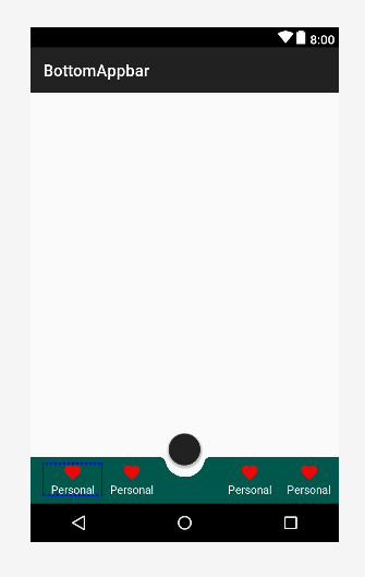
<androidx.coordinatorlayout.widget.CoordinatorLayout xmlns:android="http://schemas.android.com/apk/res/android" xmlns:app="http://schemas.android.com/apk/res-auto" android:layout_width="match_parent" android:layout_height="120dp" android:layout_gravity="bottom"> <com.google.android.material.floatingactionbutton.FloatingActionButton android:id="@+id/fab" android:layout_width="wrap_content" android:layout_height="wrap_content" android:clickable="true" android:focusable="true" app:layout_anchor="@id/bar" /> <com.google.android.material.bottomappbar.BottomAppBar android:id="@+id/bar" android:layout_width="match_parent" android:layout_height="58dp" android:layout_gravity="bottom" android:backgroundTint="@color/colorPrimaryDark"> <LinearLayout android:layout_width="match_parent" android:layout_height="wrap_content" android:orientation="horizontal"> <TextView style="?android:attr/borderlessButtonStyle" android:layout_width="0dp" android:layout_height="wrap_content" android:layout_weight="1" android:background="?android:attr/selectableItemBackground" android:drawableTop="@drawable/ic_favorite" android:gravity="center" android:orientation="vertical" android:text="Personal" android:textColor="#FFFFFF"> </TextView> <TextView style="?android:attr/borderlessButtonStyle" android:layout_width="0dp" android:layout_height="wrap_content" android:layout_weight="1" android:background="?android:attr/selectableItemBackground" android:drawableTop="@drawable/ic_favorite" android:gravity="center" android:orientation="vertical" android:text="Personal" android:textColor="#FFFFFF"> </TextView> <TextView style="?android:attr/borderlessButtonStyle" android:layout_width="0dp" android:layout_height="wrap_content" android:layout_weight="1" android:background="?android:attr/selectableItemBackground" android:drawableTop="@drawable/ic_favorite" android:gravity="center" android:orientation="vertical" android:textColor="#FFFFFF" android:visibility="invisible"> </TextView> <TextView style="?android:attr/borderlessButtonStyle" android:layout_width="0dp" android:layout_height="wrap_content" android:layout_weight="1" android:background="?android:attr/selectableItemBackground" android:drawableTop="@drawable/ic_favorite" android:gravity="center" android:orientation="vertical" android:text="Personal" android:textColor="#FFFFFF"> </TextView> <TextView style="?android:attr/borderlessButtonStyle" android:layout_width="0dp" android:layout_height="wrap_content" android:layout_weight="1" android:background="?android:attr/selectableItemBackground" android:drawableTop="@drawable/ic_favorite" android:gravity="center" android:orientation="vertical" android:text="Personal" android:textColor="#FFFFFF"> </TextView> </LinearLayout> </com.google.android.material.bottomappbar.BottomAppBar> </androidx.coordinatorlayout.widget.CoordinatorLayout> OUTPUT
113
There is an easier way to combine those 3 widgets. We could have something like:
<androidx.coordinatorlayout.widget.CoordinatorLayout xmlns:android="http://schemas.android.com/apk/res/android" xmlns:app="http://schemas.android.com/apk/res-auto" android:id="@+id/coordinator" android:layout_width="match_parent" android:layout_height="match_parent"> <androidx.fragment.app.FragmentContainerView android:layout_width="match_parent" android:layout_height="match_parent" android:layout_marginBottom="?attr/actionBarSize" /> <com.google.android.material.bottomappbar.BottomAppBar android:id="@+id/bottomBar" android:layout_width="match_parent" android:layout_height="wrap_content" android:layout_gravity="bottom" app:backgroundTint="?attr/colorPrimary" app:contentInsetEnd="0dp" app:contentInsetStart="0dp" app:fabAlignmentMode="end"> <com.google.android.material.bottomnavigation.BottomNavigationView android:id="@+id/bottomNavigation" android:layout_width="match_parent" android:layout_height="match_parent" app:backgroundTint="@android:color/transparent" app:elevation="0dp" android:layout_marginEnd="100dp" app:itemIconTint="@android:color/white" app:itemRippleColor="@android:color/white" app:itemTextColor="@android:color/white" app:menu="@menu/menu_activity_home_bottom_navigation" /> </com.google.android.material.bottomappbar.BottomAppBar> <com.google.android.material.floatingactionbutton.FloatingActionButton android:id="@+id/fab" android:src="@drawable/ic_add_white_24dp" android:layout_width="wrap_content" android:layout_height="wrap_content" app:layout_anchor="@id/bottomBar" /> </androidx.coordinatorlayout.widget.CoordinatorLayout> And that's it.
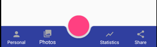
Depending on where the FAB is anchored (CENTER|END) the menu icons will be placed either to the left or in the middle:
For this sample, the result would be something like: 
If you think there's a better way, please feel free to edit/comment so I can fix the post :)
34
If you love us? You can donate to us via Paypal or buy me a coffee so we can maintain and grow! Thank you!
Donate Us With