 Menu
Menu
Set TextInputLayout android:clickable="true" . Set TextInputEditText android:clickable="true" and android:focusable="false" .
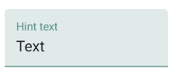
You can just set the start and end padding on the inner EditText to 0dp. Here's a screenshot with Show Layout Bounds turned on so you can see that the hints go all the way to the edge of the view.
Try The Below Code It Works In Normal State
 <android.support.design.widget.TextInputLayout
     android:layout_width="match_parent"
     android:layout_height="wrap_content"
     android:theme="@style/TextLabel">

     <android.support.v7.widget.AppCompatEditText
         android:layout_width="match_parent"
         android:layout_height="wrap_content"
         android:hint="Hiiiii"
         android:id="@+id/edit_id"/>

 </android.support.design.widget.TextInputLayout>
In Styles Folder TextLabel Code
 <style name="TextLabel" parent="TextAppearance.AppCompat">
    <!-- Hint color and label color in FALSE state -->
    <item name="android:textColorHint">@color/Color Name</item>
    <item name="android:textSize">20sp</item>
    <!-- Label color in TRUE state and bar color FALSE and TRUE State -->
    <item name="colorAccent">@color/Color Name</item>
    <item name="colorControlNormal">@color/Color Name</item>
    <item name="colorControlActivated">@color/Color Name</item>
 </style>
Set To Main Theme of App,It Works Only Highlight State Only
<item name="colorAccent">@color/Color Name</item>
Update:
UnsupportedOperationException: Can't convert to color: type=0x2 in api 16 or below
Solution
Update:
Are you using Material Components Library
You can add below lines to your main theme
 <item name="colorPrimary">@color/your_color</item> // Activated State
 <item name="colorOnSurface">@color/your_color</item> // Normal State
or else do you want different colors in noraml state and activated state and with customization follow below code
<style name="Widget.App.TextInputLayout" parent="Widget.MaterialComponents.TextInputLayout.OutlinedBox">
    <item name="materialThemeOverlay">@style/ThemeOverlay.App.TextInputLayout</item>
    <item name="shapeAppearance">@style/ShapeAppearance.App.SmallComponent</item> //Changes the Shape Apperance
    <!--<item name="hintTextColor">?attr/colorOnSurface</item>-->   //When you added this line it will applies only one color in normal and activate state i.e colorOnSurface color
</style>

<style name="ThemeOverlay.App.TextInputLayout" parent="">
    <item name="colorPrimary">@color/colorPrimaryDark</item>  //Activated color
    <item name="colorOnSurface">@color/colorPrimary</item>    //Normal color
    <item name="colorError">@color/colorPrimary</item>        //Error color

    //Text Appearance styles
    <item name="textAppearanceSubtitle1">@style/TextAppearance.App.Subtitle1</item>
    <item name="textAppearanceCaption">@style/TextAppearance.App.Caption</item>

    <!--Note: When setting a materialThemeOverlay on a custom TextInputLayout style, don’t forget to set editTextStyle to either a @style/Widget.MaterialComponents.TextInputEditText.* style or to a custom one that inherits from that.
    The TextInputLayout styles set materialThemeOverlay that overrides editTextStyle with the specific TextInputEditText style needed. Therefore, you don’t need to specify a style tag on the edit text.-->
    <item name="editTextStyle">@style/Widget.MaterialComponents.TextInputEditText.OutlinedBox</item>
</style>

<style name="TextAppearance.App.Subtitle1" parent="TextAppearance.MaterialComponents.Subtitle1">
    <item name="fontFamily">@font/your_font</item>
    <item name="android:fontFamily">@font/your_font</item>
</style>

<style name="TextAppearance.App.Caption" parent="TextAppearance.MaterialComponents.Caption">
    <item name="fontFamily">@font/your_font</item>
    <item name="android:fontFamily">@font/your_font</item>
</style>

<style name="ShapeAppearance.App.SmallComponent" parent="ShapeAppearance.MaterialComponents.SmallComponent">
    <item name="cornerFamily">cut</item>
    <item name="cornerSize">4dp</item>
</style>
Add the below line to your main theme or else you can set style to textinputlayout in your xml
<item name="textInputStyle">@style/Widget.App.TextInputLayout</item>
<style name="TextAppearance.App.TextInputLayout" parent="@android:style/TextAppearance">
    <item name="android:textColor">@color/red</item>
    <item name="android:textSize">14sp</item>
</style>

<android.support.design.widget.TextInputLayout
    android:layout_width="match_parent"
    android:layout_height="wrap_content"
    android:textColorHint="@color/gray"  //support 23.0.0
    app:hintTextAppearance="@style/TextAppearence.App.TextInputLayout" >

    <android.support.v7.widget.AppCompatEditText
        android:layout_width="match_parent"
        android:layout_height="wrap_content"
        android:hint="@string/hint" />
</android.support.design.widget.TextInputLayout>
Found the answer, use android.support.design:hintTextAppearance attribute to set your own floating label appearance.
Example:
<android.support.design.widget.TextInputLayout
    android:layout_width="match_parent"
    android:layout_height="wrap_content"
    xmlns:app="http://schemas.android.com/apk/res-auto"
    app:hintTextAppearance="@style/TextAppearance.AppCompat">

    <EditText
        android:id="@+id/password"
        android:layout_width="match_parent"
        android:layout_height="wrap_content"
        android:hint="@string/prompt_password"/>
</android.support.design.widget.TextInputLayout>
how do I change the floating label text color?
With the Material Components library you can customize the TextInputLayout the hint text color using (it requires the version 1.1.0)
In the layout:
app:hintTextColor attribute : the color of the label when it is collapsed and the text field is active
android:textColorHint attribute: the color of the label in all other text field states (such as resting and disabled)
<com.google.android.material.textfield.TextInputLayout
     app:hintTextColor="@color/mycolor"
     android:textColorHint="@color/text_input_hint_selector"
     .../>
Widget.MaterialComponents.TextInputLayout.*:<style name="MyFilledBox" parent="Widget.MaterialComponents.TextInputLayout.FilledBox">
<item name="hintTextColor">@color/mycolor</item>
<item name="android:textColorHint">@color/text_input_hint_selector</item>
</style>

The default selector for android:textColorHint is:
<selector xmlns:android="http://schemas.android.com/apk/res/android">
  <item android:alpha="0.38" android:color="?attr/colorOnSurface" android:state_enabled="false"/>
  <item android:alpha="0.6" android:color="?attr/colorOnSurface"/>
</selector>
You don't need to use android:theme="@style/TextInputLayoutTheme" to change the floating label color, since it's going to affect to the entire theme for the small TextView used as label. Instead, you could use app:hintTextAppearance="@style/TextInputLayout.HintText" where:
<style name="TextInputLayout.HintText">
  <item name="android:textColor">?attr/colorPrimary</item>
  <item name="android:textSize">@dimen/text_tiny_size</item>
  ...
</style>
Let me know if the solution works :-)
Ok, so, I found this answer very helpful and thanks to all the people who contributed. Just to add something, though. The accepted answer is indeed the correct answer...BUT...in my case, I was looking to implement the error message below the EditText widget with app:errorEnabled="true" and this single line made my life difficult. it seems that this overrides the theme I chose for android.support.design.widget.TextInputLayout, which has a different text color defined by android:textColorPrimary.
In the end I took to applying a text color directly to the EditText widget. My code looks something like this:
styles.xml
<item name="colorPrimary">@color/my_yellow</item>
<item name="colorPrimaryDark">@color/my_yellow_dark</item>
<item name="colorAccent">@color/my_yellow_dark</item>
<item name="android:textColorPrimary">@android:color/white</item>
<item name="android:textColorSecondary">@color/dark_gray</item>
<item name="android:windowBackground">@color/light_gray</item>
<item name="windowNoTitle">true</item>
<item name="windowActionBar">false</item>
<item name="android:textColorHint">@color/dark_gray</item>
<item name="android:colorControlNormal">@android:color/black</item>
<item name="android:colorControlActivated">@android:color/white</item>
And my widget:
<android.support.design.widget.TextInputLayout
        android:id="@+id/log_in_layout_name"
        android:layout_width="match_parent"
        android:layout_height="wrap_content"
        app:errorEnabled="true">

        <EditText
            android:id="@+id/log_in_name"
            android:layout_width="match_parent"
            android:layout_height="wrap_content"
            android:layout_gravity="center_horizontal"
            android:textColor="@android:color/black"
            android:ems="10"
            android:hint="@string/log_in_name"
            android:inputType="textPersonName" />
</android.support.design.widget.TextInputLayout>
Now it displays black text color instead of the textColorPrimary white.
If you love us? You can donate to us via Paypal or buy me a coffee so we can maintain and grow! Thank you!
Donate Us With