 Menu
Menu
I cannot find an answer about this anywhere on the internet.
I have an application that has to have collapsable panels, so the TitledPane and Accordion set-up in Java FX is a natural candidate.
In the application, I need to have custom headers for the container when it's collapsed. I see in the css document for the TitledPane that the header is really an HBox and a variety of other components.
http://docs.oracle.com/javafx/2/api/javafx/scene/doc-files/cssref.html#titledpane
I would like to access this component and replace it with a custom component.
I have been using the TitledPane api's setGraphic function and setContentDisplay to GraphicOnly. with a custom component. However, I cannot get it to render correctly. I've had issues with removing the arrow, and removing the space occupied by the arrow.
See the link below for screenshots of the desired look and how it actually looks.
http://tinypic.com/r/s1pxfn/6
How does one remove the arrow and remove the padding?
 653
653
(Moved answer from question)
This is the answer:
To remove the arrow, add this CSS declaration:
.titled-pane > .title > .arrow-button .arrow{
    -fx-shape: "";
}
The above CSS snippet will remove the arrow, but the space for the arrow is still occupied. This was really tricky and I couldn't find it documented anywhere on the internet, but I applied this CSS statement and it removed the gap from the arrow.
.titled-pane > .title{
   -fx-padding: 0 0 0 -4;
}
This may not be the best solution, but it is a solution that has worked for my needs.
55
 answered Nov 14 '22 04:11
TitledPane is a Labeled, so you can set a graphic on it in a listener or a binding to the expanded property.
Changing background colors etc (including overriding styling of the :focused pseudo-class) is something that can be accomplished via css (refer to the TitledPane section of the caspian.css stylesheet in jfxrt.jar for examples).
If you need code based access to sub-components of the TitledPane, you can use the lookup function after the TitledPane has been added to a Scene shown on a Stage.
adminPane.lookup(".arrow").setVisible(false);
I'd advise trying the graphic/css stylesheet based approaches before trying a lookup.
If you don't need the Labeled to display text then set it display a graphic only.
titledPane.setContentDisplay(ContentDisplay.GRAPHIC_ONLY);
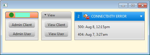
Here is some sample code which displays a TitledPane with a customized header next to a TitledPane without a customized header.
import javafx.application.Application;
import javafx.beans.binding.Bindings;
import javafx.geometry.Pos;
import javafx.scene.*;
import javafx.scene.control.*;
import javafx.scene.image.*;
import javafx.scene.layout.*;
import javafx.scene.paint.Color;
import javafx.scene.shape.Circle;
import javafx.scene.shape.Rectangle;
import javafx.stage.Stage;

/** http://stackoverflow.com/questions/11765436/how-to-change-header-component-in-titledpane-in-javafx */
public class TitledPaneCustomization extends Application {
  public static void main(String[] args) { launch(args); }

  @Override public void start(Stage primaryStage) {
    TitledPane adminPane = new TitledPane("Administration",
      VBoxBuilder.create().style("-fx-padding: 10").spacing(10).children(
        ButtonBuilder.create().text("Admin Client").maxWidth(Double.MAX_VALUE).build(),
        ButtonBuilder.create().text("Admin User").maxWidth(Double.MAX_VALUE).build()
      ).build()
    );
    adminPane.setAnimated(false);
    adminPane.getStyleClass().add("admin");
    Node open   = HBoxBuilder.create().spacing(5).children(
      new Circle(4, 4, 8, Color.FORESTGREEN),
      new Rectangle(50, 16, Color.AQUAMARINE)
    ).build();
    Node closed = HBoxBuilder.create().spacing(5).children(
      new Circle(4, 4, 8, Color.GOLDENROD),
      new Rectangle(50, 16, Color.AQUAMARINE)
    ).build();

    adminPane.graphicProperty().bind(
      Bindings
        .when(adminPane.expandedProperty())
          .then(open)
          .otherwise(closed)
    );
    adminPane.setContentDisplay(ContentDisplay.GRAPHIC_ONLY);

    TitledPane viewPane = new TitledPane("View",
      VBoxBuilder.create().style("-fx-padding: 10").spacing(10).children(
        ButtonBuilder.create().text("View Client").maxWidth(Double.MAX_VALUE).build(),
        ButtonBuilder.create().text("View User").maxWidth(Double.MAX_VALUE).build()
      ).build()
    );
    viewPane.setAnimated(false);

    VBox errorPane = VBoxBuilder.create().style("-fx-padding: 10").spacing(10).children(
      new Label("500: Aug 8, 12:15pm"),
      new Label("404: Aug 7, 3:27am")
    ).build();
    Label nErrors = new Label();
    nErrors.getStyleClass().add("nerrors");
    nErrors.textProperty().bind(Bindings.size(errorPane.getChildren()).asString());

    TitledPane connectivityPane = new TitledPane(
      "",
      errorPane
    );
    Label connectivityErrorLabel = new Label("CONNECTIVITY ERROR");
    connectivityErrorLabel.getStyleClass().add("connectivityErrorLabel");
    connectivityPane.getStyleClass().add("connectivity");
    connectivityPane.setAnimated(false);
    connectivityPane.setGraphic(
      HBoxBuilder.create().spacing(2).alignment(Pos.CENTER).styleClass("header").children(
        nErrors,
        new ImageView(
          new Image(
            "http://openiconlibrary.sourceforge.net/gallery2/open_icon_library-full/icons/png/48x48/actions/network-disconnect-2.png",
            0, 24, true, true
          )
        ),
        connectivityErrorLabel
      ).build()
    );

    HBox layout = new HBox(10);
    layout.setStyle("-fx-padding: 10; -fx-background-color: cornsilk;");
    layout.getChildren().addAll(adminPane, viewPane, connectivityPane);
    layout.setPrefHeight(150);
    layout.getStylesheets().add(this.getClass().getResource("titledpanecustomization.css").toExternalForm());
    primaryStage.setScene(new Scene(layout));
    primaryStage.show();

    Node arrow = adminPane.lookup(".arrow");
    arrow.setVisible(false);
    arrow.setManaged(false);

    // translate the titledpane arrow and header so that the arrow is displayed to right of the header.
    Pane connectivityArrow = (Pane) connectivityPane.lookup(".arrow");
    connectivityArrow.translateXProperty().bind(
      connectivityPane.widthProperty().subtract(connectivityArrow.widthProperty().multiply(2))
    );
    Pane connectivityTitle = (Pane) connectivityPane.lookup(".header");
    connectivityTitle.translateXProperty().bind(
      connectivityArrow.widthProperty().negate()
    );
  }
}
And some css to go with it:
/** titledpanecustomization.css place in same build directory as TitledPaneCustomization.java
    and ensure build system copies it to the output classpath. */
.admin .titled-pane > .title {
  -fx-background-color: blue, yellow, linear-gradient(to bottom, derive(coral, +50%), coral);
}

.connectivity {
  -fx-text-fill: white;
}

.nerrors {
  -fx-background-color: derive(-fx-focus-color, -15%);
  -fx-padding: 5 8 5 8;
  -fx-text-fill: white;
}

.connectivityErrorLabel {
  -fx-text-fill: white;
  -fx-padding: 0 40 0 3;
}

.connectivity .titled-pane > .title {
  -fx-background-color: -fx-box-border, -fx-inner-border, -fx-body-color;
  -fx-background-insets: 0, 1, 2;
  -fx-background-radius: 0 0 0 0, 0 0 0 0, 0 0 0 0;
  -fx-padding: 0.166667em 1.166667em 0.25em 0; /* 2 14 3 0 */
  -fx-color: -fx-focus-color;
}

.connectivity .titled-pane > .title > .arrow-button .arrow {
  -fx-background-color: white;
}
39
If you love us? You can donate to us via Paypal or buy me a coffee so we can maintain and grow! Thank you!
Donate Us With

