 Menu
Menu
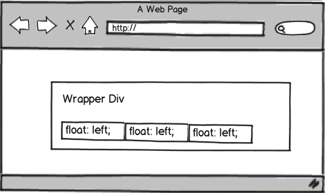
I want to center the three divs that appear in the mockup below (all have "float:left"). Is this possible?
I don't mind having wrapper-divs.
Text-align:center and display:inline-block won't work with the code I have.
 844
844
floating divs to center "works" with the combination of display:inline-block and text-align:center. Show activity on this post.
Simply add text-align center to parent div and set the child div display to inline-block. This will force our div to behave like inline element and therefore subjected text-align center.
An <img> element is an inline element (display value of inline-block ). It can be easily centered by adding the text-align: center; CSS property to the parent element that contains it. To center an image using text-align: center; you must place the <img> inside of a block-level element such as a div .
If you want to center them, you can't float them. A better alternative would be to make them all display: inline-block so you can still stylize them as a block element, and they'll still pay attention to your text-align: center on the parent wrapper. This would appear to be a good solution for the limited example you've provided.
In order to account for browser compatibility, you'd need to change them to <span> rather than <div> before adding the display: inline-block on to them. This would be supported in everything IE7 and up, and all other modern browsers. IE6 would not be supported, but it's only widely used in China anymore.
109
div#wrapper {
    width:960px;
    margin: 0 auto;
}
http://jsfiddle.net/WyxHQ/1/
edit:
Moved complete code from fiddle to answer as per suggestion
<div id="outer-wrapper">
    <div id="wrapper">
        <div class="one"></div>
        <div class="two"></div>
        <div class="three"></div>
    </div>
</div>
HTML
div#outer-wrapper{
border:2px solid black;
    padding:10px;
    width:100%;
}
CSS
div#wrapper{
    width:99px;
    margin:0 auto;
}

div {
    width:33px;
    height:20px;
}

div.one{
    background:red;
    float:left;
}

div.two{
    background:blue;
        float:left;
}

div.three{
    background:green;
        float:left;
}
You can also use a list and get the same results:
CSS:
.wrap
  {
    border:2px solid black;
    width:100%;
  }

ul
  {
    width:99px;
    margin:0 auto;
    height: 20px;
  }

ul li
  {
    width:33px;
    height:20px;
    float: left;
    margin: 0px;
    padding: 0px;
  }

ul li.red
  {
     background-color: red;
  }

ul li.blue
  {
     background-color: blue;
  }

ul li.green
  {
     background-color: green;
  }
HTML:
    <div class="wrap">
      <ul>
        <li class="red"> </li>
        <li class="blue"></li>
        <li class="green"></li>
      </ul>
    </div>
Try this: http://jsfiddle.net/nvpXx/3/
You can wrap your floated divs with an inline-block element and center it within its parent.
HTML
<div id="main">
    <div class="wrap">
        <div class="item">thing 1</div>
        <div class="item">thing 2</div>
        <div class="item">thing 3</div>
        <div class="clear"></div>
    </div>
</div>
CSS
#main {width: 600px; background-color: #eee; margin: 0 auto; padding: 10px; text-align: center;}
#main .item {float: left; border: 1px solid #ccc; margin: 5px; }
.clear {clear: both;}
.wrap { display: inline-block; padding: 5px; bordeR: 1px solid black; margin: auto;}
Potential Pitfall
This doesn't work well if you have so many floated items that they wrap to a second line. At that point, the div.wrap expands to 100% of its container and as a result everything is off-center.
44
Try this one, keep it simple:
<ul>
<li> one </li>
<li> two </li>
<li> three </li>
</ul>

<style>
ul{margin:0 auto;max-width:500px}
ul li{float:left;margin:0 auto 1em;text-align:center;width:33%}
</style>
This will make it responsive although it breaks on some point, it helps to create a media query for the max-width:
<style>
@media screen and (max-width:520px){ ul li{float:none} }
</style>
Fiddle here
23
If you love us? You can donate to us via Paypal or buy me a coffee so we can maintain and grow! Thank you!
Donate Us With