 Menu
Menu
I'll try to explain my question with images. Here we go.
1 - This image shows the text masking an image, so far so good, I can do with the following code:

font-size: 120px;
background: url(image-to-be-masked.jpg) repeat 0 0, white;
-webkit-background-clip: text;
-webkit-text-fill-color: transparent;
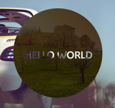
2 - This other image, the text creates the opposite effect, leaving transparent only the text area. This is what I want:
Has anyone tried it?
 759
759
* { margin: 0; padding: 0 }

header {
    overflow: hidden;
    height: 100vh;
    background: url(https://s3-us-west-2.amazonaws.com/s.cdpn.io/2017/17_04_art_bw_butterfly_bg.jpg) 50%/ cover
}

h2 {
    color: white;
    mix-blend-mode: difference;
    font: 900 35vmin/35vh cookie, cursive;
    text-align: center
}
<header>
<h2 contentEditable role='textbox' aria-multiline='true'>And stay alive...</h2>
</header>I've managed to achieve this with a couple of different methods. See my answer here: https://stackoverflow.com/a/32476482/2315496
See Below:
There are three ways to what you're looking for in HTML/CSS/JavaScript, some a little more hacky than others.
<canvas> to draw your shape and type, and set ctx.globalCompositeOperation="xor";where ctx is your canvas context.var c=document.getElementById('myCanvas');
var ctx=c.getContext('2d');
ctx.font = "bold 36px Proxima Nova";
ctx.fillStyle='blue';
ctx.fillText("MORE",100,87);
ctx.globalCompositeOperation='xor';
ctx.beginPath();
ctx.fillStyle='white';
ctx.arc(150,75,75,0,2*Math.PI);
ctx.fill();body{
background: -webkit-radial-gradient(top left,rgb(23, 39, 34) 4%,rgb(56, 99, 99) 37%,rgb(22, 27, 15) 73%,rgb(22, 27, 14) 93%,#232323 100%);
width:100%;
height:100%;
}
html{
height:100%
}<canvas id='myCanvas'></canvas>mix-blend-mode: screen and set the colour of the text to black..blend-mode {
background:white;
border-radius:100%;
width:150px;
height:150px;
line-height:155px;
float:left;
margin:20px;
font-family: "Proxima Nova", Hevetica, sans-serif;
font-weight:bold;
color:black;
text-align:center;
vertical-align:middle;
font-size:36px;
mix-blend-mode: screen;
}
body{
background: -webkit-radial-gradient(top left,rgb(23, 39, 34) 4%,rgb(56, 99, 99) 37%,rgb(22, 27, 15) 73%,rgb(22, 27, 14) 93%,#232323 100%);
width:100%;
height:100%;
}
html{
height:100%;
}<div class="blend-mode">MORE</div>-webkit-text-fill-color:transparent and -webkit-background-clip:text to reveal a copy of the background behind it. This one requires some alignment of the background copy to match the 'original' background..wrap{
margin:20px;
float:left;
position:relative;
}
.background {
width: 150px;
height: 150px;
border-radius: 100%;
background: white;
position:absolute;
top:0;
left:0;
z-index:4;
}
.text {
position:absolute;
top: 25px;
left: 25px;
z-index:5;
background: -webkit-radial-gradient(top left, rgb(23, 39, 34) 4%, rgb(56, 99, 99) 37%, rgb(22, 27, 15) 73%, rgb(22, 27, 14) 93%, #232323 100%);
font-family: Proxima Nova, Helvetica, sans-serif;
font-weight:bold;
line-height:100px;
font-size: 36px;
color: #666;
-webkit-background-clip: text;
-webkit-text-fill-color: transparent;
}
body{
background: -webkit-radial-gradient(top left,rgb(23, 39, 34) 4%,rgb(56, 99, 99) 37%,rgb(22, 27, 15) 73%,rgb(22, 27, 14) 93%,#232323 100%);
width:100%;
height:100%;
}
html{
height:100%;
}<div class="wrap">
<div class="background"></div>
<div class="text">MORE</div>
</div>None of these are likely to work that well cross browser, and I haven't tested them!
22
If you love us? You can donate to us via Paypal or buy me a coffee so we can maintain and grow! Thank you!
Donate Us With

