 Menu
Menu
I've spent an inordinate amount of time trying to figure out how to apply some simple styling to a Toolbar, but am utterly stumped. Specifically I want to change the colour of the Title and Subtitle and the overflow menu icon (three dots). I can set the text colours successfully in the layout, but not in the Theme, I have no idea why.
    <android.support.v7.widget.Toolbar
    theme="@style/Toolbar"
    android:id="@+id/toolbar"
    android:layout_width="match_parent"
    android:layout_height="?attr/actionBarSize"
    android:background="@color/orange"
    app:popupTheme="@style/AppTheme.PopupOverlay"
    />
styles.xml:
    <style name="Toolbar" parent="Widget.AppCompat.Toolbar">
    <item name="titleTextStyle">@style/ToolbarTitle</item>
    <item name="titleTextAppearance">@style/ToolbarTitleTextAppearance</item>
    <item name="popupTheme">@style/AppTheme.PopupOverlay</item>
</style>

<style name="ToolbarTitle" parent="Base.TextAppearance.Widget.AppCompat.Toolbar.Title">
    <item name="titleTextAppearance">@style/ToolbarTitleTextAppearance</item>
    <item name="android:textColor">#FF0000</item>
</style>

<style name="AppTheme.PopupOverlay" parent="ThemeOverlay.AppCompat.Light">
</style>
The PopupOverlay theme is applied to the overflow menu popup, so the Toolbar Theme is clearly being applied, but the TextAppearance does not work, the text remains black. I've tried a very large variety of alternative forms but with no joy. When I try something and it doesn't work I'm at a loss to know where to even start looking to understand why. Tips on debugging theming issues like this are welcome! It's deeply frustrating to lose several hours to what should be very simple UI styling changes, but the multiple facets of layouts, styles, themes & AppCompat leave me utterly confused and guessing.
 303
303
Following should work for you:
styles.xml
<style name="Base_ToolbarStyle">
    <item name="popupTheme">@style/ThemeOverlay.AppCompat.Light</item>
    <item name="android:background">?colorPrimary</item>
    <item name="android:theme">@style/Base_ToolbarTheme</item>
    <item name="titleTextAppearance">@style/CustomTitleTextAppearance</item>
    <item name="subtitleTextAppearance">@style/CustomSubTitleTextAppearance</item>
</style>

<style name="Base_ToolbarTheme">
    <!-- Color used for the title of the Toolbar - as long as not overridden -->
    <item name="android:textColorPrimary">@color/pink_500_primary</item>
    <!-- Used to color back button and three dots -->
    <item name="android:textColorSecondary">@color/yellow_500_primary</item>
</style>

<style name="CustomTitleTextAppearance" parent="TextAppearance.Widget.AppCompat.Toolbar.Title">
    <item name="android:fontFamily">@string/ff_roboto_condensed</item>
    <item name="android:textSize">16sp</item>
    <item name="android:textColor">@color/amber_500_primary</item>
    <item name="android:textStyle">bold</item>
</style>

<style name="CustomSubTitleTextAppearance" parent="TextAppearance.Widget.AppCompat.Toolbar.Subtitle">
    <item name="android:fontFamily">@string/ff_roboto_condensed</item>
    <item name="android:textSize">14sp</item>
    <item name="android:textColor">@color/pink_500_primary</item>
    <item name="android:textStyle">italic</item>
</style>
layout.xml
<android.support.v7.widget.Toolbar
    android:id="@+id/toolbar"
    style="@style/Base_ToolbarStyle"
    android:layout_width="match_parent"
    android:layout_height="?actionBarSize"
    android:elevation="4dp" />
Result:
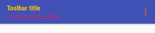
Note: I've made the style on purpose as ugly as possible. :<
So how do you figure this out. Well in case of the textAppearances you just look at the parent classes, e.g. TextAppearance.Widget.AppCompat.Toolbar.Title. There you'll find something like this eventually:
<style name="TextAppearance.Material.Widget.ActionBar.Title"
       parent="TextAppearance.Material.Title">
    <item name="textSize">@dimen/text_size_title_material_toolbar</item>
    <item name="textColor">?attr/textColorPrimary</item>
</style>
Clicking on the parent once again reveals the following:
<style name="TextAppearance.Material">
    <item name="textColor">?attr/textColorPrimary</item>
    <item name="textColorHint">?attr/textColorHint</item>
    <item name="textColorHighlight">?attr/textColorHighlight</item>
    <item name="textColorLink">?attr/textColorLink</item>
    <item name="textSize">@dimen/text_size_body_1_material</item>
    <item name="fontFamily">@string/font_family_body_1_material</item>
</style>
So in summary we know all the attributes we can tweak now. Applying a style to the Toolbar instead of a theme is more or less the result of some trial and error process though. ;)
113
If you love us? You can donate to us via Paypal or buy me a coffee so we can maintain and grow! Thank you!
Donate Us With