 Menu
Menu
Few days ago Twitter Bootstrap 3 RC1 released and i just started to play with it on a personal project.
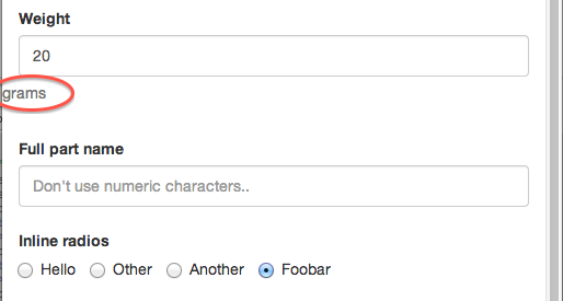
I have a horizontal form which includes some inline radio-checkbox groups but horizontal alignment of these elements are not equal:

Question 1: Why chrome doesn't displays help-block element on the same line with the label?
Question 2: How to align inline radio group on the same line with label?
Question 3: Is following markup valid? Are these problems related with the markup?
Markup:
<div class="container">
  <form class="form-horizontal">

  <div class="form-group">
    <label class="col-lg-2 control-label">Weight</label>
    <div class="col-lg-1">
      <input type="text" name="weight" class="form-control" value="20">
    </div>
    <div class="help-block"> grams</div>
  </div>

  <div class="form-group">
    <label class="col-lg-2 control-label">Full part name</label>
    <div class="col-lg-6">
      <input type="text" name="name" class="form-control" placeholder="Don't use numeric characters..">
    </div>
  </div>

  <div class="form-group">
    <label class="col-lg-2 control-label">Inline radios</label>
    <div class="col-lg-10">
      <label class="radio-inline">
        <input type="radio" name="radio"> Hello
      </label>
      <label class="radio-inline">
        <input type="radio" name="radio"> Other
      </label>
      <label class="radio-inline">
        <input type="radio" name="radio"> Another
      </label>
      <label class="radio-inline">
        <input type="radio" name="radio" checked="checked"> Foobar
      </label>
    </div>
  </div>
</form>
</div>
EDIT:
Also this markup on a small screen produces a "dropped help-block element". I think my markup is problematic but i have no idea what is wrong.
 676
676
Your markup seems to be valid on first sight. About your question 1.
You have set your input with:
<div class="col-lg-1">
  <input type="text" name="weight" class="form-control" value="20">
</div>
So to width is set with the col-lg-1 prefix, see also: https://stackoverflow.com/a/17920693/1596547. "col-lg-1" stack below 992 pixels. When you're screen width is > 992 px. The div got a width of 8.333% (100/12). The form-control class set the width of the input tag to 100%. Below the 992px there is no definition for "col-lg-1" cause the 100% width of the input, the input is displayed with 100% width.
Try to use the col-* prefixes which never stacks (or use other CSS to set the width)
I did not found different behavior for Chrome at all. Above the 992px i will find this on both FF and Chrome:

I did not found a solution for your second question yet.
Question 2: Your labels got a padding-top of 9px from:
 .form-horizontal .control-label {
     padding-top: 9px;
  }
the .radio-inline have no padding, so add the code below to your css:
.radio-inline, .checkbox-inline {
    padding-top: 9px;
 }
See: https://github.com/twbs/bootstrap/pull/8967
83
If you love us? You can donate to us via Paypal or buy me a coffee so we can maintain and grow! Thank you!
Donate Us With