 Menu
Menu
I want to align a div to the bottom of the PAGE, not to the bottom of the screen. When I do this:
#contact-block{
position: absolute;
    bottom: 0; left: 0;
}
, the div is placed in the bottom area of the screen. When my page is long, I have to scroll down and the div which should have been at the bottom, floats somewhere in the middle.
There might be a simple solution to this, but I'm just not seeing it.
Here's my HTML:
<div id="left">
<div id="submenu"> <span class="menutitle">Services</span>
  <ul>
  </ul>
 </div>

 <div id="contact-block">
 <span class="contacttitle">Contact</span></div>
</div>
<div id="content">
</div>
I've also added a little image to illustrate what I mean:
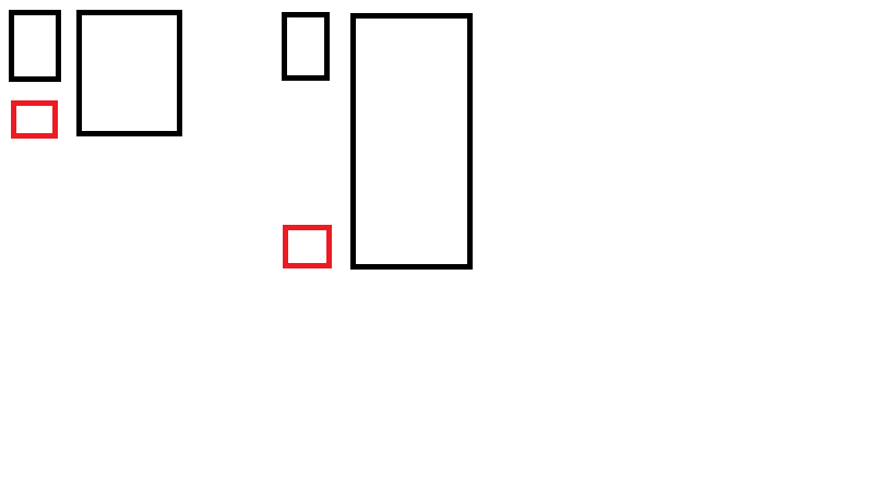
The red div is the contact div.
Edit: I've found a solution with jQuery and CSS. This might not be the best solution, but hey, it works.
jQuery:
var offset= $(document).height()-$("#contact-block").height()- $("#footer").height()-60;
$("#contact-block").css("top", offset);
$("#contact-block").css("left", $("#wrapper").position().left);
CSS:
#contact-block {
position : absolute;
width:216px;
height:100px;
background:url(../img/contact-bg.jpg) repeat-x #5c5c5c;
}
 288
288
You could absolute-position the your divs in place. This technique requires a #wrapper element, which I'm not a fan of, but hey, you gotta do watcha gotta do.
In this example I removed the #left div entirely as it was only required for layout purposed and is no longer necessary.
HTML:
<div id="wrapper">
<div id="submenu">This is services</div>
<div id="contact-block">This is contact</div>
<div id="content">This is content</div>
</div>
CSS:
#wrapper {
    position: relative;
    width: 960px;
}

#submenu {
    position: absolute;
    left: 0;
    top: 0;
    width: 320px;
    height: 320px;
}

#contact-block {
    position: absolute;
    left: 0;
    bottom: 0;
    width: 320px;
    height: 160px;
}

#content {
    position: relative;
    left: 320px;
    right: 0;
    top: 0;
    width: 640px;
    height: 640px;
}

//#content position is relative for the #wrapper to stretch.
//The left property is equal to the width of the #submenu or #contact-block element
A good point of this technique is that it gives you cleaner HTML. I believe it will be easier to make a mobile version of your version if the need arise.
The jsfiddle
Additional thought:
The #wrapper element could easily be removed in favor of you body element, which is a great step towards semantic HTML. Check this out!
120
The position of your absolute positioned element depends on the first ancestor-element, which is not positioned static ( which is the default, so you have to explicitely set it to relative(or absolute) ).
So, make sure, your enclosing #left container has 100% document-heigth and position:relative, and everything is well.
32
If you love us? You can donate to us via Paypal or buy me a coffee so we can maintain and grow! Thank you!
Donate Us With