 Menu
Menu
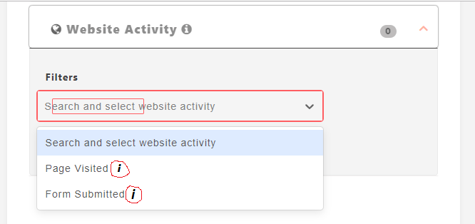
I am trying add fontawesome icon and tooltip on react-select component options. Below image i am trying to achieve
Code
import React, { Component } from 'react';
import Select from 'react-select';

const websiteFilterFiedsOptions = [
    {value: '', label: 'Search and select website activity'},
    {value: 'page_visited', label: 'Page Visited'},
    {value: 'form_submitted', label: 'Form Submitted'}
]

export default class Website extends Component {

    constructor(props) {
        super(props);
        this.state = {
            selectedFilter: ''
        }
    }

    filterSelectedData = function(data) {

    }

    render() {
        return <div className="form-group">
                    <h6 className="website_filter"><b>Filters</b></h6>
                    <div className="location-search field-width filed_width_custom">
                        <Select
                            value={this.state.selectedFilter}
                            onChange={(e) => this.filterSelectedData(e)}
                            options={ websiteFilterFiedsOptions }
                            placeholder="Search and select website activity"
                        />
                    </div>
                </div>;
    }
}
 240
240
You need to add the component as shown below, added it for only one option for demo purpose, you can style it in your way.
Even you can use a reusable component to generate label, since label accepts a node.
I hope this will solve the issue.
{
    value: "page_visited",
    label: (
      <>
        <span style={{ paddingRight: "5px" }}>Page Visited</span>
        <FontAwesomeIcon icon="info" title={"Page Visited Option"} />
      </>
    )
  },
Entire Code
import React, { Component } from "react";
import ReactDOM from "react-dom";
import Select from "react-select";
import { library } from "@fortawesome/fontawesome-svg-core";
import { fab } from "@fortawesome/free-brands-svg-icons";
import { faInfo, faCoffee } from "@fortawesome/free-solid-svg-icons";
import { FontAwesomeIcon } from "@fortawesome/react-fontawesome";

library.add(fab, faInfo, faCoffee);

const websiteFilterFiedsOptions = [
  { value: "", label: "Search and select website activity" },
  {
    value: "page_visited",
    label: (
      <>
        <span style={{ paddingRight: "5px" }}>Page Visited</span>
        <FontAwesomeIcon icon="info" title={"Page Visited Option"} />
      </>
    )
  },
  { value: "form_submitted", label: "Form Submitted" }
];

export default class Website extends Component {
  constructor(props) {
    super(props);
    this.state = {
      selectedFilter: ""
    };
  }

  filterSelectedData = function(data) {};

  render() {
    return (
      <div className="form-group">
        <h6 className="website_filter">
          <b>Filters</b>
        </h6>
        <div className="location-search field-width filed_width_custom">
          <Select
            value={this.state.selectedFilter}
            onChange={e => this.filterSelectedData(e)}
            options={websiteFilterFiedsOptions}
            placeholder="Search and select website activity"
          />
        </div>
      </div>
    );
  }
}

const rootElement = document.getElementById("root");
ReactDOM.render(<Website />, rootElement);
Working codepen
137
I think you can try this way by making your own component and object with the icon values.
https://github.com/JedWatson/react-select/issues/3480
35
If you love us? You can donate to us via Paypal or buy me a coffee so we can maintain and grow! Thank you!
Donate Us With