 Menu
Menu
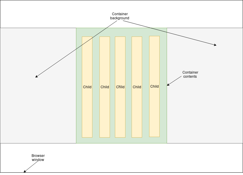
I have simple structure of element container of dynamic height and fixed width (Markup below). On one hand the element's background should span the whole window width, on the other the children's size must be limited by the container (Desired layout below). The number of children and their sizes (which are equal on the image only for simplicity) are dynamic.
Is that possible without adding extra container? I want to avoid achieving the desired element content width by setting width on the children, because their number is dynamic and the size relationships become complicated to write unless their total width is already limited by container's width.
Here's a pen to experiment;
Markup
<div class="container">
  <div class="child">
  <div class="child">
  ...
</div>

.container {
  width: <fixed-width>px;
}
Desired layout (the whitespace between children and container is irrelevant)
 495
495
One route we can take to solve this is by using viewport width on the parent container padding, to force the children into a box that is only 500px wide (as per your codepen).
The important thing to remember when doing this is that box-sizing:border-box; will need to be set on the container, otherwise the padding goes ballistic.
We do this by using calc, vw and padding.
padding: 20px calc(50vw - /*half of container width*/);
Here's the full expanded code of your container on the linked codepen:
.container {
  display: flex;
  flex-flow: row nowrap;
  justify-content: center;
  margin-left: auto;
  margin-right: auto;
  height: 300px;
  width: 100%;
  padding: 20px calc(50vw - 250px);
  background-color: #acffac;
  background-size: 100vw auto;
  background-position: center top;
  box-sizing: border-box;
}

html {
  overflow-y:scroll; /* fixes potential calculation errors caused by scroll bar - thanks to Roberts comment */
}
Here's a working version of the codepen, and for the sake of keeping all my eggs in one basket, here's an expandable code snippet:
.container {
  display: flex;
  flex-flow: row nowrap;
  justify-content: center;
  margin-left: auto;
  margin-right: auto;
  height: 300px;
  width: 100%;
  padding: 20px calc(50vw - 250px);
  background-color: #acffac;
  background-size: 100vw auto;
  background-position: center top;
  box-sizing: border-box;
}

.child {
  flex: 1 0 auto;
  width: 100px;
  height: 100%;
  background-color: #ff4444;
}

.child+.child {
  margin-left: 20px;
}
<div class="container">
<div class="child"></div>
<div class="child"></div>
<div class="child"></div>
<div class="child"></div>
</div>I will finish off by pointing out that if someone else has a better solution, you may want to look at that for time being instead as there is some issues with using vw inside calc on older versions of Chrome and Safari.
EDIT:
As noted in the comments by Vadim and Robert there are a few things that can cause some snags.
Firstly, assuming you are working with a bare minimum template (i.e. no normalize/reset.css), your body will most probably still have the inherent margins that would mess with this kind of layout. You can fix this with:
body {
    margin:0;
}
Secondly, depending on your OS (Yes I'm looking at you Microsoft!) your scrollbars can push your content to the side whilst simultaneously still being included in the calculation for vw.
We can fix this one of two way. The first being an adjustment on the padding calculation to include the scrollbar side, but you would have to write a script to ensure that scrollbar is actually present, and scrollbars differ in sizes (I.E -> 17px, Edge -> 12px).
The other alternative would be to use a custom content scroller, which would do a full overflow:hidden; over the content, thereby removing the scroll bar, before implementing it's own version of a scrollbar (which generally lies on top of the content with a position:fixed;) it.
68
If you love us? You can donate to us via Paypal or buy me a coffee so we can maintain and grow! Thank you!
Donate Us With