I want to display three buttons in the middle of a screen, and have the three buttons all be the same width, though they will have text labels of different lengths.
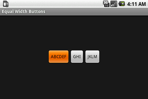
Just adding three buttons with text labels of different lengths produces buttons of different widths.
<?xml version="1.0" encoding="utf-8"?> <LinearLayout xmlns:android="http://schemas.android.com/apk/res/android" android:orientation="horizontal" android:layout_width="fill_parent" android:layout_height="wrap_content" android:layout_gravity="center_vertical" android:gravity="center"> <Button android:id="@+id/button_1" android:layout_height="fill_parent" android:layout_width="wrap_content" android:text="ABCDEF" /> <Button android:id="@+id/button_2" android:layout_height="fill_parent" android:layout_width="wrap_content" android:text="GHI" /> <Button android:id="@+id/button_3" android:layout_height="fill_parent" android:layout_width="wrap_content" android:text="JKLM" /> </LinearLayout>default button width wraps contents:
--
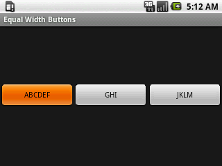
Setting the layout_weight to 1 and the layout_width to 0dip on all the buttons causes them to stretch equally to fill the entire screen width. For what I want, such buttons are simply too big, especially on large screens.
<?xml version="1.0" encoding="utf-8"?> <LinearLayout xmlns:android="http://schemas.android.com/apk/res/android" android:orientation="horizontal" android:layout_width="fill_parent" android:layout_height="wrap_content" android:layout_gravity="center_vertical" android:gravity="center"> <Button android:id="@+id/button_1" android:layout_height="fill_parent" android:layout_width="0dip" android:layout_weight="1" android:text="ABCDEF" /> <Button android:id="@+id/button_2" android:layout_height="fill_parent" android:layout_width="0dip" android:layout_weight="1" android:text="GHI" /> <Button android:id="@+id/button_3" android:layout_height="fill_parent" android:layout_width="0dip" android:layout_weight="1" android:text="JKLM" /> </LinearLayout>layout weight 1 buttons fill screen width:
--
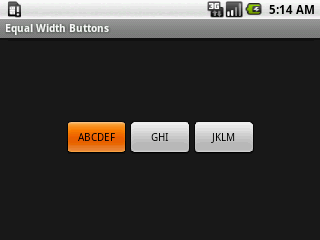
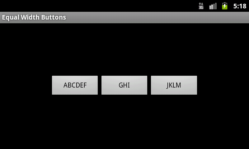
Setting different values for weightSum in the parent LinearLayout can be used to stop the buttons from filling the entire screen, but I don't think this is the path I want to take, because I don't want the buttons to occupy a large portion of the screen on large screen devices. To clarify, using weightSum, I could, for example, set the three buttons to collectively occupy half the screen width, which may look OK on small screens, but on a large screen, the buttons would still occupy half the screen width, and the buttons would simply be much larger than what I want. Perhaps the final solution will be to simply have different layout files for different screens, but I'd rather not go down this path.
<?xml version="1.0" encoding="utf-8"?> <LinearLayout xmlns:android="http://schemas.android.com/apk/res/android" android:orientation="horizontal" android:layout_width="fill_parent" android:layout_height="wrap_content" android:layout_gravity="center_vertical" android:gravity="center" android:weightSum="5"> <Button android:id="@+id/button_1" android:layout_height="fill_parent" android:layout_width="0dip" android:layout_weight="1" android:text="ABCDEF" /> <Button android:id="@+id/button_2" android:layout_height="fill_parent" android:layout_width="0dip" android:layout_weight="1" android:text="GHI" /> <Button android:id="@+id/button_3" android:layout_height="fill_parent" android:layout_width="0dip" android:layout_weight="1" android:text="JKLM" /> </LinearLayout>weight sum 5 small screen:
weight sum 5 large screen:
--
I also tried many things with TableLayout, but didn't get anything better than just using LinearLayout.
GridView is extra-clumsy to use, and I haven't tried it, yet.
So, how does one create buttons with equal widths, preferrably where they are only as wide as necessary to fit the contents of the button with the longest label?
Any advice is appreciated.
(I did search and find this question asked and answered many times, but none of the answers I found resolved what I'm trying to achieve.)
If you set the box-sizing property to content-box, the width and height will only include the content, and not the border, padding, or margin. So, to make all HTML buttons the same size, you would set the box-sizing property to content-box. Now all your buttons will be the same size, no matter what!
display: block and width: 100% is the correct way to go full width but you need to remove the left/right margin on the button as it pushes it outside the containing element. for more information on the box-sizing property, read the MDN docs.
Perhaps the final solution will be to simply have different layout files for different screens, but I'd rather not go down this path.
Many programmers will use res/layout/ and res/layout-large/ for handling situations like this. In the limited case of the three buttons, you might have alternatives, but usually user interfaces aren't quite that simplistic.
So, how does one create buttons with equal widths, preferrably where they are only as wide as necessary to fit the contents of the button with the longest label?
To accomplish your "preferrably" [sic] requirement, you would need to create a custom layout class for that. Here is one related to it, for the dashboard pattern, that you might use as a starting point.
If you know in advance what your widest button text will be you can use the android:ems attribute to set your buttons to that width.
<Button android:id="@+id/my_button" android:layout_width="wrap_content" android:layout_height="wrap_content" android:minEms="5" android:text="@string/my_button" /> It's not perfect but it's the easiest way that I've found to achieve this look without endlessly fiddling around with layouts.
If you love us? You can donate to us via Paypal or buy me a coffee so we can maintain and grow! Thank you!
Donate Us With