 Menu
Menu
Let's say we have a flex container with a width of 400px.
Inside this container are three flex items:
:nth-child(1) { flex: 0 2 300px; } /* flex-grow, flex-shrink, flex-basis */ :nth-child(2) { flex: 0 1 200px; } :nth-child(3) { flex: 0 2 100px; } So the total width of flex items is 600px and the free space in the container is -200px.
With help from this question, this article, and the flexbox spec, I've learned the basic formula for distributing negative free space among flex items:
Step 1
Multiply each shrink value by its basis and add them all together:
:nth-child(1) 2 * 300 = 600 :nth-child(2) 1 * 200 = 200 :nth-child(3) 2 * 100 = 200 TOTAL = 1000
Step 2
Divide each item above by the total to determine the shrink factor:
:nth-child(1) 600 / 1000 = .6 :nth-child(2) 200 / 1000 = .2 :nth-child(3) 200 / 1000 = .2 Step 3
Multiply the shrink factor by the negative free space to determine the space removed from each item:
:nth-child(1) .6 * -200px = -120px :nth-child(2) .2 * -200px = -40px :nth-child(3) .2 * -200px = -40px So, the computed size of each flex item should be:
:nth-child(1) 300px - 120px = 180px :nth-child(2) 200px - 40px = 160px :nth-child(3) 100px - 40px = 60px Tested in Chrome, Firefox and IE11, the numbers check out. The calculation works perfectly.
.flex { display: flex; width: 400px; height: 50px; margin: 0; padding: 0; list-style: none; text-align: center; } .flex li:nth-child(1) { flex: 0 2 300px; background: orange; } .flex li:nth-child(2) { flex: 0 1 200px; background: chartreuse; } .flex li:nth-child(3) { flex: 0 2 100px; background: aqua; }<ul class="flex1 flex"> <li>180px</li> <li>160px</li> <li>60px</li> </ul>jsFiddle demo
When padding is introduced, however, the shrink results are different. When padding is applied along with box-sizing: border-box, this results in yet another set of numbers.
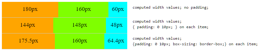
What's the flex-shrink calculation when padding and box-sizing are involved?
.flex { display: flex; width: 400px; height: 50px; margin: 0; padding: 0; list-style: none; text-align: center; border-bottom: 1px solid #ccc; } .flex li:nth-child(1) { flex: 0 2 300px; background: orange; } .flex li:nth-child(2) { flex: 0 1 200px; background: chartreuse; } .flex li:nth-child(3) { flex: 0 2 100px; background: aqua; } .flex2 li { padding: 0 10px; } .flex3 li { padding: 0 10px; box-sizing: border-box; }<ul class="flex1 flex"> <li>180px</li> <li>160px</li> <li>60px</li> </ul> <ul class="flex2 flex"> <li>144px</li> <li>148px</li> <li>48px</li> </ul> <ul class="flex3 flex"> <li>175.5px</li> <li>160px</li> <li>64.4px</li> </ul>jsFiddle demo
 651
651
The flex-shrink property specifies how the item will shrink relative to the rest of the flexible items inside the same container. Note: If the element is not a flexible item, the flex-shrink property has no effect.
To find the shrink factor for each, multiply its flex-shrink value by its flex-basis value (1×100px or 1×400px), then divide this by the combined sum of the flex-shrink multiply the flex-basis for all items (1×100px) + (1×400px) + (1×400px).
The flex-basis is the thing that sizing is calculated from. If we set flex-basis to 0 and flex-grow to 1 then all of our boxes have no starting width, so the space in the flex container is shared out evenly, assigning the same amount of space to each item.
Flexbox defines this as
For every unfrozen item on the line, multiply its flex shrink factor by its inner flex base size, and note this as its scaled flex shrink factor. Find the ratio of the item’s scaled flex shrink factor to the sum of the scaled flex shrink factors of all unfrozen items on the line. Set the item’s target main size to its flex base size minus a fraction of the absolute value of the remaining free space proportional to the ratio.
Simplifying, frozen flex items are those which can't or don't have to be flexed anymore. I will assume no min-width restrictions and non-zero flex shrink factors. This way all flex items are initially unfrozen and they all become frozen after only one iteration of the flex loop.
The inner flex base size depends on the value of box-sizing, defined by CSS2UI as
content-box: The specified width and height (and respective min/max properties) apply to the width and height respectively of the content box of the element. The padding and border of the element are laid out and drawn outside the specified width and height.
border-box: Length and percentages values for width and height (and respective min/max properties) on this element determine the border box of the element. That is, any padding or border specified on the element is laid out and drawn inside this specifiedwidthandheight. The content width and height are calculated by subtracting the border and padding widths of the respective sides from the specified width and height properties. [...] Used values, as exposed for instance through getComputedStyle(), also refer to the border box.
Basically, that means that sizes (widths, flex bases) have an inner an an outer variant. The inner size includes only the content, the outer one also includes paddings and border widths. The length specified in the stylesheet will be used as the inner size in case of box-sizing: content-box, or as the outer one in case of box-sizing: border-box. The other can be calculated by adding or subtracting border and padding widths.
Neglecting lots of details, the algorithm would be something like
let sumScaledShrinkFactors = 0, remainingFreeSpace = flexContainer.innerMainSize; for (let item of flexItems) { remainingFreeSpace -= item.outerFlexBasis; item.scaledShrinkFactor = item.innerFlexBasis * item.flexShrinkFactor; sumScaledShrinkFactors += item.scaledShrinkFactor; } for (let item of flexItems) { let ratio = item.scaledShrinkFactor / sumScaledShrinkFactors; item.innerWidth = item.innerFlexBasis + ratio * remainingFreeSpace; } With no paddings, it's as you explain
(width) innerW │ padd │ outerW ───────┼──────┼─────── 300px * (1 + 2 / 1000px * -200px) = 180px │ 0px │ 180px 200px * (1 + 1 / 1000px * -200px) = 160px │ 0px │ 160px 100px * (1 + 2 / 1000px * -200px) = 60px │ 0px │ 60px ───────┼──────┼─────── 400px │ 0px │ 400px With 10px horizontal paddings, the available space is reduced by 3 * 2 * 10px = 60px, so now it's -260px.
(width) innerW │ padd │ outerW ───────┼──────┼─────── 300px * (1 + 2 / 1000px * -260px) = 144px │ 20px │ 164px 200px * (1 + 1 / 1000px * -260px) = 148px │ 20px │ 168px 100px * (1 + 2 / 1000px * -260px) = 48px │ 20px │ 68px ───────┼──────┼─────── 340px │ 60px │ 400px When you use box-sizing: border-box, the specified flex bases are the outer ones, so the paddings are subtracted from them to calculate the inner ones, which are 280px, 180px, 80px. Then the sum of the scaled flex shrink factors becomes 2*280px + 180px + 2*80px = 900px. The available space is like in the case with no padding, because the outer flex bases are the same. Note the width retrieved by getComputedStyle will now be the outer one, so paddings are added back at the end.
(width) innerW │ padd │ outerW ────────┼──────┼──────── 280px * (1 + 2 / 900px * -200px) ≈ 155.6px │ 20px │ 175.6px 180px * (1 + 1 / 900px * -200px) = 140.0px │ 20px │ 160.0px 80px * (1 + 2 / 900px * -200px) ≈ 44.4px │ 20px │ 64.4px ────────┼──────┼──────── 340.0px │ 60px │ 400.0px If you love us? You can donate to us via Paypal or buy me a coffee so we can maintain and grow! Thank you!
Donate Us With

