 Menu
Menu
How do I convert standard CSS with special attributes like "type" and "active", to Styled-Components consts?
.box {
  position: absolute;
  top: 50%;
  left: 50%;
  transform: translate(-50%, -50%);
  width: 400px;
  background: #fff;
  padding: 40px;
  border: 1px solid rgba(0, 0, 0, 0.1);
  box-shadow: 0 5px 10px rgba(0, 0, 0, 0.2);
}

input[type='submit'] {
  background: #00aec9;
  color: #fff;
  cursor: pointer;
  margin-bottom: 0;
  text-transform: uppercase;
  width: 100%;
  border-radius: 5px;
  height: 35px;
  border-color: transparent;
  box-shadow: 0px;
  outline: none;
  transition: 0.15s;
  text-align: center;
}

input[type='submit']:active {
  background-color: #f1ac15;
}
I managed to create the const for the .box CSS class but not sure how to achieve this with "input[type='submit']" and "input[type='submit']:active"
//---- .box class ------ //
const DivBox = styled.div`
  position: absolute;
  top: 50%;
  left: 50%;
  transform: translate(-50%, -50%);
  width: 400px;
  background: #fff;
  padding: 40px;
  border: 1px solid rgba(0, 0, 0, 0.1);
  box-shadow: 0 5px 10px rgba(0, 0, 0, 0.2);
`
Any assistance would be greatly appreciated
PS, I am using React and Nextjs
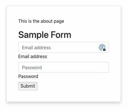
What I currently have:
What I want:

My current Component Code:
import Layout from '../components/MyLayout.js'
import styled from 'styled-components'

const DivBox = styled.div`
  position: absolute;
  top: 50%;
  left: 50%;
  transform: translate(-50%, -50%);
  width: 400px;
  background: #fff;
  padding: 40px;
  border: 1px solid rgba(0, 0, 0, 0.1);
  box-shadow: 0 5px 10px rgba(0, 0, 0, 0.2);
`

const Input = styled.input.attrs({ type: 'submit' })`
  background: #00aec9;
  color: #fff;
  cursor: pointer;
  margin-bottom: 0;
  text-transform: uppercase;
  width: 100%;
  border-radius: 5px;
  height: 35px;
  border-color: transparent;
  box-shadow: 0px;
  outline: none;
  transition: 0.15s;
  text-align: center;
  &:active {
    background-color: #f1ac15;
  }
`

export default function About() {
  return (
    <Layout>
      <DivBox>
        <p>This is the about page</p>
        <h2>Sample Form</h2>
        <div className="form-label-group">
          <input
            type="email"
            id="inputEmail"
            className="form-control"
            placeholder="Email address"
            required
            autoFocus
          />
          <label htmlFor="inputEmail">Email address</label>
        </div>

        <div className="form-label-group">
          <input
            type="password"
            id="inputPassword"
            className="form-control"
            placeholder="Password"
            required
          />
          <label htmlFor="inputPassword">Password</label>
        </div>
        <div>
          <input type="submit" value="Submit" />
        </div>
      </DivBox>
    </Layout>
  )
}
Additional CSS:
.form-control:focus {
  border-color: #00aec9;
  box-shadow: 0 0 0 0.2rem rgba(19, 162, 228, 0.25);
}

.form-label-group input:not(:placeholder-shown) ~ label {
  color: #00aec9;
}
 879
879
As you can see, styled-components lets you write actual CSS in your JavaScript.
How do we use CSS variables with styled components to make truly reusable components? To make for good contrast, let apply button styles using StyleSheet. create({}) and then write the button in a way that we can pass in inline styles to override the default.
Passing propsstyled-components creates a React component, which renders an HTML tag corresponding to the property in the styled object. Button will create and render a button HTML tag, while Div will create and render a div tag. They are components, so we can pass props to them.
The styled method works perfectly on all of your own or any third-party component, as long as they attach the passed className prop to a DOM element.
I guess you can achieve that by:
const Input = styled.input.attrs({
  type: 'submit',
  value: 'Submit'
})`
  background: #00aec9;
  color: #fff;
  cursor: pointer;
  margin-bottom: 0;
  text-transform: uppercase;
  width: 100%;
  border-radius: 5px;
  height: 35px;
  border-color: transparent;
  box-shadow: 0px;
  outline: none;
  transition: 0.15s;
  text-align: center;
  &:active {
    background-color: #f1ac15;
  }
`
And replace
<input type="submit" value="Submit" />
with
<Input />
More informations on attrs here
66
If you love us? You can donate to us via Paypal or buy me a coffee so we can maintain and grow! Thank you!
Donate Us With