 Menu
Menu
I had a project in AEM 6.1's Classic UI where I was able to override the default Drag components or assets here label to a custom one simply like that:
I've overriden the new.jsp by adding these lines:
String emptyText = currentStyle.get("cq:emptyText", "");
if (StringUtils.isNotBlank(emptyText)) {
    editConfig.setEmpty(true);
    editConfig.setEmptyText(emptyText);
}
Now I was able to easily customize each parsys' drop area label by setting it via /etc/designs/custom structures. So every parsys was basically explicitely telling the author what kind of components it accepted. Apart from the traditional components' availability inside parsys this added a great value for the editors to work with a complex structure of a page with many different paragraphs, often nested one in another.
Now I'm working in AEM 6.3 with Touch UI and a lot has changed in a way that does not allow me to simply port the above solution. Googling the issue did not help unfortunately, 6.3 is quite fresh, there are solutions for older versions of wcm/foundation/components/parsys and/or foundation/components/parsys, but not for the latest one. Has anyone worked this one out already?

 786
786
The above mentioned approaches will not work for Touch UI. Adobe has it hardcoded as "Drag Components Here" in their i18n file for the "new" section.
Alternative Solution: -
<sly data-sly-resource="${@path='par1',resourceType='mysite/components/parsys',selectors='par-1'}"/>${request.requestPathInfo.selectors[0]}if (this.dom.hasClass("par-1")) {
return "Customized Text for Par 1";
}
if (this.dom.hasClass("par-2")) {
return "Customized Text for Par 2";
}
// New component placeholder
if (this.dom.hasClass(newComponentClass)) {
return newComponentPlaceholderText;
}For more details, refer:- Detailed Help text Customization For parsys in Touch UI
192
Parsys drop text with CSS utilizing the data-text property on the placeholder element as you can see outlined in blue: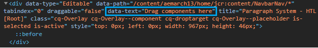
content property with additional/custom CSS for our parsys component):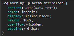
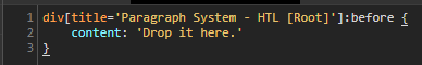

data-path attribute for styling instead of the data-text attribute:div[data-path='/content/aemarch13/home/jcr:content/NavbarNav/*']:before {
content: 'Drop it here.'
}
Good Luck...
34
If you love us? You can donate to us via Paypal or buy me a coffee so we can maintain and grow! Thank you!
Donate Us With