 Menu
Menu
To make the transition occur, you must specify at least two things — the name of the CSS property to which you want to apply the transition effect using the transition-property CSS property, and the duration of the transition effect (greater than 0) using the transition-duration CSS property.
Transitioning two or more properties You can transition two (or more) CSS properties by separating them with a comma in your transition or transition-property property. You can do the same with duration, timing-functions and delays as well. If the values are the same, you only need to specify one of them.
transition: all 0.3s ease; "all" transition effect apply on property you set on css. " 0.3s" time when apply transition "ease" specifies a transition effect with a slow start, then fast, then end slowly.
Here's a solution that also works on Firefox:
transition: all 0.3s ease, background-position 1ms;
I made a small demo: http://jsfiddle.net/aWzwh/
Hope not to be late. It is accomplished using only one line!
-webkit-transition: all 0.2s ease-in-out, width 0, height 0, top 0, left 0;
-moz-transition: all 0.2s ease-in-out, width 0, height 0, top 0, left 0;
-o-transition: all 0.2s ease-in-out, width 0, height 0, top 0, left 0;
transition: all 0.2s ease-in-out, width 0, height 0, top 0, left 0;
That works on Chrome. You have to separate the CSS properties with a comma.
Here is a working example: http://jsfiddle.net/H2jet/
You can try using the standard W3C way:
.transition { transition: all 0.2s, top 0s, left 0s, width 0s, height 0s; }
http://jsfiddle.net/H2jet/60/
Try this...
* {
    transition: all .2s linear;
    -webkit-transition: all .2s linear;
    -moz-transition: all .2s linear;
    -o-transition: all .2s linear;
}
a {
    -webkit-transition: background-position 1ms linear;
    -moz-transition: background-position 1ms linear;
    -o-transition: background-position 1ms linear;
    transition: background-position 1ms linear;
}
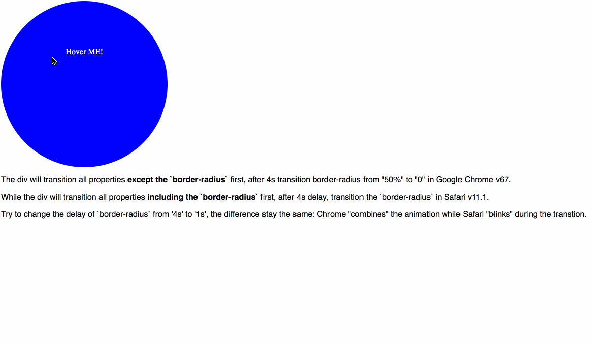
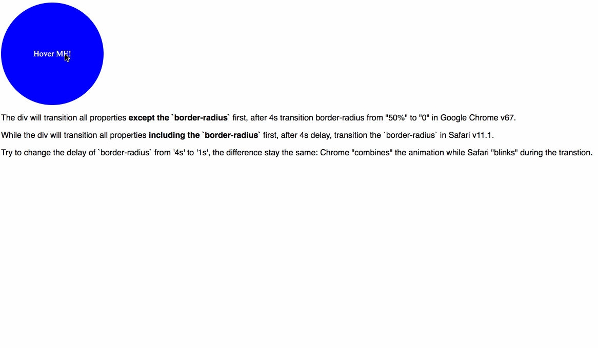
For anyone looks for a shorthand way, to add transition for all properties except for one specific property with delay, be aware of there're differences among even modern browsers.
A simple demo below shows the difference. Check out full code
div:hover {
  width: 500px;
  height: 500px;
  border-radius: 0;
  transition: all 2s, border-radius 2s 4s;
}
Chrome will "combine" the two animation (which is like I expect), like below:
While Safari "separates" it (which may not be expected):
A more compatible way is that you assign the specific transition for specific property, if you have a delay for one of them.
If you love us? You can donate to us via Paypal or buy me a coffee so we can maintain and grow! Thank you!
Donate Us With