 Menu
Menu
My #1 try fails because of padding in col's.
My #2 try also because I must be doing something stupid.
Here's desired result:
Could someone help me? Please avoid rewriting bootstrap rules if possible.
 964
964
Try this and read the comments in CSS area: http://www.bootply.com/byopZWzR2K
This code will solve the vertical alignment of any cell.
Here is the same code also:
CSS
/* This play-area class is just for testing and aligned the width of this table */
.play-area{width:400px;margin:19px auto}
.play-area img{height:32px;}

.make-this-table{border:1px solid #d7d7d7;overflow:hidden;} /* this to give our table outer border */
.make-this-table .row{border-top:1px solid #d7d7d7;background:#e7e7e7} /* This simple to add separator line between each row also to give each row background color */
.make-this-table .row:nth-child(1){border:none;background:#c5c5c5} /* This to ignore the separator for the first row since it will be the head of this table. You can remove this line to have this table without head */


/* This code to make rows in alternative background colors */
.make-this-table .row:nth-child(even) {background:#fff}


/* This to make the text vertical align in middle if the next column in the same row has more than one line while the first column just one line like the second row in this table .. You can remove this line if you like to make the alignment at the top of the cell. */
.make-this-table .row{align-items: center;display: -webkit-flex; display: -ms-flexbox; display: flex; -webkit-flex-wrap: wrap; -ms-flex-wrap: wrap; flex-wrap: wrap;}
-
HTML
<div class="play-area">
<div class="make-this-table">
<div class="row">
<div class="col-md-4 col-xs-4">
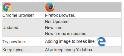
<img src="http://www.chromium.org/_/rsrc/1438811752264/chromium-projects/logo_chrome_color_1x_web_32dp.png" alt="" style="">
</div>
<div class="col-md-8 col-xs-8">
<img src="https://www.mozilla.org/media/img/styleguide/identity/firefox/guidelines-logo.7ea045a4e288.png" alt="" style="width:32px;">
</div>
</div>
<div class="row">
<div class="col-md-4 col-xs-4">
Chrome Browser.
</div>
<div class="col-md-8 col-xs-8">
Firefox Browser.
</div>
</div>
<div class="row">
<div class="col-md-4 col-xs-4">
Updated.
</div>
<div class="col-md-8 col-xs-8">
Not Updated<br>New line.<br>Now firefox is updated.
</div>
</div>
<div class="row">
<div class="col-md-4 col-xs-4">
Try new line.
</div>
<div class="col-md-8 col-xs-8">
Adding image to break line: <img src="http://www.w3schools.com/images/compatible_edge.gif" alt="">
</div>
</div>
<div class="row">
<div class="col-md-4 col-xs-4">
Keep trying ..
</div>
<div class="col-md-8 col-xs-8">
Also keep trying Ya labba ..
</div>
</div>
</div>
</div>
Basic principle of Table -> row / column is that, in a particular row, columns should be of equal height whatever is the content.
You can make table -> row/columns structure using bootstrap grid but there will be a problem of equal heights column.
So, for this purpose i.e. for equal columns, you can use flexbox property. (it doesn't work in ie9 and less so be sure about its use.)
Check this fiddle here
Just add following simple CSS to a parent container (for complete demo checkout above fiddle),
.row-eq-height {
    display: -webkit-box;
    display: -webkit-flex;
    display: -ms-flexbox;
    display: flex;
}
Here is the reference
25
If you love us? You can donate to us via Paypal or buy me a coffee so we can maintain and grow! Thank you!
Donate Us With