 Menu
Menu
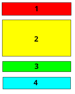
First, this is the desired effect:
Layout without reordering divs:
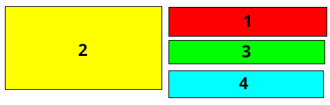
Layout after reordering divs
2 is a fixed width. 1,3,4 are all flexable and could be any width.
I have tried using flexboxes, but they will not layout in 2 cols after reordering.
.container { display: flex; flex-wrap: wrap; width: 700px; }
.d1 {
  order: 2;
  background-color: red;
}
.d2 {
 order: 1;
 background-color: yellow;
 }
 .d3 {
 order: 3;
 background-color: blue;
 }
 .d4 {
 order: 4;
 background-color: green;
 }

 .d1,.d2,.d3,.d4 {
  padding: 20px;
  font-size: 20px;
  font-weight: bold;
  border: 1px solid black;
  width: 300px;
  height: 50px;
  }

  .d2 {
   height: 200px;
   }
<div class="container">
<div class="d1">1</div>
<div class="d2">2</div>
<div class="d3">3</div>
<div class="d4">4</div>
</div>I have also tried float 2 to the left, but it does not make 1, 3 and 4 take up all of rest of the avaible space of the container. (it needs to do so at any container width)
.container { position: relative; width: 900px; border: 1px solid black; }
.d1 {
float: right;
  background-color: red;
}
.d2 {
 float: left;
 background-color: yellow;
 }
 .d3 {
 float: right;
 background-color: blue;
 }
 .d4 {
 float: right;
 background-color: green;
 }

 .d1,.d2,.d3,.d4 {
  padding: 20px;
  font-size: 20px;
  font-weight: bold;
  border: 1px solid black;
  width: 300px;
  height: 50px;
  }

  .d2 {
   height: 200px;
   }
<div class="container">
<div class="d1">1</div>
<div class="d2">2</div>
<div class="d3">3</div>
<div class="d4">4</div>
</div>I forgot to mention that all of this is inside another container that needs to have the height its contents
 790
790
Total Height should be less than Height of 1st div and 2nd div.
Reason: So flex-wrap will provide the desired output
* {
  margin: 0;
}

.outer {
  height: 60vh;
  display: flex;
  flex-direction: column;
  flex-wrap: wrap;
}

.two {
  width: calc(100vw - 400px);
  text-align: center;
  font-size: 50px;
  line-height: 100px;
  color: white;
  height: 16vh;
  background: red;
}

.one {
  margin: 0 auto;
  width: 400px;
  text-align: center;
  font-size: 50px;
  line-height: 50vh;
  color: white;
  height: 50vh;
  background: green;
}

.three {
  width: calc(100vw - 400px);
  text-align: center;
  font-size: 50px;
  line-height: 20vh;
  color: white;
  height: 20vh;
  background: orange;
}

.four {
  width: calc(100vw - 400px);
  text-align: center;
  font-size: 50px;
  line-height: 100px;
  color: white;
  height: 23vh;
  background: black;
}

@media only screen and (max-width: 601px) {
  .outer {
    height: 150vh;
  }
  .one {
    order: 2;
    width: 100vw;
  }
  .two {
    order: 1;
    width: 100vw;
  }
  .three {
    order: 3;
    width: 100vw;
  }
  .four {
    order: 4;
    width: 100vw;
  }
}
<div class="outer">
<div class="one">2</div>
<div class="two">1</div>
<div class="three">3</div>
<div class="four">4</div>
</div>If you love us? You can donate to us via Paypal or buy me a coffee so we can maintain and grow! Thank you!
Donate Us With
