 Menu
Menu
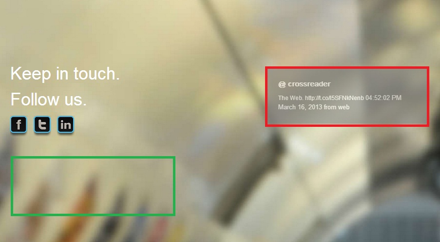
I want to place the red border div,on the left where the green border is,when the window is resized.
Currently the div has the following css rules:
#twitter-2 {
width: 332px;
background-color: #7E7D7D;
opacity: 0.6;
margin-left:525px;
margin-top:-142px;
}
I solved the problem:
window.onresize = function(event) {
    var elem = document.getElementById("twitter-2");
    elem.setAttribute("style","margin: 20px 1px;");
}
 430
430
you can use media queries
and test your site by re-sizing the window
adjust what you want on which device and always try to play with %'s not px's
Some media queries for you Thanks to Chris
/* Smartphones (portrait and landscape) ----------- */
@media only screen
and (min-device-width : 320px)
and (max-device-width : 480px) {
/* Styles */
}

/* Smartphones (landscape) ----------- */
@media only screen
and (min-width : 321px) {
/* Styles */
}

/* Smartphones (portrait) ----------- */
@media only screen
and (max-width : 320px) {
/* Styles */
}

/* iPads (portrait and landscape) ----------- */
@media only screen
and (min-device-width : 768px)
and (max-device-width : 1024px) {
/* Styles */


Like This
#twitter-2 {
margin-left:Some Value ;
margin-top:Some Value ;
}
    }

/* iPads (landscape) ----------- */
@media only screen
and (min-device-width : 768px)
and (max-device-width : 1024px)
and (orientation : landscape) {
/* Styles */
}

/* iPads (portrait) ----------- */
@media only screen
and (min-device-width : 768px)
and (max-device-width : 1024px)
and (orientation : portrait) {
/* Styles */
}

/* Desktops and laptops ----------- */
@media only screen
and (min-width : 1224px) {
/* Styles */
}

/* Large screens ----------- */
@media only screen
and (min-width : 1824px) {
/* Styles */
}

/* iPhone 4 ----------- */
@media
only screen and (-webkit-min-device-pixel-ratio : 1.5),
only screen and (min-device-pixel-ratio : 1.5) {
/* Styles */
}
If you love us? You can donate to us via Paypal or buy me a coffee so we can maintain and grow! Thank you!
Donate Us With

