 Menu
Menu
While delving into CSS units I've encountered a definition of the reference pixel. However, I wasn't able to find a consistent and comprehensive description of its relation to the CSS pixel unit. I've done some research on this matter, yet it's still a little bit unclear to me.
There are two distinct types/definitions of a pixel:
"Device pixel" — a single physical point on a display.
And:
CSS pixel — a unit most closely matching the reference pixel. [1]
Two parallel concepts under the same name definitely don't clarify the confusion. I fully understand the purpose of introducing the second one, but I find its nomenclature misleading. The CSS pixel is classified as an absolute unit and:
"Absolute length units are fixed in relation to each other." [1]
The above statement seems pretty obvious for every unit except for the pixel. Following the w3c specification:
"For a CSS device, these dimensions are either anchored (i) by relating the physical units to their physical measurements, or (ii) by relating the pixel unit to the reference pixel.
(...) Note that if the anchor unit is the pixel unit, the physical units might not match their physical measurements. Alternatively if the anchor unit is a physical unit, the pixel unit might not map to a whole number of device pixels." [1]
Considering the aforementioned quotation I assume that absolute units are not all that absolute, since they may be anchored to the reference pixel.
The reference pixel itself is actually an angular measurement [2]:
"The reference pixel is the visual angle of one pixel on a device with a pixel density of 96dpi and a distance from the reader of an arm's length. For a nominal arm's length of 28 inches, the visual angle is therefore about 0.0213 degrees." [1]
What is illustrated on the image below:
Despite defining the reference pixel as a visual angle, we can further read:
"For reading at arm's length, 1px thus corresponds to about 0.26 mm (1/96 inch)."
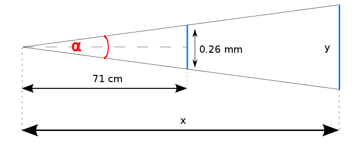
Leaving inconsistencies aside, we are able to establish a value of the angle:
α = 2 * arctan(0.026/142) = 0.02098° where: α — a value of the visual angle Thus a size of the displayed unit equals:
y = 2x * tan(0.01049°) where: y — a displayed unit size x — a reading distance Given the above formula, in order to calculate a unit size we need to determine what's the actual reading distance. As it may vary among users, its categorisation has been based on a device's DPI.
For convenience, let's assume that DPI == PPI.
This measurement allows us to guess a display type. Quick check:
So, in general, the bigger PPI the closer to a screen a user sits. The table below [3] presents reading distance recommendations for devices with particular DPI:
——————————————————————————————————————— | DPI | Pixel size | Reading distance | ————————————————————————————————————————————————————— |PC's CRT | 96 | ~0.2646 mm | ~71 cm | |display | | | | ————————————————————————————————————————————————————— |Laptop's LCD | 125 | 0.2032 mm | ~55 cm | |display | | | | ————————————————————————————————————————————————————— |Tablet | 160 | ~0.159 mm | ~43 cm | —————————————————————————————————————————————————————
However, it's unclear to me how those distance values were obtained. Is the relation to DPI described with a function or is it just an empirical observation?
The introduction of the Retina display complicated the matter even further. Its PPI tends to be approximately 2 times bigger than non-Retina one's, while a recommended reading distance should remain the same. Since a CSS pixel size doesn't necessarily correspond with a device pixel size, I assume that the unit size on the Retina display is firstly translated into a reference pixel size (expressed in device pixels) and then multiplied by pixel ratio. Is it correct?
While zooming in, the displayed reference pixel size grows [4], ergo a distance from a display grows. It's quite counterintuitive, because it means that we are "stepping away" from the screen, not getting closer to it.
Concluding my doubts and articulating questions:
Also, please correct me if my reasoning is invalid or I am missing something. Thanks for replies.
 537
537
The CSS pixel (px)The reference pixel is the visual angle of one pixel on a device with a pixel density of 96 DPI and a distance from the reader of an arm's length. The proper dimension of a CSS pixel is actually dependent on the distance between you and the display.
The pixel dimensions may be determined by multiplying both the width and the height by the dpi. A digital camera will also have pixel dimensions, expressed as the number of pixels horizontally and vertically that define its resolution (e.g., 2,048 by 3,072).
The term CSS pixel is synonymous with the CSS unit of absolute length px — which is normatively defined as being exactly 1/96th of 1 inch.
The devicePixelRatio of Window interface returns the ratio of the resolution in physical pixels to the resolution in CSS pixels for the current display device. This value could also be interpreted as the ratio of pixel sizes: the size of one CSS pixel to the size of one physical pixel.
I may be wrong but I don't think it's possible for CSS pixel to have the physical unit as an anchor.
Based on this article:
The px unit is the magic unit of CSS. It is not related to the current font and also not related to the absolute units. The px unit is defined to be small but visible, and such that a horizontal 1px wide line can be displayed with sharp edges (no anti-aliasing). What is sharp, small and visible depends on the device and the way it is used: do you hold it close to your eyes, like a mobile phone, at arms length, like a computer monitor, or somewhere in between, like a book? The px is thus not defined as a constant length, but as something that depends on the type of device and its typical use.
UPDATE: I was wrong. It is possible just not implemented in any browser currently. In cases where that is indeed the case, as per spec: "these dimensions are either anchored (i) by relating the physical units to their physical measurements" meaning that 1px will be equal to 1/96th of a physical inch.
As for the relation between DPI and reading distance in the table, it takes that if DPI = 96 then reading distance is ~71cm or 28in and these values are inversely proportional meaning higher DPI will result in a smaller reading distance.
From that it's easy to come up with a formula:
x = 125/96 y = 71/x where: x - ratio between second and first DPI value y - reading distance for second DPI value For higher resolution devices there is an example given lower in Mozilla Hacks article:
Let’s take iPhone 4 as the most famous example. It comes with a 326 DPI display. According to our table above, as a smartphone, it’s typical viewing distance is 16.8 inches and it’s baseline pixel density is 160 DPI. To create one CSS pixel, Apple chose to set the device pixel ratio to 2, which effectively makes iOS Safari display web pages in the same way as it would on a 163 DPI phone.
So that means we have two resolutions - physical (PPI) and CSS one (cssppi). It seems that cssppi is used for calculating reference pixel size and then device manufacturers choose how much reference pixels will they map to one CSS pixel (I assume this number is equal to device pixel ratio value but not 100% sure).
Here's table with comparisons for some common devices pixel ratio, PPI, and cssppi: http://mydevice.io/devices/
For more information and reference check following articles:
160
If you love us? You can donate to us via Paypal or buy me a coffee so we can maintain and grow! Thank you!
Donate Us With

