 Menu
Menu
As part of my learning modern web development, I'm making a sample landing page using Bootstrap and jQuery. For demo purposes, the code was simplified with only HTML and CSS bits left.
The idea is to have several pages of HTML all on one page, each of which occupies 100% of browser's viewport.
Part of the problem is that on portable devices content often does not fit, so height:100% no longer works, and content overlaps. I tried various combinations of min-height and height, none of them seem to work.
I would like to keep responsive design principle, and make content shrink as much as possible, but keep everything readable without overlap.
body {
  font-family: Helvetica Neue, Helvetica, Arial, sans-serif;
  margin: 0;
}

#divAbout {
  background-color: white;
}

#divDownload {
  background-color: lightgoldenrodyellow;
}

#header {
  margin: 0;
  height: 50px;
  position: fixed;
  background-color: rgba(255, 255, 255, 0.25);
  width: 100%;
}

.page {
  text-align: center;
}

#divHome {
  background-color: lightblue;
}

#divHomeCenter {
  max-width: 700px;
  background-color: rgba(255, 255, 255, 0.35);
  border-radius: 20px;
  padding: 10px 40px;
  margin: 0 auto;
  position: relative;
  top: 200px;
}

#divDownloadCenter {
  padding-top: 150px;
}

html,
body,
.page {
  height: 100%;
}
<link href="https://maxcdn.bootstrapcdn.com/bootstrap/4.0.0/css/bootstrap.min.css" rel="stylesheet"/>
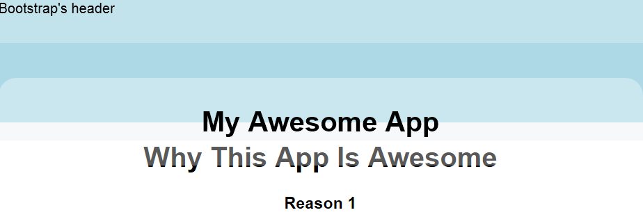
<div id="header">
Bootstrap's header
</div>
<div id="divHome" class="page">
<div id="divHomeCenter">
<h1>My Awesome App</h1>
</div>
</div>
<div id="divAbout" class="page">
<div id="divAboutCenter">
<h1>Why This App Is Awesome</h1>
<div class="row">
<div>
<h3>Reason 1</h3>
<p>
Lorem ipsum dolor sit amet, consectetur adipiscing elit. Nam interdum arcu at ante tempor, a pretium sem posuere. In hac habitasse platea dictumst. Integer lectus odio, porttitor et libero ac, mattis commodo risus. Morbi sit amet orci lacinia, feugiat
nulla eu, tincidunt lacus. Fusce semper, neque vel iaculis mollis, lorem risus ultricies enim, quis congue metus neque a nibh. Curabitur ut turpis rutrum, volutpat odio quis, fringilla risus. Aliquam erat volutpat. Proin eget risus pretium,
malesuada risus id, feugiat magna. Lorem ipsum dolor sit amet, consectetur adipiscing elit. Proin placerat, ex ac varius aliquet, nisl nunc finibus nisl, at finibus odio neque a nulla.
</p>
<button>Sign Up</button>
</div>
<div>
<h3>Reason 1</h3>
<p>
Nunc sed diam ac dui fringilla maximus. Mauris dignissim tincidunt nunc, vitae pulvinar nibh maximus eu. Aliquam eleifend libero non pharetra varius. Cras eleifend sagittis lectus, vel commodo mi mollis vel. Quisque tempus interdum mi, eget vulputate
ligula feugiat tincidunt. Integer et diam gravida, vulputate tortor ac, tincidunt lectus. Nunc ac nisi felis. Aliquam ac felis sapien. Vestibulum ante ipsum primis in faucibus orci luctus et ultrices posuere cubilia Curae; Suspendisse eleifend
ex neque, at sagittis ipsum venenatis in. Vivamus ac consequat arcu. Sed sit amet risus a elit viverra venenatis sed vel ligula. Curabitur tincidunt malesuada augue at suscipit. Nam semper tristique ultrices. Sed in lorem sem.
</p>
<button>Sign Up</button>
</div>
<div>
<h3>Reason 1</h3>
<p>
Curabitur sapien nunc, rhoncus et justo nec, feugiat faucibus tellus. Sed in molestie nisi, at pretium turpis. Phasellus nulla augue, porttitor non elit sit amet, gravida auctor ante. Nulla malesuada nisl urna, sit amet facilisis magna porttitor ut. Nullam
pretium, felis et pellentesque iaculis, libero nisl venenatis est, sit amet molestie augue mi at sapien. Ut imperdiet mauris eget ultricies tincidunt. Etiam tincidunt enim justo, in gravida massa ornare sit amet. Fusce id cursus orci, vel lobortis
dui. Morbi pretium, felis eu lobortis vestibulum, erat mauris facilisis dui, et suscipit risus neque in nisi. Praesent pellentesque facilisis nisi sed tincidunt. Cras consectetur imperdiet elit, dictum tempor elit vehicula eget. Maecenas nec
ex leo. Nunc eu erat eu erat venenatis faucibus a in nulla. Sed auctor suscipit nibh id consequat.
</p>
<button>Sign Up</button>
</div>
</div>
</div>
</div>
<div id="divDownload" class="page">
<div id="divDownloadCenter">
<h1>Download The App!</h1>
<button>Download</button>
</div>
</div>Demo on JSFiddle:
How to reproduce the problem on JSFiddle:
Simply scroll down, you'll see content overlapping.
How to reproduce the problem on Live version:
Shrink browser height to show half of internal container on page 1, then scroll down, you'll see page 2 starts immediately.
Before scroll (low screen height simulation - page #1 does not fit in 100% height):

After scroll (second page overlaps #1):
 467
467
Height % is based on it's parent (so you have to set every element above the target element to 100%) , there are a few workarounds to this though. For instance you can set it to height: 100vh; This will create the element to be 100% of your window height. Or you can use px instead.
The fit-content behaves as fit-content(stretch) . In practice this means that the box will use the available space, but never more than max-content . When used as laid out box size for width , height , min-width , min-height , max-width and max-height the maximum and minimum sizes refer to the content size.
Updated
Here is an updated fiddle
I changed these CSS rules
html, body {
  height: 100%;
}
.page {
  min-height: 100%;
}
#divAbout h1 {
  margin: 0;
}
And I commented out the following
#divHomeCenter {
  max-width: 700px;
  background-color: rgba(255,255,255,0.35);
  border-radius: 20px;
  padding: 10px 40px;
  margin: 0 auto;
  position: relative;
  /* top: 200px;             */
}
When you set top: 200px; on an element that have position: relative;, it will push that element 200px down but leave all other element where they were initially, which will cause that pushed element to overlap the other(s).
101
I have a simple idea that might help you solve the issue. As I noticed the font size is always the same, whatever the screen resolution, therefore the content gets overlapped.
You can use media queries like these:
/* Small devices (tablets, 768px and up) */
@media (min-width: 768px) {
  body{
    font-size: 9px;
  }
}

/* Medium devices (desktops, 992px and up) */
@media (min-width: 992px) {
  body{
    font-size: 11px
  }
}

/* Large devices (large desktops, 1200px and up) */
@media (min-width: 1200px) {
  body{
    font-size:13px;
  }
}
You can adjust the font sizes according to you application.
Another option is using Viewport Sized Typography units like vh and vw but they are not such a good solution, I guess.
Try this updated fiddle
28
If you love us? You can donate to us via Paypal or buy me a coffee so we can maintain and grow! Thank you!
Donate Us With