 Menu
Menu
My question is about gradient with fading: gradient - from top to bottom, and fading - from left to right.
Example:

The code is:
background-image:
  linear-gradient(0deg, rgba(198,83,165,.95) 0%, rgba(198,86,51,.95) 100%),
  linear-gradient(90deg, transparent 50%, rgba(0,0,0,.95) 100%);
opacity: 0.949;
My result is below.
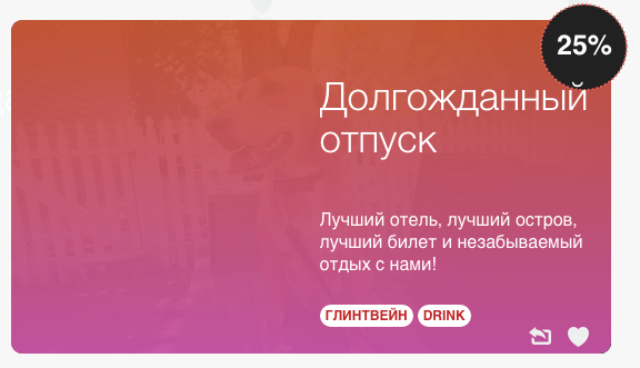
As you see, it doesn't fade the gradient, it looks like separate layer, behind this gradient. Is there any other method of implementing this?
 687
687
To add transparency, we use the rgba() function to define the color stops. The last parameter in the rgba() function can be a value from 0 to 1, and it defines the transparency of the color: 0 indicates full transparency, 1 indicates full color (no transparency).
CSS gradients also support transparency, which can be used to create fading effects. To add transparency, we use the rgba() function to define the color stops.
In CSS, you can't transition a background gradient. It jumps from one gradient to the other immediately, with no smooth transition between the two. He documents a clever tactic of positioning a pseudo element covering the element with a different background and transitioning the opacity of that pseudo element.
Thanks to the new @property defined in the CSS Properties and Values API Level 1 specification we can now have transition with custom properties (aka CSS variables).
As I had mentioned in comments, when you add a transparent layer on top of another gradient, it will only show through the colored gradient layer that is below it (and not the image that is present in the container). So, it would be very tough (almost impossible) to achieve this with gradients.
You'd have to use a mask image to achieve it. The below is a snippet that uses a SVG mask.
div {
  position: relative;
  height: 300px;
  width: 500px;
}
div svg {
  position: absolute;
  height: 100%;
  width: 100%;
}
div .grad-fill {
  fill: url(#grad);
  mask: url(#masker);
}
<div>
<svg viewBox="0 0 500 300" preserveAspectRatio="none">
<defs>
<linearGradient id="grad" gradientUnits="objectBoundingBox" gradientTransform="rotate(270,0.5,0.5)">
<stop offset="0%" stop-color="rgba(198,83,165,.95)" />
<stop offset="100%" stop-color="rgba(198,86,51,.95)" />
</linearGradient>
<linearGradient id="mask-grad" gradientUnits="objectBoundingBox">
<stop offset="40%" stop-color="black" />
<stop offset="100%" stop-color="white" />
</linearGradient>
<mask id="masker" x="0" y="0" width="500" height="300">
<rect x="0" y="0" width="500" height="300" fill="url(#mask-grad)" />
</mask>
</defs>
<rect x="0" y="0" width="500" height="300" class="grad-fill" />
</svg>
<img src="http://lorempixel.com/500/300/animals/8" />
</div>You can find more information about SVG masks in the below links:
This can be done with pure CSS also but unfortunately mask-image property is currently supported only by WebKit browsers and so this approach is not recommended.
div {
  position: relative;
  height: 300px;
  width: 500px;
  color: white;
}
div:after,
img {
  position: absolute;
  height: 100%;
  width: 100%;
  top: 0px;
  left: 0px;
  z-index: -1;
}
div:after {
  content: '';
  background-image: linear-gradient(0deg, rgba(198, 83, 165, .95) 0%, rgba(198, 86, 51, .95) 100%);
  -webkit-mask-image: linear-gradient(90deg, transparent 40%, rgb(0, 0, 0) 100%);
}
<div>Some text
<img src="http://lorempixel.com/500/300/animals/8" />
</div>A way to create this effect with pure CSS is to play with multiple radial gradients, and with the transparency of each
behind the radial gradients, that are quite transparent to allow them to fade in between them, there is a linear gradient that provides opacity (in white) to the right side.
If you want this to be more accurate, you can set more radial gradients, each covering a part of the image.
.test {
  width: 500px;
  height: 400px;
  border: solid 1px green;
  background:
  radial-gradient(ellipse 70% 100% at top right, rgba(255,0,0,0.5), transparent),
               radial-gradient(ellipse 70% 100% at bottom right, rgba(255,0,80,0.5), transparent),
               linear-gradient(to left, white 20%, transparent);
  background-size: 100% 80%, 100% 80%, 100% 100%;
  background-position: top left, left 100%, top left;
  background-repeat: no-repeat;
}

body {
  background-image: url(http://lorempixel.com/500/400/nature);
  background-repeat: no-repeat;
  background-position: 8px 8px;
}
<div class="test"></div>If you love us? You can donate to us via Paypal or buy me a coffee so we can maintain and grow! Thank you!
Donate Us With


