 Menu
Menu
I'm trying to produce the following layout, using flexbox.
The top black bar, the middle section and bottom black bar are all flex items, which are children of a wrapper div just inside the body tag, which looks as follows.
<!DOCTYPE html>
<html lang="en">
<head>
    <meta charset="utf-8">
    <meta http-equiv="X-UA-Compatible" content="IE=edge">
    <meta name="viewport" content="width=device-width, initial-scale=1">
    <link href='https://fonts.googleapis.com/css?family=Open+Sans:400,300,300italic,400italic,600,600italic,700,700italic' rel='stylesheet' type='text/css'>
    <link href="~/Styles/bootstrap.min.css" rel="stylesheet" />
    <link href="~/Styles/font-awesome.min.css" rel="stylesheet" />
    <link href="~/Styles/ppt_site.css" rel="stylesheet" />
</head>
<body>
    <div class="wrapper">

        <div id="topRow">
        </div>

        <div id="centralRow">

            <div id="sidebarColumn">
            </div>

            <div id="contentColumn">
            </div>

        </div>

        <div id="bottomRow">
        </div>

    </div>

    @Section['customScripts']
    <script src="~/Scripts/siteGlobals.js"></script>

    <script src="~/requireconfig"></script>
    <script data-main="~/scripts/NewTemplatesAppLoader.js" src="~/requirejs"></script>

</body>
</html>
The style sheet controlling all of this is as follows
.wrapper, html, body {
    height: 100%;
    margin: 0;
}

.wrapper {
    display: flex;
    -ms-flex-direction: column;
    -webkit-flex-direction: column;
    flex-direction: column;
}

#topRow {
    background-color: black;
    color: white;
}

#centralRow {
    -ms-flex: 1;
    -webkit-flex: 1;
    flex: 1;
    display: flex;
    -ms-flex-direction: row;
    -webkit-flex-direction: row;
    flex-direction: row;
}

#bottomRow {
    background-color: #333333;
    color: white;
}

#sidebarColumn {
    background-color: #B83B1D;
    color: white;
}

#contentColumn {
    -ms-flex: 1;
    -webkit-flex: 1;
    flex: 1;
    background-color: #F7F7F7;
    color: black;
    padding: 10px;
    overflow-y: auto;
}
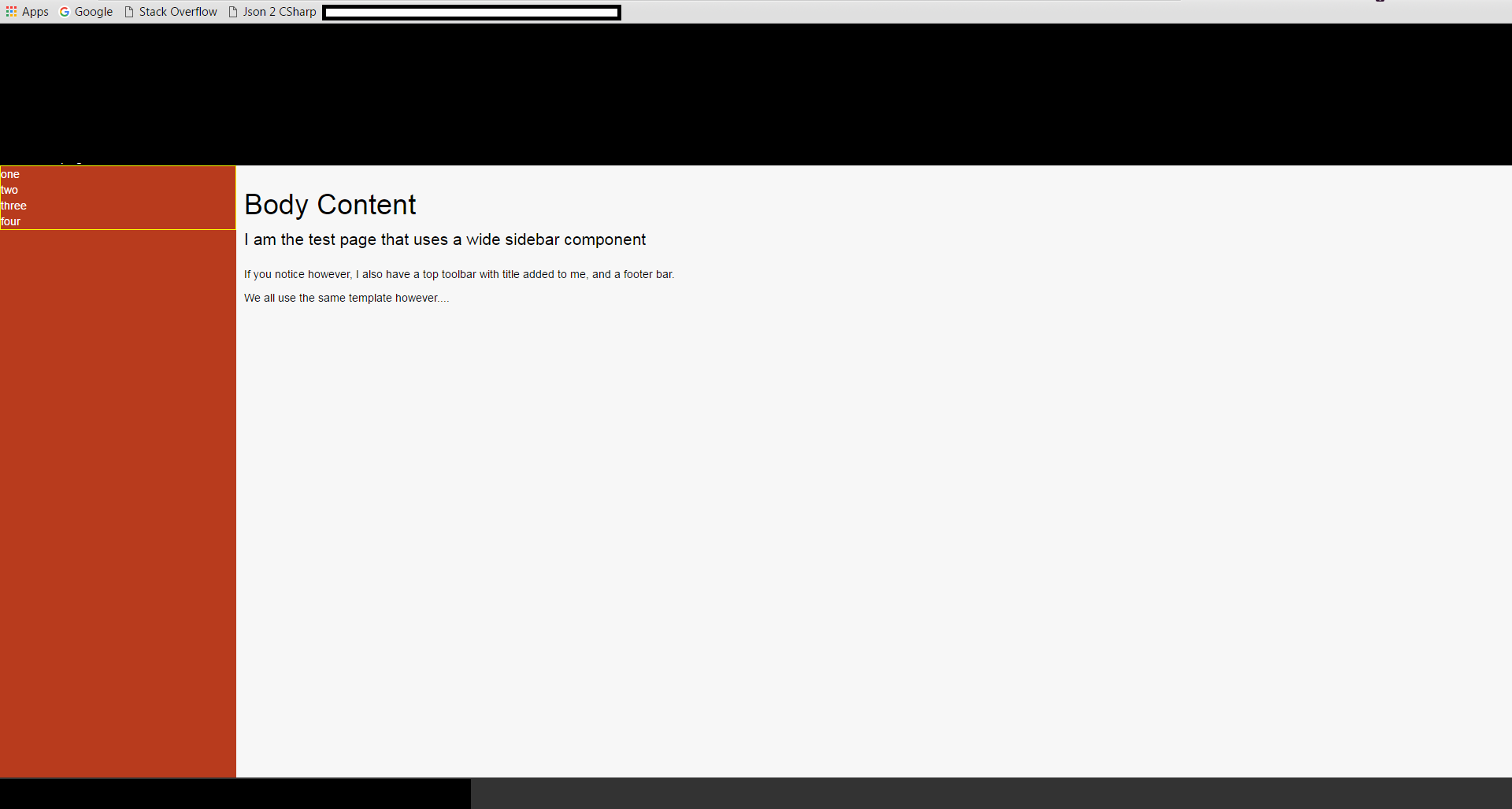
As far as the main layout goes, this all works perfectly, you'll notice however if you look in the image, the red side bar as an area at the top with a yellow border.
That area, is destined to be a div that stretches the full height of the red area (Sidebar Column) in the above CSS, but try as I might I cannot get it to do what I need.
Ideally, I want it to be a div, that's a flex container, which I can then put 4 flex items into and have each of them take up a quarter of the space available each, but because the div with the yellow border cannot seem to see the height of the parent container (The red sidebar, which is a flex item itself) then it only ever takes up the height of space around it's content.
I've tried wrapping it in more div's and positioning those divs, I've wrapped further flex boxes in further divs, I've tried blocks, inlines, table-cells and just about everything else I can think of.
No matter what I try I just can't seem to get the yellow bordered container to be the same height as it's parent.
Any ideas anyone?
The 2 proposed solutions, do indeed work, in their own right and they work as I would have expected them too.
In my particular case however, they don't work.
I'm using NancyFX with it's super simple view engine, and I'm using KnockoutJS to compose "Web Components" so I can keep my pieces re-usable.
If I edit my "Master Template", and insert the div's directly in the markup, nested below #sidebarColumn I get the 4 divs of equal size as desired.
However, what actually needs to happen is the following, my template looks as follows:
<div class="wrapper">

    <div id="topRow">
        @Section['topbarContent']
    </div>

    <div id="centralRow">

        <div id="sidebarColumn">
            @Section['sidebarContent']
        </div>

        <div id="contentColumn">
            @Section['bodyContent']
        </div>

    </div>

    <div id="bottomRow">
        @Section['bottombarContent']
    </div>

</div>
If I remove the "@Section['sidebarContent']" and put the divs directly in they work.
If I put the divs directly in my "Page" that uses the template as follows:
@Master['shared/ppt_layout.html']

@Section['topbarContent']
    <toptoolbar></toptoolbar>
@EndSection

@Section['sidebarContent']
    <div>aaa</div>
    <div>aaa</div>
    <div>aaa</div>
    <div>aaa</div>
@EndSection

@Section['bodyContent']
    <h1>Body Content</h1>
    <p class="lead">I am the test page that uses a wide sidebar component</p>
    <p>If you notice however, I also have a top toolbar with title added to me, and a footer bar.</p>
    <p>We all use the same template however....</p>
@EndSection

@Section['bottombarContent']
    <footerbar></footerbar>
@EndSection

@Section['customScripts']
@EndSection
That also works, but If i place the markup in a knockout component, even just the straight divs as works in the page, then I get the effect I originally noticed.
So for some reason, adding the content, using knockout components is the very thing that's causing the problem.
Even if i try to build a new flex layout inside the component, vertically nothing at all works, horizontally however everything works perfectly.
The footer bar for example is divided up into left and right sections with no problems at all, but vertical alignment just gets quashed.
 786
786
So, after what seems like days of torture, I've finally figured out what the issue is.
I'm using knockout.js in my project, specifically knockout components, and it's the barrier between these that causes the problem.
For those who've not used KO components before, it's quite a simple process. You build a JS view model, and a small snippet of HTML to provide the components display surface.
you then use:
ko.components.register("myComponent", {
    viewModel: "Components/myComponent.js",
    template: "Components/myComponent.html"
});

ko.applyBindings();
To register your component.
Once the component is registered, you can then simply use it by putting
<myComponent></myComponent>
Where ever you wish to add it in your web page.
Now this is all fine and dandy, BUT... when KO instantiates the component, it leaves the custom tag in place.
So if you imagine that your component looks like so
<div>
    <div>Item...</div>
    <div>Item...</div>
    <div>Item...</div>
    <div>Item...</div>
</div>
and your page looks like
<body>
    <div>
        <myComponent></myComponent>
    </div>
</body>
Then the final output will look like
<body>
    <div>
        <myComponent>
            <div>
                <div>Item...</div>
                <div>Item...</div>
                <div>Item...</div>
                <div>Item...</div>
            </div>
        </myComponent>
    </div>
</body>
Given that the rules in the above CSS, mine and both of the responders was targeting the wrapper div, the rule was never matching the target div to enable flex on it.
The key (As I've found through trial and error) is to use the custom tag name, EG:
#sidebarColumn > narrowsidebar {
     width: 70px;
     flex: 1;
     display: flex;
     flex-direction: column;
}
and then, descend further flex operations from that parent.
It still doesn't explain however, why when you do a full flexbox layout from scratch inside the component (That is without any flex operations in the main web page and/or template), that it still has issues with the vertical alignment, as far as I can see KO does nothing to the dom that should cause this behavior.
For my initial problem however, targeting through the custom tag got me where I needed to be.
Shawty
107
If you love us? You can donate to us via Paypal or buy me a coffee so we can maintain and grow! Thank you!
Donate Us With
