 Menu
Menu
in flutter i would like to design this layout as widget

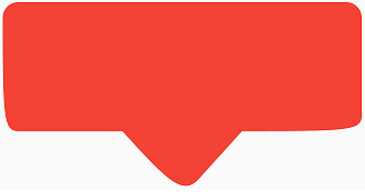
and current implemented code has this result:
could you help me to fix some problem on this desing?
in that height/weight and corners should be customizable and i should can put some widget into that, for example:
class MessageClipper extends CustomClipper<Path> {
  MessageClipper({this.borderRadius = 15});
  final double borderRadius;
  @override
  Path getClip(Size size) {
    double width = size.width;
    double height = size.height;
    double rheight = height - height / 3;
    double oneThird = width / 3;

    final path = Path()
      ..lineTo(0, rheight - borderRadius)
      ..cubicTo(0, rheight - borderRadius, 0, rheight, borderRadius, rheight)
      ..lineTo(oneThird, rheight)
      ..lineTo(width/2-borderRadius, height-borderRadius)
      ..cubicTo(width / 2 - borderRadius, height - borderRadius, width / 2,
          height, width / 2 + borderRadius, height - borderRadius )
      ..lineTo(2 * oneThird, rheight)
      ..lineTo(width-borderRadius, rheight)
      ..cubicTo(width - borderRadius, rheight, width, rheight, width,
          rheight - borderRadius)
      ..lineTo(width, 0)
      ..lineTo(0, 0);
    return path;
  }

  @override
  bool shouldReclip(CustomClipper<Path> oldClipper) => true;
}
 832
832
Edit: As pskink metioned in this question: Flutter - ClipPath, this would be the correct way to achieve what you want:
class TooltipShapeBorder extends ShapeBorder {
  final double arrowWidth;
  final double arrowHeight;
  final double arrowArc;
  final double radius;

  TooltipShapeBorder({
    this.radius = 16.0,
    this.arrowWidth = 20.0,
    this.arrowHeight = 10.0,
    this.arrowArc = 0.0,
  }) : assert(arrowArc <= 1.0 && arrowArc >= 0.0);

  @override
  EdgeInsetsGeometry get dimensions => EdgeInsets.only(bottom: arrowHeight);

  @override
  Path getInnerPath(Rect rect, {TextDirection textDirection}) => null;

  @override
  Path getOuterPath(Rect rect, {TextDirection textDirection}) {
    rect = Rect.fromPoints(rect.topLeft, rect.bottomRight - Offset(0, arrowHeight));
    double x = arrowWidth, y = arrowHeight, r = 1 - arrowArc;
    return Path()
      ..addRRect(RRect.fromRectAndRadius(rect, Radius.circular(radius)))
      ..moveTo(rect.bottomCenter.dx + x / 2, rect.bottomCenter.dy)
      ..relativeLineTo(-x / 2 * r, y * r)
      ..relativeQuadraticBezierTo(-x / 2 * (1 - r), y * (1 - r), -x * (1 - r), 0)
      ..relativeLineTo(-x / 2 * r, -y * r);
  }

  @override
  void paint(Canvas canvas, Rect rect, {TextDirection textDirection}) {}

  @override
  ShapeBorder scale(double t) => this;
}
This is how to use it:
@override
Widget build(BuildContext context) {
  return Scaffold(
    appBar: AppBar(
      title: Text('Instagram Like Balloon Tooltip'),
    ),
    body: Center(
      child: Container(
        decoration: ShapeDecoration(
          color: Colors.red,
          shape: TooltipShapeBorder(arrowArc: 0.5),
          shadows: [
            BoxShadow(
                color: Colors.black26, blurRadius: 4.0, offset: Offset(2, 2))
          ],
        ),
        child: Padding(
          padding: EdgeInsets.all(16.0),
          child: Text('Text 22', style: TextStyle(color: Colors.white)),
        ),
      ),
    ),
  );
}
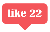
And this would be the result:

If you want to change the curvature of the arrow, you can use the arrowArc propery of the TooltipShapeBorder, if you set it to 0.0 it won't have any curvature and if you set it to 1.0 it will have the maximum curvature.
To see how quadraticBezierTo works and how to make other shapes check this link: Paths in Flutter: A Visual Guide
169
If you love us? You can donate to us via Paypal or buy me a coffee so we can maintain and grow! Thank you!
Donate Us With