 Menu
Menu
I'm trying to place some divs, with this rule: Fill first column where possible, then (when first column is full) fill the second column, etc. (Please see the image below)
This is what I want to have: (created with Paint!)
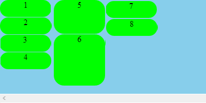
In the image above, as you can see, first column has 1,2,3,4 and there is not enough vertical space to put 5 in the first column. So 5 should be placed on the second column...
I've tried to create something like the image above using float:left, but this is the result:
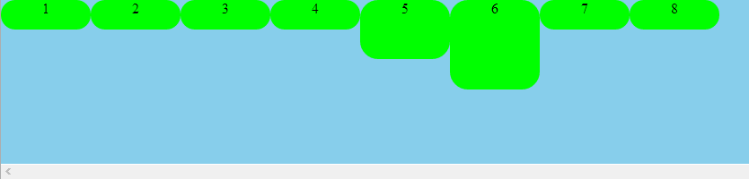
How to create something like the first image? What's wrong with my current code (which creates the second image)?
This is my HTML code:
<div class="container">
<div class="i1">1</div>
<div class="i1">2</div>
<div class="i1">3</div>
<div class="i1">4</div>
<div class="i2">5</div>
<div class="i3">6</div>
<div class="i1">7</div>
<div class="i1">8</div>
</div>
And this is my CSS:
.container {
    overflow:scroll;
    width:10000px;
    height:200px;
    background:skyblue;
    position:absolute;
}
.i1,.i2,.i3 {
    float:left;
    width:100px;
    background:lime;
    border-radius: 20px;
    text-align:center;
}
.i1 {
    height:33px;
}
.i2 {
    height:66px;
}
.i3 {
    height:100px;
}
Fiddle of my code
 523
523
just modern tablets and smartphones should show it correctly
In that case, use CSS3 columns. The browser support should be good enough.
http://jsfiddle.net/thirtydot/AQ7bp/4/
.container {
    -webkit-column-width: 100px;
    -moz-column-width: 100px;
    column-width: 100px;

    -webkit-column-gap: 5px;
    -moz-column-gap: 5px;
    column-gap: 5px;
}
.i1,.i2,.i3 {
    display: inline-block;
    vertical-align: top;
}
If you love us? You can donate to us via Paypal or buy me a coffee so we can maintain and grow! Thank you!
Donate Us With

