 Menu
Menu
LIVE DEMO
Consider the following HTML and CSS:
<div class="wrapper">
  <div class="first">The CSS3 Flexible Box, or flexbox, is a layout mode providing for the arrangement .</div>
  <div class="second"></div>
</div>
<div class="wrapper">
  <div class="first"></div>
  <div class="second"></div>
</div>


.wrapper {
  display: flex;
  border: 1px solid black;
  width: 300px;
  height: 100px;
  margin-top: 30px;
}
.first {
  flex-grow: 1;
  background-color: #aaa;
}
.second {
  width: 80px;
  background-color: #ddd;
}
and the following result:
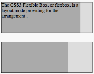
Why the first wrapper doesn't respect .second's width: 80px?
How could I fix that using flexbox?
PLAYGROUND HERE
 262
262
You need to use flex: 1; instead of flex-grow: 1;
.first {
    flex: 1;
    background-color: #aaa;
}
Demo
Also, I would like to point out that flexbox support isn't good as far as IE is concerned, so if anyones interested in a similar layout with more compatible option, than
<div class="wrapper">
    <div class="second"></div>
    <div class="first"></div>
</div>


.wrapper {
    border: 1px solid black;
    width: 300px;
    height: 100px;
    margin-top: 30px;
}

.wrapper .first {
    background: red;
    height: 100%;
    margin-right: 80px;
}

.wrapper .second {
    height: 100%;
    width: 80px;
    float: right;
    background: blue;
}
Demo (Note that I swapped the order of the div in the DOM)
156
If you love us? You can donate to us via Paypal or buy me a coffee so we can maintain and grow! Thank you!
Donate Us With

