 Menu
Menu
I want to make a box (flex-item in this case) which always stays in the middle of it's container. In that box, there is a header, footer and content section. If the size of the content grows too big in height, I want the content section to be scrollable. The header and footer should always be visible and the box should always stay in it's container.
Here is what I have been able to write:
HTML
<div class="flex-container">
  <div class="flex-item">
     <header>Header</header>
     <div class="content">
        A
      <br>B
      <br>C
      <br>D
      <br>E
      <br>F
      <br>G
      <br>H
      <br>I
      <br>J
      <br>K
     </div>
     <footer>Footer</footer>
  </div>
</div>
CSS
body {
  margin: 120px;
}

.flex-container {
  display: flex;
  width: 200px;
  height: 200px; /* We can assume that the container's height is hardcoded in this example, but the end solution should work even if this value is changed*/
  border: 1px solid black;
  justify-content: center;
}

.flex-item {
  box-sizing: border-box;
  width: 150px;
  border: 5px solid blue;
  align-self: center;
  background-color: red;
  display: flex;
  flex-flow: column;
  max-height: 100%;
}

.content {
  /* It should be possible to scroll this element when it get too big in height*/
  background-color: grey;
  flex: 1;
}
The code is hosted on JSFiddle: https://jsfiddle.net/9fduhpev/3/
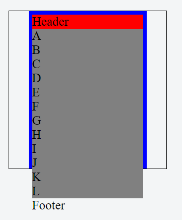
To explain the same thing visually, here is the current situation:
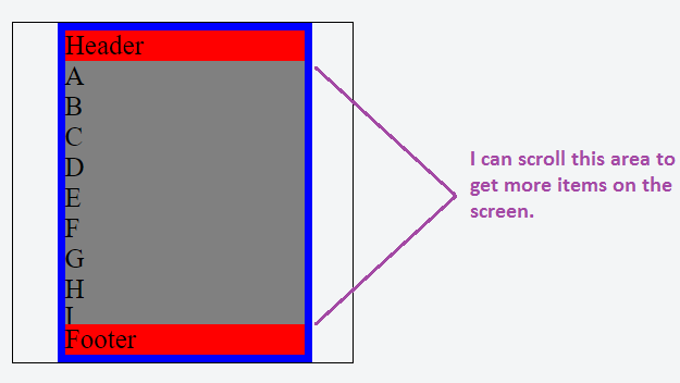
Here is what I want:
 553
553
Use overflow-y: auto;.
Read this: http://www.w3schools.com/cssref/css3_pr_overflow-y.asp
body {
  margin: 120px;
}

.flex-container {
  display: flex;
  width: 200px;
  height: 200px;
  border: 1px solid black;
  justify-content: center;
}

.flex-item {
  box-sizing: border-box;
  width: 150px;
  border: 5px solid blue;
  align-self: center;
  background-color: red;
  display: flex;
  flex-flow: column;
  max-height: 100%;
}

.content {
  background-color: grey;
  flex: 1;
  overflow-y: auto;
}
<div class="flex-container">
<div class="flex-item">
<header>Header</header>
<div class="content">
A
<br>B
<br>C
<br>D
<br>E
<br>F
<br>G
<br>H
<br>I
<br>J
<br>K
<br>L
</div>
<footer>Footer</footer>
</div>
</div>If you love us? You can donate to us via Paypal or buy me a coffee so we can maintain and grow! Thank you!
Donate Us With

