 Menu
Menu
I'm in the process of updating an old inline-block-based grid model I have to a newer Flexbox one I created. Everything has worked fine, apart from one little snag, which has become a bit of a dealbreaker:
I have a bunch of CSS-controlled sliders; so there's a containing wrapper with 100% width, and inside is another div: its width is also 100%, but its white-space is set to nowrap. Using inline-block, this meant that the internal divs (which were also set to 100% width) wouldn't be bound by their parents' constraints and wrap onto the next line - they'd just carry on flowing out of the box. This is exactly what I wanted. However, I cannot get this to work at all with flexbox. For reference, here's an image:
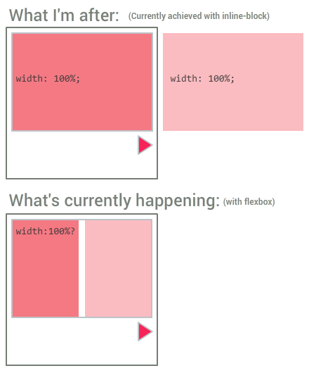
And for reference, here's a jsFiddle of the thing working with inline-block: http://jsfiddle.net/5zzvqx4b/
...and not working with Flexbox: http://jsfiddle.net/5zzvqx4b/1/
I've tried all kinds of variations with flex, flex-basis, flex-wrap, flex-grow, etc. but for the life of me I can't get this to work.
Note that I can force it to do what I want in a hacky, inflexible way by setting the .boxcontainer width to 200%. That works for this single example, but in some cases I won't know beforehand how many child boxes there will be, and I'd rather not resort to inline styling on each element if possible.
 796
796
You can make flex items take the content width instead of the width of the parent container with CSS properties. The problem is that a flex container's initial setting is align-items: stretch; meaning that items expand to cover the container's full length along the cross axis.
To prevent the flex items from shrinking, set the flex shrink factor to 0:
The flex shrink factor determines how much the flex item will shrink relative to the rest of the flex items in the flex container when negative free space is distributed. When omitted, it is set to 1.
.boxcontainer .box { flex-shrink: 0; } * { box-sizing: border-box; } .wrapper { width: 200px; background-color: #EEEEEE; border: 2px solid #DDDDDD; padding: 1rem; } .boxcontainer { position: relative; left: 0; border: 2px solid #BDC3C7; transition: all 0.4s ease; display: flex; } .boxcontainer .box { width: 100%; padding: 1rem; flex-shrink: 0; } .boxcontainer .box:first-child { background-color: #F47983; } .boxcontainer .box:nth-child(2) { background-color: #FABCC1; } #slidetrigger:checked ~ .wrapper .boxcontainer { left: -100%; } #overflowtrigger:checked ~ .wrapper { overflow: hidden; }<input type="checkbox" id="overflowtrigger" /> <label for="overflowtrigger">Hide overflow</label><br /> <input type="checkbox" id="slidetrigger" /> <label for="slidetrigger">Slide!</label> <div class="wrapper"> <div class="boxcontainer"> <div class="box"> First bunch of content. </div> <div class="box"> Second load of content. </div> </div> </div>You can use the shorthand flex property and set it to
flex: 0 0 100%; That's flex-grow, flex-shrink, and flex-basis in one line. Flex shrink was described above, flex grow is the opposite, and flex basis is the size of the container.
42
If you love us? You can donate to us via Paypal or buy me a coffee so we can maintain and grow! Thank you!
Donate Us With