 Menu
Menu
I am working on a nested flexbox layout which should work as follows:
The outermost level (ul#main) is a horizontal list that must expand to the right when more items are added to it. If it grows too big, there should be a horizontal scroll bar.
#main {
    display: flex;
    flex-direction: row;
    flex-wrap: nowrap;
    overflow-x: auto;
    /* ...and more... */
}
Each item of this list (ul#main > li) has a header (ul#main > li > h2) and an inner list (ul#main > li > ul.tasks). This inner list is vertical and should wrap into columns when needed. When wrapping into more columns, its width should increase to make room for more items. This width increase should apply also to the containing item of the outer list.
.tasks {
    flex-direction: column;
    flex-wrap: wrap;
    /* ...and more... */
}
My problem is that the inner lists don't wrap when the height of the window gets too small. I have tried lots of tampering with all the flex properties, trying to follow the guidelines at CSS-Tricks meticulously, but no luck.
This JSFiddle shows what I have so far.
Expected result (what I want):
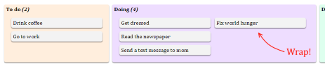
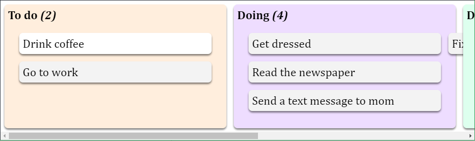
Actual result (what I get):
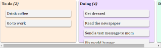
Older result (what I got in 2015):
After some investigation, this is beginning to look like a bigger issue. All major browsers behave the same way, and it has nothing to do with my flexbox design being nested. Even simpler flexbox column layouts refuse to increase the list's width when the items wrap.
This other JSFiddle clearly demonstrates the problem. In current versions of Chrome, Firefox and IE11, all items wrap correctly; the list's height increases in row mode, but its width does not increase in column mode. Also, there is no immediate reflow of elements at all when changing the height of a column mode, but there is in row mode.
However, the official specs (look specifically at example 5) seem to indicate that what I want to do should be possible.
Can someone come up with a workaround to this problem?
After a lot of experimenting using JavaScript to update the height and width of various elements during resize events, I have come to the conclusion that it is too complex and too much trouble to try to solve it that way. Also, adding JavaScript definitely breaks the flexbox model, which should be kept as clean as possible.
For now, I'm falling back to overflow-y: auto instead of flex-wrap: wrap so that the inner container scrolls vertically when needed. It is not pretty, but it is one way forward that at least does not break useability too much.
 501
501
This looks like a fundamental deficiency in flex layout.
A flex container in column-direction will not expand to accommodate additional columns. (This is not a problem in flex-direction: row.)
This question has been asked many times (see list below), with no clean answers in CSS.
It's hard to pin this as a bug because the problem occurs across all major browsers. But it does raise the question:
How is it possible that all major browsers got the flex container to expand on wrap in row-direction but not in column-direction?
You would think at least one of them would get it right. I can only speculate on the reason. Maybe it was a technically difficult implementation and was shelved for this iteration.
UPDATE: The issue appears to be resolved in Edge v16.
The OP created a useful demo illustrating the problem. I'm copying it here: http://jsfiddle.net/nwccdwLw/1/
Hacky solutions from the Stack Overflow community:
"It seems this issue cannot be solved only with CSS, so I propose you a JQuery solution."
"It's curious that most browsers haven't implemented column flex containers correctly, but the support for writing modes is reasonably good. Therefore, you can use a row flex container with a vertical writing mode."
Chromium Bug Report
Mark Amery's answer
161
If you love us? You can donate to us via Paypal or buy me a coffee so we can maintain and grow! Thank you!
Donate Us With

