 Menu
Menu
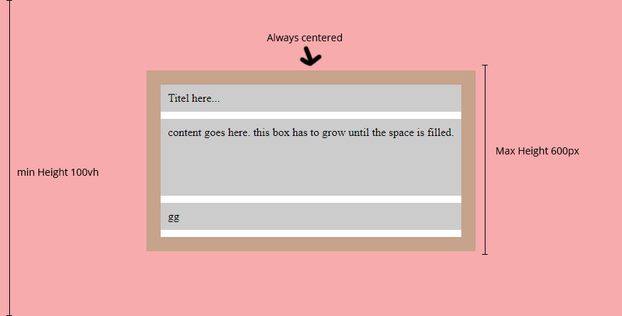
I need a centered box inside a 100vh min-height container with a min-height of 100% and a max-height of let's say 600px. thats pretty easy so far. but in my centered box i have 3 other elements (title, content and footer). the content part has to grow until all available space is reached (in this case it's the max-height of the parent minus the title and gg part).
is this possible with flexbox?
here is a short scribble:
I also tried i by myself, but i run into problems as soon as i enter a minheight of 100% istead of a pixel value to the item div. any idea how i can fix this and can work with min-height 100%?
* {
  box-sizing:border-box;
  margin:0;
  padding:0;
}
.wrapper {
  background: rgba(red, 0.3);
  display:flex;
  min-height:100vh;
  align-items: center;
  justify-content:center;
  //flex-direction:column;

  .wrapper-inner {
    padding:20px;
    max-width:80%;
    min-height:100%;
    //max-height: 500px;
    background:#fff;
    display:flex;
    flex-direction:column;
    background: rgba(green, 0.2);

  }
  .item {
    width:100%;
    min-height:100%;
    display:flex;
    flex-direction:column;
    max-height:600px;
    background:#fff;
  }

  .titel,
  .content,
  .footer {
    padding:10px;
    background: rgba(#000, 0.2);
    margin-bottom:10px;
  }
  .content {
   flex-grow:1;
  }


}
<div class="wrapper">
<div class="wrapper-inner">
<div class="item">
<div class="titel">Titel here...</div>
<div class="content">
content goes here. this box has to grow until the space is filled.
"Lorem ipsum dolor sit amet, consectetur adipiscing elit, sed do eiusmod tempor incididunt ut labore et dolore magna aliqua. Ut enim ad minim veniam, quis nostrud exercitation ullamco laboris nisi ut aliquip ex ea commodo consequat. Duis aute irure dolor in reprehenderit in voluptate velit esse cillum dolore eu fugiat nulla pariatur. Excepteur sint occaecat cupidatat non proident, sunt in culpa qui officia deserunt mollit anim id est laborum.
</div>
<div class="footer">gg</div>
</div>
</div>
</div>here is a working fiddle: https://jsfiddle.net/zg3kLe70/14/
EDIT: And here the design:
The White Box has to fill the available max-height space.

EDIT2: I'm getting closer and closer :) newest fiddel seems to work well in chrome, firefox, edge and safari. but in IE10/11 the content is not centered. i think it's a problem with the min-height:100 vh... https://jsfiddle.net/zg3kLe70/26/
Thank you, Marco
 276
276
Getting the child of a flex-item to fill height 100%Set position: relative; on the parent of the child. Set position: absolute; on the child. You can then set width/height as required (100% in my sample).
1: When the parent "flex-direction" is a "row", its child "flex-grow" works horizontally. 2: When the parent "flex-direction" is "columns", its child "flex-grow" works vertically.
The flex-basis Property on the Block Axis On the block axis ( flex-direction: column ), flex-basis takes the height of the flex-items into account, instead of their width.
“For example, if all items have flex-grow set to 1, every child will set to an equal size inside the container. If you were to give one of the children a value of 2, that child would take up twice as much space as the others.”
You can use less wrappers. For a single box to be at center (body is the wrapper-inner):
html,
body {
  height: 100%;
  display: flex;
  flex-direction: column;
  background: lightblue;
}

body {
  max-height: 600px;
  width: 80%;
  border: solid;
  margin: auto;
  background: crimson;
  color: white;
}

main {
  flex: 1;
  background: maroon;
  /* overflow:auto; */
  /* recommended*/
}

body>* {
  padding: 3vh;
}
<header>
<h1>header any height</h1>
</header>
<main>
<p>should it be scrolling when needed</p>
</main>
<footer>
<p>footer any height</p>
</footer>For a few boxes stacking at 100vh and a centered box, an extra wrapper to set the 100% height is needed and an inner wrapper to set the *(max-)*height. (body holds a few wrapper)
first box might the one you look for in the snippet below, growing from its content untill it reaches max-height set)
html, body , .wrapper, .wrapper-inner{
  height:100%;
}
.wrapper, .wrapper-inner {
  display:flex;
  flex-direction:column;
  width:80%;
  margin:auto;
}
.wrapper-inner {
  max-height:600px;
  border:solid;
  background:crimson;
  color:white;
}
main {
  flex:1;
  background:maroon;
   overflow:auto; /* recommended*/
}
.wrapper:first-of-type .wrapper-inner {
height:auto;
}

.wrapper-inner > * {
  padding:3vh;
}
<div class="wrapper">
<div class="wrapper-inner">
<header><h1>header any height</h1></header>
<main> <p>first box will grow up 600px max</p> </main>
<footer><p>footer any height</p></footer></div>
</div>
<div class="wrapper">
<div class="wrapper-inner">
<header><h1>header any height</h1></header>
<main> <p>should it be scrolling when needed</p> </main>
<footer><p>footer any height</p></footer></div>
</div>
<div class="wrapper">
<div class="wrapper-inner">
<header><h1>header any height</h1></header>
<main> <p>should it be scrolling when needed</p> </main>
<footer><p>footer any height</p></footer></div>
</div>If you love us? You can donate to us via Paypal or buy me a coffee so we can maintain and grow! Thank you!
Donate Us With

