 Menu
Menu
I would like a column of divs, of any number, each with width 100% and height 100% of their parent div, so one is visible initially, and the others overflow the parent downwards. I've set the divs to have flex: 0 0 100%;, inside a parent div with display: flex and flex-direction: column to achieve this.
The parent div is itself of unknown height, so it is also a child of a display: flex and flex-direction: column, set to flex: 1 0 0 to take remaining space in its container.
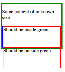
In Firefox the output is as I would like it:
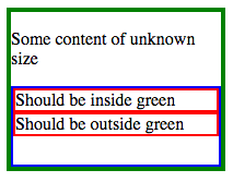
However, not in Chrome:
How can I achieve the Firefox style in Chrome, without Javascript?
You can see this in action at http://plnkr.co/edit/WnAcmwAPnFaAhqqtwhLL?p=preview, as well as the corresponding version with flex-direction: row, which works consistently in both Firefox and Chrome.
For reference, the full CSS
.wrapper { display: flex; flex-direction: column; height: 150px; width: 200px; border: 4px solid green; margin-bottom: 20px; } .column-parent { flex: 1 0 0; display: flex; flex-direction: column; border: 2px solid blue; } .column-child { flex: 0 0 100%; border: 2px solid red; } and HTML
<div class="wrapper"> <p>Some content of unknown size</p> <div class="column-parent"> <div class="column-child"> Should be inside green </div> <div class="column-child"> Should be outside green </div> </div> </div>  940
940
Getting the child of a flex-item to fill height 100%Set position: absolute; on the child. You can then set width/height as required (100% in my sample).
Flex-basis is both width and height in a Flexbox, depending on the flex direction.
This seems to be a bug with Chrome. Similar to the ones reported here (issue 428049) and perhaps related to (issue 346275).
This says:
- Browsers are supposed to resolve percentages on the flex item's child, *if* its flex-basis is definite. - Gecko is *always* resolving percentages regardless of the flex-basis. - Chrome is *never* resolving percentages, regardless of the flex-basis.
Summarily, Chrome is not resolving percent heights on flex-item's child (even if the child itself is a flex-item), while all other browsers do.
This can be demonstrated in the below snippet: (Fiddle here)
* { box-sizing: border-box; margin: 0; padding: 0; } div.wrap { height: 120px; width: 240px; margin: 0px 12px; border: 1px solid blue; float: left; display: flex; flex-direction: column; } div.parent { flex: 0 0 100%; border: 1px solid green; display: flex; flex-direction: column; } div.item { flex: 0 0 100%; border: 1px solid red; }<div class="wrap"> <div class="item">a</div> <div class="item">b</div> <div class="item">c</div> </div> <div class="wrap"> <div class="parent"> <div class="item">a</div> <div class="item">b</div> <div class="item">c</div> </div> </div>The second div should show the same behaviour as the first one. Other browsers (IE11, Edge, FF39) show it correctly. Chrome fails here and does not resolve div.item correctly. It needs a fixed height on its parent, without which it uses min-content as its height and thus does not overflow.
Whereas, in the first div, the div.items are correctly resolved and overflow accordingly. This is because there is a fixed height on the parent (i.e. div.wrap)
Possible Solution:
As a workaround, if you are sure to have only two elements (p and div) inside your wrapper, then you could give them a 50% height. You have to provide a height:50% to your .column-parent. Chrome needs a fixed height on parent as demonstrated above.
Then everything will work as you need to.
Demo Fiddle: http://jsfiddle.net/abhitalks/kqncm65n/
Relevant CSS:
.wrapper > p { flex: 0 0 50%; } /* this can be on flex-basis */ .column-parent { flex: 1 0 auto; height: 50%; /* but, this needs to be fixed height */ display: flex; flex-direction: column; border: 2px solid blue; } .column-child { flex: 0 0 100%; /* this flex-basis is then enough */ border: 2px solid red; } PS: There also seem to be differences in the way jsfiddle and plnkr render. I don't know why, but sometimes I get different results!
179
If you love us? You can donate to us via Paypal or buy me a coffee so we can maintain and grow! Thank you!
Donate Us With