I want to know the basic difference between Flat button and Raised Button. According to the new Android material design guidelines i want to use raised button but i don't know what are they. there are forums on the web that display a button which is raised but they call it Flat.
can any one tell me the base difference between the two ? (By Look specifically)
Both Buttons are following the new Flat Design concept instead of the old Gradient Design concept.
Those concept used to give the user the feeling of this is a Clickable button not just a colored area with text or image.
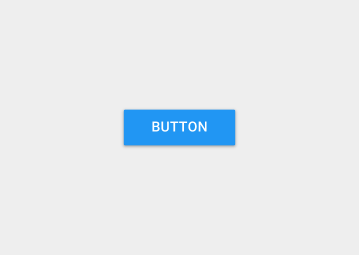
This is the Raised Button that gives you the feeling that it is relatively above the surface on part of it. Which give the user the feeling that he/she can push it down expecting a specific action. More Elegant and give better UX
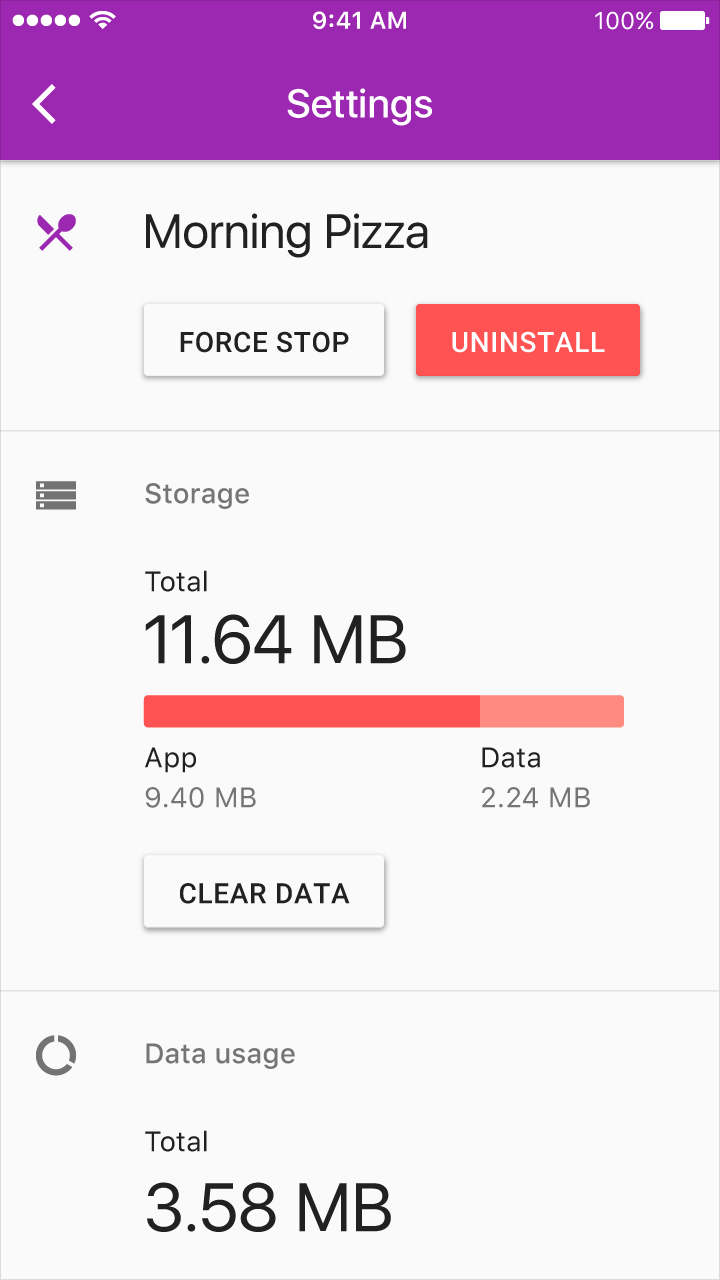
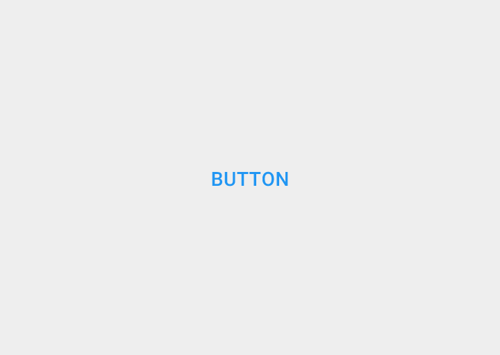
This is the Flat Button. Which is only depend on change part of the surface color to give the user the feeling of this is a different place that might give you different action if you clicked on it.

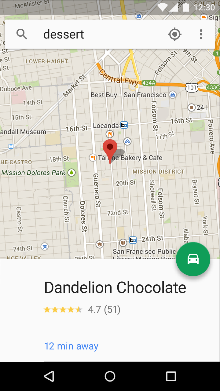
This is the FAB Button. (FAB stands for Floating Action Button) Which is following the same concept of the Raised Button in Material Design, but with a floating feature. This FAB button can be used to indicate a primary action in an app.

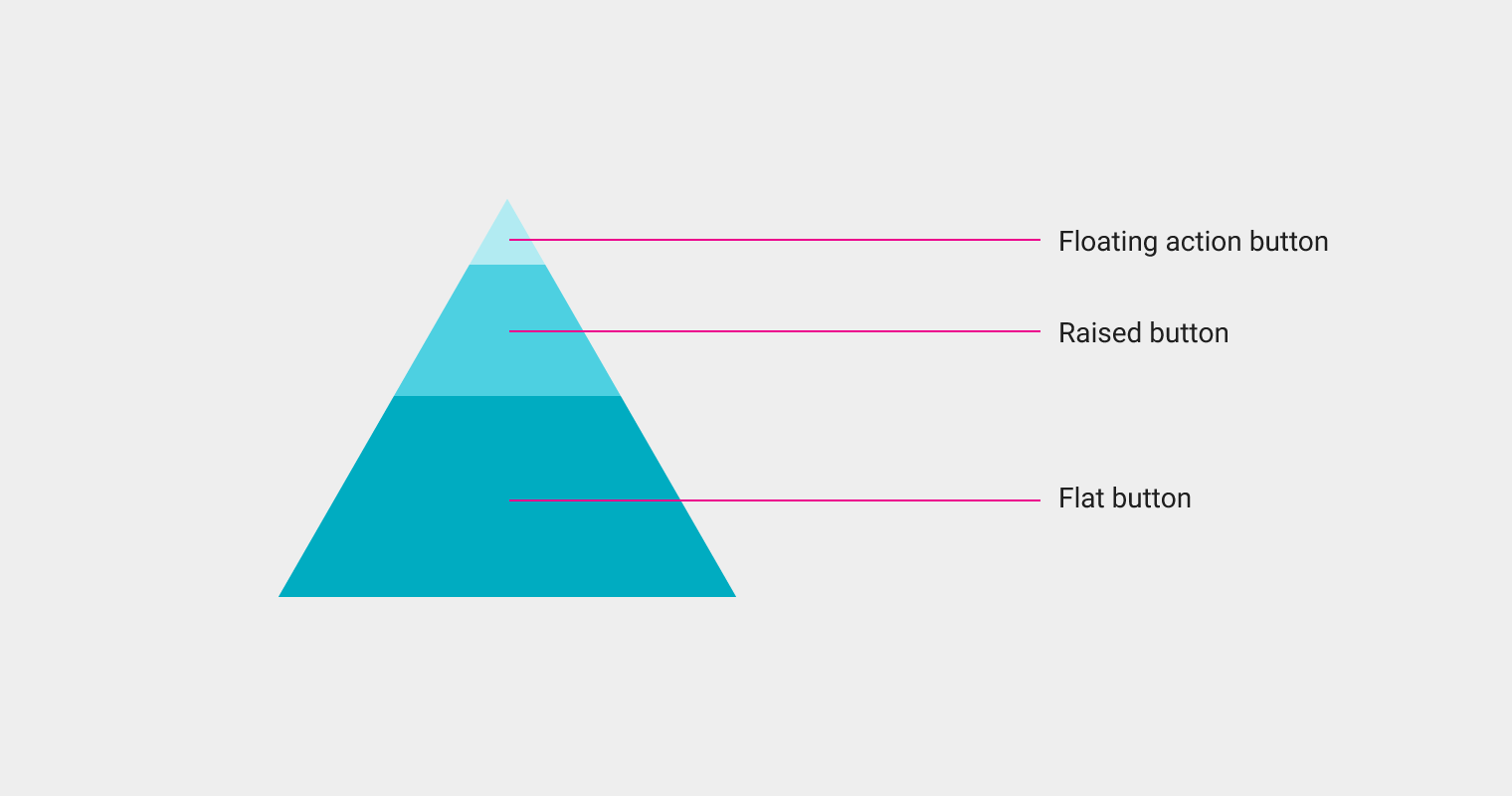
Choosing a button style depends on the primacy of the button, the number of containers on screen, and the screen layout. - Material Design guidelines
According to the Material Design guidelines, you can choose which type of button to use based on these 3 factors:
- Function: Is it important and ubiquitous enough to be a floating action button?
- Dimension: Choose raised or flat depending on the container it will be in and how many z-space layers you have on screen. There should not be many layers of objects on the screen.
- Layout: Use primarily one type of button per container. Only mix button types when you have a good reason to, such as emphasizing an important function.
If you love us? You can donate to us via Paypal or buy me a coffee so we can maintain and grow! Thank you!
Donate Us With