 Menu
Menu
I'm trying to make page with 5 DIVs.
Plan is to put one picture in central DIV, and a link in each of other 4, using Bootstrap 3.
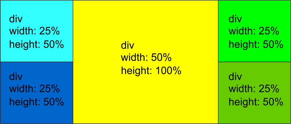
Wanted result:
Code so far:
.container-fluid2 {
  min-height: 100%;
  overflow: hidden;
  background-color: black;
}
.levogore5 {
  height: 50%;
  min-height: 50%;
  margin-bottom: -22%;
  padding-bottom: 22%;
  min-width: 25%;
  max-width: 100%;
  background-color: lime;
  vertical-align: top;
}
.levodole5 {
  height: 50%;
  min-height: 50%;
  margin-bottom: -25%;
  padding-bottom: 25%;
  min-width: 25%;
  max-width: 100%;
  background-color: green;
  vertical-align: baseline;
  margin-top: 22%;
}
.centar5 {
  height: 100%;
  min-height: 100%;
  min-width: 50%;
  max-width: 100%;
  background-color: red;
  margin-bottom: -50%;
  padding-bottom: 50%;
  overflow: hidden;
}
.desnogore5 {
  height: 50%;
  min-height: 50%;
  margin-bottom: -22%;
  padding-bottom: 22%;
  min-width: 25%;
  max-width: 100%;
  background-color: aqua;
  vertical-align: top;
}
.desnodole5 {
  height: 50%;
  min-height: 50%;
  margin-bottom: -25%;
  padding-bottom: 25%;
  min-width: 25%;
  max-width: 100%;
  background-color: blue;
  vertical-align: baseline;
  float: right;
  margin-top: 22%;
}
<div class="container-fluid2">
<div class="row">
<div class="col-sm-3 levogore5">levo gore</div>
<div class="col-sm-5 col-sm-5 span2 centar5">centralni</div>
<div class="col-sm-3 desnogore5">desno gore</div>
</div>
<div class="row">
<div class="col-sm-3 levodole5">levo dole</div>
<div class="col-sm-3 desnodole5">desno dole</div>
</div>
</div>I think I read all existing questions and answers here.
I tried html/body 100%, max-height, container-fluid, -9999px, but they didn't work.
I forgot to mention, responsiveness is crucial, and in my example, those float:right (in css for last DIV), make very big mess on smaller screens.
my idea is using bootstrap to have less problems with smaller screens, in more simpler pages bootstrap just make pile of horizontal DIVs so i hope to have something like this
 459
459
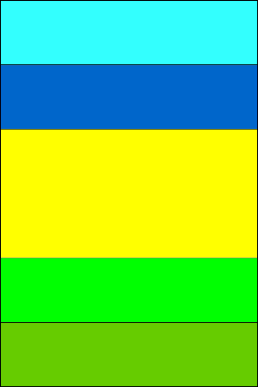
Responsive example without modifying bootstrap grid (Extra points because you shouldn't modify the grid or you won't be able to use it in every scenario)
I had to change your html and add few classes:
<div class="container-fluid container-table">
  <div class="row inline-row">
    <!-- I'm using three columns and nesting aqua and blue under the 1st column -->
    <div class="col-xs-12 col-sm-3">
      <div class="row">
        <div class="col-xs-12 aqua"></div>
        <div class="col-xs-12 blue"></div>
      </div>
    </div>

    <div class="col-xs-12 col-sm-6 yellow"></div>

    <!-- Nesting greenyellow and green -->
    <div class="col-xs-12 col-sm-3">
      <div class="row">
        <div class="col-xs-12 greenyellow"></div>
        <div class="col-xs-12 green"></div>
      </div>
    </div>

  </div>
</div>
And the CSS:
/* Colors */
.aqua{ background-color:aqua; }
.blue{ background-color:blue; }
.yellow{ background-color:yellow; }
.greenyellow{ background-color:greenyellow; }
.green{ background-color:green; }

/* Height 100% to all the elements */
html,
body,
.container-table,
.inline-row,
.inline-row > div {
    height: 100%;
}

/* We do the trick here with Table, table row and table-cell */
.container-table {
    display: table;
    width: 100%; /* Width is important for display:table */
}
.inline-row { display: table-row; }
.inline-row > div { display: table-cell; }

/* This will set our heights as we need them */
.inline-row > div > .row { height: 100%; }
.inline-row > div .row > div { height: 50%; }
EDIT: Changed right and left grid to 25% of width.
My JsFiddle Live example
162
This is a great example of a place to use flex box!
It seems to me that you're taking a row-based approach to this. I think a column-based approach is more appropriate.
When I'm designing a site, I like to try to break it up into squares or rectangles that go all the way across the width or the height of the page.
To my mind, this design has 1 rectangle going across the width of the page, which contains 3 rectangles going across the height of the page, and then some smaller rectangles in each of those.
body {
  margin: 0;
  padding: 0;
}
.column > div {
  border: 1px solid blue;
  min-height: 150px;
}
@media (min-width: 600px) {
  .row {
    display: flex;
    flex-direction: row;
    min-height: 100vh;
  }
  .row > div {
    flex-basis: 25%;
  }
  .row > div.main {
    flex-basis: 50%;
  }
  .column {
    display: flex;
    flex-direction: column;
  }
  .column > div {
    flex-basis: 50%;
  }
  .column.main > div {
    flex-basis: 100%;
  }
}
<div class="row">
<div class="column">
<div>Div width 25% height 50%</div>
<div>Div width 25% height 50%</div>
</div>
<div class="column main">
<div>Div width 50% height 100%</div>
</div>
<div class="column">
<div>Div width 25% height 50%</div>
<div>Div width 25% height 50%</div>
</div>
</div>If you love us? You can donate to us via Paypal or buy me a coffee so we can maintain and grow! Thank you!
Donate Us With