 Menu
Menu
I'm working on a creative project whereby I want to add 'triangles' to box elements to get a speech bubble effect and still apply an opacity to each element as shown below:
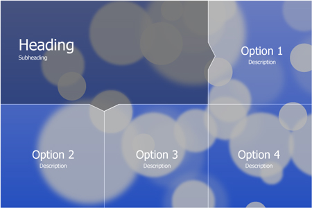
I can get the blocks to display correctly with a 1px boarder on the right and bottom of each element. This, however, does not include the arrows on the heading element. When I add the arrows, using .heading:before, the result is as shown below:

As you can see, the original border remains, breaking the arrow and its corresponding element.
My HTML is as follows:
    <li class="heading">
        <div class="text_contain_head">
            <h1>Heading</h1><p>Subheading</p>
        </div>
    </li>

    <li class="options">
        <div class="text_contain">
            <h2>Option 1</h2><p>Description</p>
        </div>
    </li>

    <li class="options">
        <div class="text_contain">
            <h2>Option 2</h2><p>Description</p>
        </div>
    </li>

    <li class="options">
        <div class="text_contain">
            <h2>Option 3</h2><p>Description</p>
        </div>
    </li>

    <li class="options">
        <div class="text_contain">
            <h2>Option 4</h2><p>Description</p>
        </div>
    </li>
and here's the CSS for .options:
.options {
    position: relative;
    padding-bottom: 25%;
    height: 0;
    width: 25%;
    background-color: rgba(0, 0, 0, 0.25);
    border-right: 1px solid #FFF;
    border-bottom: 1px solid #FFF;
    -moz-box-sizing: border-box;
    -webkit-box-sizing: border-box;
    box-sizing: border-box;
    float: left;
}
and here's the CSS for .heading:
.heading {
    position: relative;
    padding-bottom: 25%;
    width: 75%;
    background-color: rgba(0, 0, 0, 0.6);

    border-right: 1px solid #FFF;
    border-bottom: 1px solid #FFF;

    -moz-box-sizing: border-box;
    -webkit-box-sizing: border-box;
    box-sizing: border-box;

    padding-left: 40px;
    padding-right: 40px;
    float:left;
}

.heading:before {
    content: "\0020";
    display: block;
    border: solid 20px transparent;
    border-right-color: rgba(0, 0, 0, 0.6);

    position: absolute;
    top: 50%;
    right: -40px;
    margin-top: -20px;
    z-index: 1002;

    transform:scale(1,1.5);
    -ms-transform:scale(1,1.5);
    -webkit-transform:scale(1,1.5);
}
P.S. I use :after to add a white triangle with a 1px offset underneath the :before to replicate the border around the triangles.
In the end, I want to be able to keep the elements' opacities (due to the background image) and still be able to 'remove' the original border where the arrows overlap.
I'm stumped, as such any and all advice would be most apreciated
here is a jsfiddle of what I have so far: http://jsfiddle.net/N2nZ6/1/
 894
894
I have put up a fiddle of my own: http://jsfiddle.net/Pevara/8WBcQ/
It was not easy, but i think i got away with it, but with some limitations:
- I had to add two empty nodes inside your .heading for the arrows. I know it isn't pretty, but I tried without them and just couldn't get it to work.
- I had to set a fixed width. It might be possible to do with percentages, but as it requiers very exact positioning, I did not even try... (percentages and exact postioning are a no go in my experience)
How does it work:
- I turn the extra nodes into a square and rotate them 45deg to make them look like an arrow point
- I position them absolute over the edge of the .heading, to cover up the border.
- I set them to overflow hidden to prevent the :after and :before overflowing
- I set the background image on the :before, counter rotate 45deg, and position exactly to line up with the background image of the ul
- I add another :after with a the same semi-transparent background color as the .heading to make the backgrounds match exactly.
It is not exactly clean, and it will take some fiddling with the positioning, but it works (in chrome, other browsers might need some prefixes). I don't dare to look at the result in older IE's. Might not be useable in a real life website, but as a proof of concept...
In real life I would probably go for a sprite image with the borders and arrows already in place, and position the li's on top of them.
And because SO insists, here is a part of the css:
.arrow-down {
    position: absolute;
    display: block;
    overflow: hidden;
    width: 50px;
    height: 50px;
    -webkit-transform: rotate(45deg);
    top: 200px;
    left: 300px;
    background-color: rgba(0, 0, 0, .5);
    margin-left: -25px;
    z-index: 5;
    border: 1px solid #fff;
    border-left: none;
    border-top: none;
}
.arrow-down:after {
    content:' ';
    display: block;
    width: 300px;
    height: 300px;
    -webkit-transform: rotate(-45deg);
    background-repeat: no-repeat;
    background-image: url(http://www.placekitten.com/900/600);
    background-position: -114px -77px;
    z-index: 1;
    position: absolute;
    top: -100px;
    left: -150px;
}
.arrow-down:before {
    content:'';
    background-color: rgba(0, 0, 0, .5);
    z-index: 2;
    position: absolute;
    top: -5px;
    left: -5px;
    bottom: -5px;
    right: -5px;
}
If you love us? You can donate to us via Paypal or buy me a coffee so we can maintain and grow! Thank you!
Donate Us With