 Menu
Menu
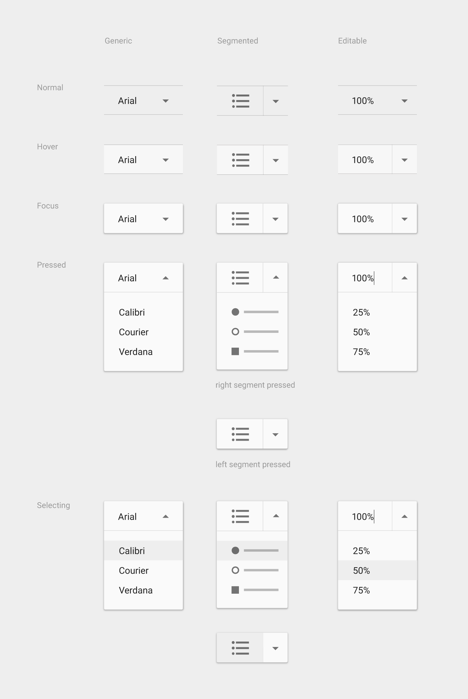
I'm wondering how can I do a dropdown button / menu like the ones we can see in the designs specs from Google and in the image bellow, so the list expands bellow right bellow the button. Do I need to set a custom layout for it instead of the R.layout.support_simple_spinner_dropdown_item?
 604
604
You could use a PopUpMenu https://developer.android.com/reference/android/widget/PopupMenu.html
PopupMenu popup = new PopupMenu(context, view);

for (Element e: elementsList) {

    popup.getMenu().add(e.id).setTitle(e.title);
}

popup.setOnMenuItemClickListener(new PopupMenu.OnMenuItemClickListener() {

     public boolean onMenuItemClick(MenuItem item) {

        return true;
     }
});

popup.show();
Technically it's just a Spinner with custom views and styles.
I tried to make one that looks similar to the one you posted, using AppCompat, working with custom drawables and with the view's elevation property, thus it may not completely work for Android versions older than 5.0.
First let us define our Spinner with its dropdown properties:
<your.package.CustomSpinner
    android:id="@+id/spinner"
    style="@style/Widget.AppCompat.Spinner"
    android:layout_margin="10dp"
    android:layout_width="200dp"
    android:dropDownWidth="200dp"
    android:layout_height="?attr/dropdownListPreferredItemHeight"
    android:dropDownVerticalOffset="?attr/dropdownListPreferredItemHeight"
    android:background="@drawable/spinner_bg"
    android:popupBackground="@android:color/white"
    android:paddingRight="14dp"
    android:stateListAnimator="@drawable/spinner_sla"
    android:popupElevation="3dp" />
Important: We use the CustomSpinner class from this post, because we need the callbacks to know when the spinner opens an closes (for styling purposes).
Then we setup the spinner: We use a custom View for the selected item (layout defined below) to apply our styles, and AppCompat's default R.layout.support_simple_spinner_dropdown_item, but we may use another layout to further adjust the styling.
String[] data = {"Arial", "Calibri", "Helvetica", "Roboto", "Veranda"};

ArrayAdapter adapter = new ArrayAdapter<>(getContext(), R.layout.spinner_item_selected, data);
adapter.setDropDownViewResource(R.layout.support_simple_spinner_dropdown_item);

final CustomSpinner spinner = (CustomSpinner) view.findViewById(R.id.spinner);
spinner.setAdapter(adapter);
spinner.setSpinnerEventsListener(new CustomSpinner.OnSpinnerEventsListener() {
    public void onSpinnerOpened() {
        spinner.setSelected(true);
    }
    public void onSpinnerClosed() {
        spinner.setSelected(false);
    }
});
And here the spinner_item_selected.xml layout:
<TextView xmlns:android="http://schemas.android.com/apk/res/android"
    android:id="@android:id/text1"
    style="?attr/spinnerDropDownItemStyle"
    android:singleLine="true"
    android:layout_width="match_parent"
    android:layout_height="?attr/dropdownListPreferredItemHeight"
    android:background="@drawable/abc_spinner_mtrl_am_alpha"
    android:ellipsize="marquee" />
Further we need the drawables used above:
spinner_bg.xml as the spinner's background:
<selector xmlns:android="http://schemas.android.com/apk/res/android"
    android:exitFadeDuration="@android:integer/config_mediumAnimTime">
    <item android:state_pressed="true" android:drawable="@android:color/white" />
    <item android:state_selected="true" android:drawable="@android:color/white" />
    <item>
        <inset android:insetLeft="-1dp" android:insetRight="-1dp">
            <shape android:shape="rectangle">
                <stroke android:width="1dp" android:color="#cccccc" />
                <solid android:color="#f0f0f0" />
            </shape>
        </inset>
    </item>
</selector>
spinner_sla.xml to animate the spinner's elevation:
<selector xmlns:android="http://schemas.android.com/apk/res/android">
    <item android:state_pressed="true">
        <set>
            <objectAnimator
                android:duration="@android:integer/config_mediumAnimTime"
                android:propertyName="translationZ"
                android:valueTo="3dp" />
        </set>
    </item>
    <item android:state_selected="true">
        <set>
            <objectAnimator
                android:duration="@android:integer/config_shortAnimTime"
                android:propertyName="translationZ"
                android:valueTo="3dp" />
        </set>
    </item>
    <item>
        <set>
            <objectAnimator
                android:duration="@android:integer/config_shortAnimTime"
                android:propertyName="translationZ"
                android:valueTo="0" />
        </set>
    </item>
</selector>
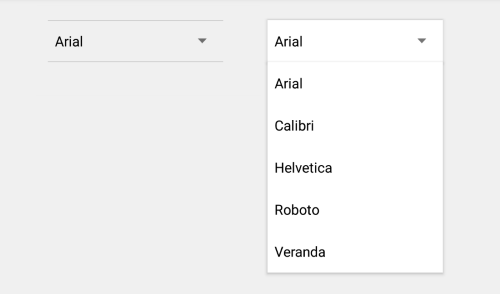
This gives us a result like this (left collapsed, right open):
If we want to use a spinner with images, we would also have to define a custom dropdown item view.
34
If you love us? You can donate to us via Paypal or buy me a coffee so we can maintain and grow! Thank you!
Donate Us With