 Menu
Menu
It seems as though I am having problems with creating a display: inline styling equivalent with flexbox. So far I have achieved the following (where the red and blue lines are governed by the border function to help with styling):
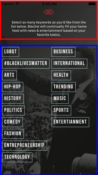
With this code:
var React = require('react-native'); var { View, ScrollView, Image, StyleSheet, Text, TouchableHighlight, } = React; //additional libraries var Parse = require('parse/react-native'); //parse for data storage Icon = require('react-native-vector-icons/Ionicons'); //vector icons //dimensions var Dimensions = require('Dimensions'); var window = Dimensions.get('window'); //dynamic variable components var ImageButton = require('../common/imageButton'); //var KeywordBox = require('./onboarding/keyword-box'); module.exports = React.createClass({ render: function() { return ( <View style={[styles.container]}> <Image style={styles.bg} source={require('./img/login_bg1_3x.png')}> <View style={[styles.header, this.border('red')]}> <View style={[styles.headerWrapper]} > <Image resizeMode={'contain'} style={[styles.onboardMsg]} source={require('./img/onboard_msg.png')} > </Image> </View> </View> <View style={[styles.footer, this.border('blue')]}> <ScrollView horizontal={false} style={styles.footerWrapperNC} contentContainerStyle={[styles.footerWrapper]}> {this.renderKeywordBoxes()} </ScrollView> </View> </Image> </View> ); }, renderKeywordBoxes: function() { //renders array of keywords in keyword.js //and maps them onto custom component keywordbox to show in the onboarding //component var Keywords = ['LGBQT', '#BlackLivesMatter', 'Arts', 'Hip-Hop', 'History', 'Politics', 'Comedy', 'Fashion', 'Entrepreneurship', 'Technology', 'Business', 'International', 'Health', 'Trending', 'Music', 'Sports', 'Entertianment']; return Keywords.map(function(keyword, i) { return <TouchableHighlight style={styles.keywordBox} key={i} underlayColor={'rgb(176,224,230, 0.6)'} > <Text style={styles.keywordText} >{keyword}</Text> </TouchableHighlight> }); }, //function that helps with laying out flexbox itmes //takes a color argument to construct border, this is an additional //style because we dont want to mess up our real styling border: function(color) { return { borderColor: color, borderWidth: 4, } }, }); styles = StyleSheet.create({ header: { flex: 2, }, headerWrapper: { flex: 1, flexDirection: 'column', alignItems: 'center', justifyContent:'space-around', marginTop: window.height/35, }, onboardMsg: { width: (window.width/1.3), height: (452/1287)*((window.width/1.3)), }, footer: { flex: 7, marginTop: window.height/35, }, //container style wrapper for scrollview footerWrapper: { flexWrap: 'wrap', alignItems: 'flex-start', }, //non-container style wrapper for scrollview footerWrapperNC: { flexDirection:'row', }, container: { flex: 1, alignItems: 'center', justifyContent: 'center', }, bg: { flex: 1, width: window.width, height: window.height, }, actionButtonIcon: { fontSize: 20, height: 22, color: 'white', }, keywordText: { fontFamily: 'Bebas Neue', fontSize: 18, padding: 6, fontWeight: 'bold', color: 'white', letterSpacing: 1.5, textAlign: 'center' }, keywordBox: { backgroundColor: 'transparent', margin: 3, borderColor: 'rgb(176,224,230, 0.6)', borderWidth: 1, }, }); But I would like to achieve this:
any ideas?
EDIT** ANSWER:
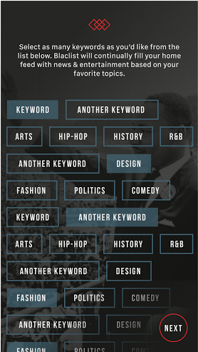
Needed to change the styling to the following:
//container style wrapper for scrollview footerWrapper: { flexWrap: 'wrap', alignItems: 'flex-start', flexDirection:'row', }, //non-container style wrapper for scrollview footerWrapperNC: { flexDirection:'column', }, So use of flexDirection in column and row for scrollView works children stay inline
 424
424
React Native doesn't support the CSS display property, and by default all elements use the behavior of display: flex (no inline-flex either). Most non-flex layouts can be simulated with flex properties, but I'm flustered with inline text.
The display: inline-block Value Compared to display: inline , the major difference is that display: inline-block allows to set a width and height on the element. Also, with display: inline-block , the top and bottom margins/paddings are respected, but with display: inline they are not.
Now let's switched to the opposite of it, block . Remember inline elements appears on the same line. Well, block starts on a NEW line and takes up the full width available. So that means block elements will occupy the entire width of its parent element.
“display: inline” Property: This property is used to display an element as an inline element (like <span>). The height and width properties are not effected on display:inline; property. It allows only left and right side of margins, not top and bottom.
How to make items display inline in React Native? To make items display inline in React Native, we can use set flexDirection to 'row'. to set the outer view’s style to have flexDirection set to 'row' and flexWrap set to 'wrap' to make the Text components display side by side and wrap them to the next row if they overflow the width of the screen.
There is no direct equivalent of display none in React Native - this is because React Native shows and hides elements based on your application state. So rather than setting an elements visibility directly, you would show or hide an element based on a state value.
The most fundamental component for building a UI, View is a container that supports layout with flexbox, style, some touch handling, and accessibility controls. View maps directly to the native view equivalent on whatever platform React Native is running on, whether that is a UIView, , android.view, etc.
If you're coming to React Native from web development, you're probably used to hiding an element by setting the display property to none in CSS - and you might be wondering if there's an equivalent method in React Native. The answer is… sort of.
Needed to change the styling to the following:
//container style wrapper for scrollview footerWrapper: { flexWrap: 'wrap', alignItems: 'flex-start', flexDirection:'row', }, //non-container style wrapper for scrollview footerWrapperNC: { flexDirection:'column', }, This works for me:
import {View, Text} from 'react-native'; <View style={styles.container}> <Text>Hello</Text> </View> const styles = StyleSheet.create({ container: { flexDirection: 'row', alignSelf: 'flex-start' } }); If you love us? You can donate to us via Paypal or buy me a coffee so we can maintain and grow! Thank you!
Donate Us With
