 Menu
Menu
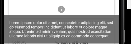
Is there a way to customise the Flutter tooltip to change colour and increase the padding/margins. The default seems to fill the width of the whole screen and there are no named parameters to configure this any further. The code below produces a Tooltip as shown in the screenshot.
Tooltip(child:  IconButton(icon: Icon(Icons.info, size: 30.0)),
        message: 'Lorem ipsum dolor sit amet, consectetur '
                 'adipiscing elit, sed do eiusmod tempor incididunt '
                 'ut labore et dolore magna aliqua. '
                 'Ut enim ad minim veniam, quis nostrud exercitation '
                 'ullamco laboris nisi ut aliquip ex ea commodo consequat',
        padding: EdgeInsets.all(20),
        preferBelow: true,
        verticalOffset: 20,
        )
I'm trying at the very least to pad it away from the edge of the screen and display it in a more compact manner. Obviously wrapping the Tooltip in Padding just affects the positioning of the child widget (the IconButton) rather than the Tooltip itself.
Ideally I'm looking to display a tooltip something with a similar format to the one below. And super-ideally I'd like it to be displayed with a single tap rather than a long press. I'm guessing Tooltip isn't necessarily the widget I should be using?

 442
442
To customize your tooltip you can take a look here. Or it's example here.

176
For the padding that you are referring to, you will have to use the margin parameter. The padding is for the internal space and margin is for outside.
For the background color, use the decoration parameter and for text, use textStyle.
Here's an example:
Tooltip(
  child: IconButton(icon: Icon(Icons.info, size: 30.0)),
  message: 'Lorem ipsum dolor sit amet, consectetur '
           'adipiscing elit, sed do eiusmod tempor incididunt '
           'ut labore et dolore magna aliqua. '
           'Ut enim ad minim veniam, quis nostrud exercitation '
           'ullamco laboris nisi ut aliquip ex ea commodo consequat',
  padding: EdgeInsets.all(20),
  margin: EdgeInsets.all(20),
  showDuration: Duration(seconds: 10),
  decoration: BoxDecoration(
    color: Colors.blue.withOpacity(0.9),
    borderRadius: const BorderRadius.all(Radius.circular(4)),
  ),
  textStyle: TextStyle(color: Colors.white),
  preferBelow: true,
  verticalOffset: 20,
)
As for the single tap, you will have to make an iteration of this widget for yourself. The easiest way would be to view the source code, copy it over to your project, change the direct references from import colors.dart'; to import 'package:flutter/src/material/colors.dart'; and then make the necessary change you want.
For single tap, search for GestureDetector and add the same value from onLongPress to onTap:
    Widget result = GestureDetector(
      behavior: HitTestBehavior.opaque,
      onLongPress: _handleLongPress,
      onTap: _handleLongPress,
      excludeFromSemantics: true,
      child: Semantics(
        label: excludeFromSemantics ? null : widget.message,
        child: widget.child,
      ),
    );
Poke around and you might find other ways to customize it to your liking!
37
If you love us? You can donate to us via Paypal or buy me a coffee so we can maintain and grow! Thank you!
Donate Us With