 Menu
Menu
I am working on a website which uses multiple css3 gradients as overlay for a background tiled with texture image
site url: --snipped--
currently for header i am using following css:
#header {
 background: #DBD6D3;
 height: 364px;
 background: -moz-radial-gradient(50% 0% 0deg,circle farthest-corner,#FFFFFF,#DBD6D3);
 background: -webkit-gradient(radial,50% 59,500,50% 0,40,from(#DBD6D3),to(#FFFFFF));
}

#header .wrp{background:url('img/headerBg.png');height:100%;padding-top:40px;}
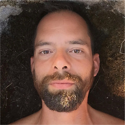
here headerBg.png is a semi-transparent texture of size 5x5 pixel, ad for body I need to create this background:

I need to know how to make this kind of radial background in CSS3, initially I had used same code as header but with rgba() for color, setting end of the gradient with 0 opacity but it created too much noise.
tried few online generators as well for CSS3 radial background but none of them were good!
This image i am using is taking up 280kbs and I want to reduce it as it significantly effects the performance! Help would be appreciated.
update:
Upload psd, can be downloaded from http://ylspeaks.com/stackoverflow_css3.zip
and adding bounty
 683
683
Edit Jan 2011: Webkit nightly now supports elliptical gradients http://webkit.org/blog/1424/css3-gradients/, these will eventually find their way into Safari and Chrome. Faking elliptical radial gradients through css transforms will eventually be unnecesary.
Your problem has the most difficult constraints I've ever encountered, but it is an interesting challenge and it illustrates the limitations of each browsers approach for radial backgrounds, so that's why I decided on trying.
First, the rgba approach is stillborn because the opacity is going to hide some of the noise. It's better to apply semitransparent noise on top of the gradient, you can avoid the extra div by applying multiple background on the same image:
background: url(noise.png) repeat top left, -webkit-gradient(radial,50% 0,700,50% 0,100,from(#6f2813),to(#B9513D)) transparent;
You may notice the color property at the end of declaration, it looks weird but this how you declare colors when you apply multiple backgrounds.
Second, webkit doesn't support elliptical backgrounds, so the work around to this is squishing the gradient through -webkit-transform and positioning it a bit further up:
-webkit-transform: scale(1, 0.7) translate(0, -350px);
For sanity, the right thing to do would seem be applying circular backgrounds on both FF and webkit and then transform them. However, Firefox's transform doesn't support scaling gradients! So we apply an elliptical background:
background: url(noise.png) repeat top left, -moz-radial-gradient(50% 0 0deg,ellipse farthest-side,#B9513D,#6f2813) transparent;
But, since Webkit's container is squished, Firefox's gradient is larger! At this point we would think about applying different css rules for the height of the gradient, but since Firefox doesn't scale the gradient, we can apply the same transformation on the elliptical background the get the containers to be of the same height:
-moz-transform: scale(1, 0.7) translate(0, -250px);
And voila! we have an elliptical gradient with noise, that works on both Safari and Firefox!
http://duopixel.com/stackoverflow/gradient/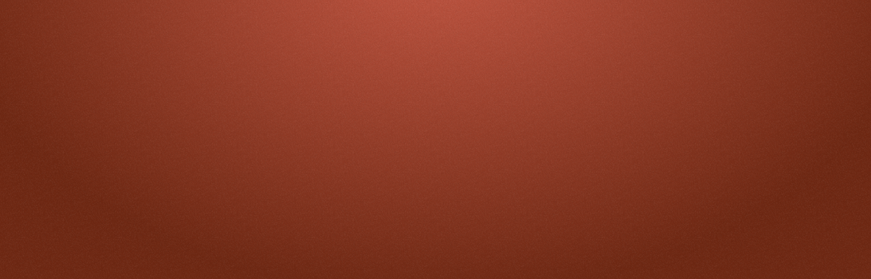
188
If you love us? You can donate to us via Paypal or buy me a coffee so we can maintain and grow! Thank you!
Donate Us With