 Menu
Menu
I'm trying to create a sort of perspective crowd for my website. It's literally a ul full of flat images, and I want to create a "curved" feel like a rounded crowd. Where it's inwards and perceptively smaller towards the inside and curves out towards the ends.
The poster circle example is the closest I can find http://www.webkit.org/blog-files/3d-transforms/poster-circle.html except I don't need the "front" - just the back. Each image is 100px x 100px, 23 images per row and four rows.
I'm pretty much at a complete loss as to how to approach this... I've tried a few different ways applying unique -webkit-transform: rotateY(x) translateZ(x) to each image but never quite getting there (struggling with calculating the right values, or using the wrong thing entirely), as well as playing with perspective.
 526
526
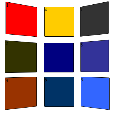
This is a simple "poster wall" with 9 divs - all the divs are absolutely positioned within a wrapper div.
In the wrapper div, you add: -webkit-transform-style:preserve-3d; This is what actually creates the 3D effect. You can optionally add a perspective setting depending on the degree of foreshortening you want.
And in the CSS, you create div styling that looks like this for the left hand images:
-webkit-transform: rotateX(0deg) rotateY(30deg) rotateZ(0deg);
-webkit-transform-origin: 100% 0%;
and for the right hand images:
-webkit-transform: rotateX(0deg) rotateY(-30deg) rotateZ(0deg);
-webkit-transform-origin: 0% 0%;
NOTE: Only Safari and iOS support preserve-3D right now. For other browsers, you'll have to manually add perspective by manually scaling and skewing the images, and it never looks exactly right.
2014 Update: preserve-3D is supported widely cross browser now
154
Just found this after creating the following that might help you: http://jsfiddle.net/remybach/hpsJV/2/
The meat of it lies in this:
&:nth-of-type(3n+1) { /* col 1 */
    transform:rotateY(20deg) translateZ(-30px);
}
&:nth-of-type(3n+2) { /* col 2 */
    transform:translateZ(-90px);
}
&:nth-of-type(3n+3) { /* col 3 */
    transform:rotateY(-20deg) translateZ(-30px);
}
If you love us? You can donate to us via Paypal or buy me a coffee so we can maintain and grow! Thank you!
Donate Us With