 Menu
Menu
I've encountered this very annoying problem.
When you align an image with transform, translate percentage based it causes the image to blur slightly. This is only with percentage alignment
Consider this css:
img {
  display: block;
  height: auto;
  max-width: 100%;
  transform: translate(1%,1%);
}
Tried solutions:
Maybe somebody has an solution?
Updated: Js Fiddle I updated the js fiddle with an image to better see the difference. It is very noticeable in photography.
Example image:
Thanks!
 872
872
Try something like this
translateX(calc(-50% + 0.5px))
69
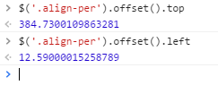
Using a percentage value with Transform: translate means it positions your element with sub-pixel accuracy. You can see the pixel-value offset of your second div in the jsfiddle when you query it in the console:
This means that your browser is forced to do some less than optimal anti-aliasing to position your image, and that's what's causing the blurriness. If you could position it to whole-pixel values instead the image would remain sharp.
I haven't found an elegant solution to this annoying problem, but with javascript (sorry, I know this is tagged as a css problem) it's conceivable you could measure the element's offset values, then remove the translate and measure the non-translated pixel offset values and then calculate the difference between the two offsets (difference in offset between pre and post translate). Then rather than putting translate(%, %) back onto your element you could round the differences you calculated to the nearest whole pixel value (ie: remove sub-pixel rendering) and then reapply those values as translate (px, px) instead. This would keep your image sharp. It's a less than optimal solution, but it's the best I've been able to come up with so far.
EDIT:
Here's a quick function I wrote that will do what I'm talking about above. Once again, I apologize that this is not a CSS solution, but I see no way to fix it with CSS. This is also not a great solution in that you lose the responsiveness of % values, and it will also overwrite any Transform attributes that aren't translateX or translateY (so maybe use a wrapper div if that's a problem). Somebody could probably solve that problem by doing this with a Transform matrix, but yeah...
[EDIT 2: updated function to account for any css transitions that may be assigned to element]
function snapTranslateXYValsToNearestPixel(element){
  var xTransPos = $(element).offset().left;
  var yTransPos = $(element).offset().top;
  // turn off any transitions (but save values first):
  var transitionVal = $(element).css('transition');
  $(element).css('transition', 'none');
  // turn off translate:
  $(element).css('transform', 'translateX(0) translateY(0)');
  var xPosDiff = xTransPos - $(element).offset().left;
  var yPosDiff = yTransPos - $(element).offset().top;
  var xPixelVal = Math.round(xPosDiff);
  var yPixelVal = Math.round(yPosDiff);
  var translateVal = 'translateX(' + xPixelVal + 'px) translateY(' + yPixelVal + 'px)';
  $(element).css('transform', translateVal);
  // reapply transition value (wait one tick for new css value to apply first):
  setTimeout(function() {
    $(element).css('transition', transitionVal);
  }, 1);
}
Again, not a totally ideal solution... BUT it WILL convert the translateX and translateY percentages of your element to whole pixel values and it will give you a nice crisp image.
Example usage:
snapTranslateXYValsToNearestPixel('.align-per');
If you love us? You can donate to us via Paypal or buy me a coffee so we can maintain and grow! Thank you!
Donate Us With