 Menu
Menu
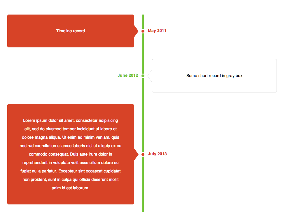
I am working on a vertical timeline with css, can any one help. left portion is getting congested. left portion pointer circle is overlapped with opposite one. Trying to make it with css only. Is there any java-script we can add to make it work.
http://jsfiddle.net/cdtHx/
Code:
<!DOCTYPE HTML>
<html>
<head>
<meta charset="utf-8">
<title>Untitled Document</title>
<style type='text/css'>
.line {
width:930px;
margin:0 auto;
}
.line div {
width: 408px;
background-color:#ffffff;
border:solid 1px #B4BBCD;
min-height:35px;
text-align:justify;
word-wrap:break-word;
list-style:none;
}
.ci {
position:relative;
float:right;
}
.cl {
position: relative;
text-align:right;
}
.ci, .cl span {
padding:10px;
}
.line:before {
content: "";
position: absolute;
top: 0;
left: 50%;
}
.ci:before, .cl:after, .ci span:before, .cl span:after {
content: "";
position: absolute;
top: 0;
left: 0;
}
.line:before {
width: 3px;
top: -20px;
bottom: -20px;
background:#000;
}
.ci:before {
width: 5px;
height: 5px;
border: 3px solid #CCC;
border-radius: 100px;
margin: 10px 0 0 -38px;
box-shadow: 0 1px 1px rgba(0,0,0,0.2), inset 0 1px 1px rgba(0,0,0,0.1);
background: #000;
}
.ci:hover:before {
background: #090;
}
.ci span:before {
top: 12px;
left: -6px;
width: 9px;
height: 9px;
border-width: 0 0 1px 1px;
border-style: solid;
border-color: #e5e5e5;
background: #fff;
-webkit-transform: rotate(45deg);
-moz-transform: rotate(45deg);
-ms-transform: rotate(45deg);
-o-transform: rotate(45deg);
}
/*gggggg*/
.cl:after {
width: 5px;
height: 5px;
border: 3px solid #CCC;
border-radius: 100px;
margin: 10px 0 0 445px;
background: #000;
}
.cl:hover:after {
background: #090;
}
.cl span:after {
top: 12px;
left: 404px;
width: 9px;
height: 9px;
border-width: 1px 1px 0 0;
border-style: solid;
border-color: #e5e5e5;
background: #fff;
-webkit-transform: rotate(45deg);
-moz-transform: rotate(45deg);
-ms-transform: rotate(45deg);
-o-transform: rotate(45deg);
}
</style>
</head>
<body style="overflow:hidden;">
<div class="line">
<div class="ci"><span>one</span></div>
<div class="cl"><span>two</span></div>
<div class="ci"><span>one</span></div>
<div class="cl"><span>two</span></div>
<div class="ci"><span>one</span></div>
<div class="cl"><span>two</span></div>
</div>
</body>
</html>
 368
368
Check my example on Github https://gist.github.com/OzzyCzech/6240202
It's vertical timeline element are on two sides (left and right)
98
If you love us? You can donate to us via Paypal or buy me a coffee so we can maintain and grow! Thank you!
Donate Us With

