 Menu
Menu
I am working with multiple tablet devices - both Android and iOS. Currently I have following resolution variations for all the tablets.
Simplest way to apply device orientation based style is to use media query's orientation using following syntax.
@media all and (orientation:portrait) { /* My portrait based CSS here */ } @media all and (orientation:landscape) { /* My landscape based CSS here */ } This works perfectly fine on all tablet devices. BUT, the problem is, when device is in portrait mode and user taps on any input field (eg. search) the soft-keyboard pops up - which reduces the visible area of web page and forces it to render in landscape based css. On android tablet devices, it depends on keyboard's height. So, ultimately the web page looks broken. Therefore, I can't use CSS3's orientation media query to apply styles based on orientation (unless there is better media query to target orientation). Here is a fiddle http://jsfiddle.net/hossain/S5nYP/5/ which emulates this - for device testing use full test page - http://jsfiddle.net/S5nYP/embedded/result/
Here is a screenshot of the behaviour taken from the demo page. 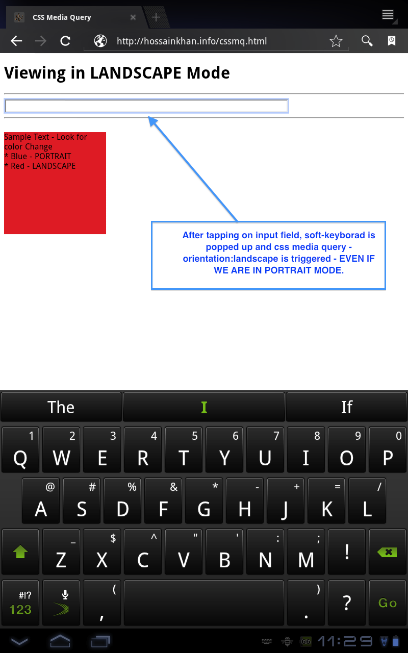
So, is there any alternative to takle this issue, I'm open to JavaScript based solution if native CSS based solution does not work.
I found a snippet on http://davidbcalhoun.com/2010/dealing-with-device-orientation which suggests to add class on and target based on that. For example:
<html class="landscape"> <body> <h1 class="landscape-only">Element Heading - Landscape</h1> <h1 class="portrait-only">Element Heading - Portrait</h1> <!-- .... more... -> # CSS .landscape .landscape-only { display:block; } .landspace .portrait-only { display:none; } .portrait .portrait-only { display:block; } .portrait .landscape-only { display:none; } What do you guys think about this? Do you have better solution?
 922
922
I know this is a couple of years late but I found a great solution
For landscape media:
@media screen and (min-aspect-ratio: 13/9) { /* landscape styles here */} And for portrait media:
@media screen and (max-aspect-ratio: 13/9) { /* portrait styles here */} The full solution and why it works can be found here Michael Barret - Android browser challenges
Edit: this link is now expired, but a snapshot can be found on the internet archive: Michael Barret - Android browser challenges
57
If you love us? You can donate to us via Paypal or buy me a coffee so we can maintain and grow! Thank you!
Donate Us With

